Does Virtual Staging Help In The Sale Of A Property?
Virtual Staging is a modern way to help buyers visualize their property or home before buying any furniture. It gives them ideas that how the entire ambiance

Interior Design Mistakes To Avoid When Virtually Staging A Home
If you want to sell your property fast, you have to create the right first impression on potential buyers. Of course, the interior of the home plays an essential role in creating a lasting impression. That is why you should avoid some typical virtual staging interior mistakes.
Here are the most common mistakes you should never make when virtually staging a home.
Bright Colors
Virtual staging aims to give clients an idea of how the space can be utilized. That is why you should never use bright colors on walls, furniture, and other items. It will be a turn-off for the buyers, and they will instantly not like the room's brightness.
That is why you should always keep the walls, floors, and even the furniture as minimal as possible. Providing a clean and sleek look will tell the audience how the space can be used and visualize further. After all, you have to give them a starting point to be creative with the room.
Gold Fixtures
While gold fixtures may be trendy, you should not add them to your virtual staging. That is because they stand out and take away the attention from the rest of the room. It would help if you always opted for fixtures that are neutral-colored so that they go well with the room.
Staging home using these tips is essential because it ensures that everything goes well together. Always opt for neutral fixtures. Never go for bright or gold fixtures,
Themed Rooms
Have a consistent theme throughout the house but avoid having various themed rooms. For example, your living room and bedroom should not have different themes. If you want a contemporary home, then make sure it is staged in the same theme throughout.
Having various themed rooms will give your clients the sense that even you don't know what you want the house to look like. Consistency is critical when it comes to virtual staging a property in the best way possible.
Patterns
Too many patterns throughout the property are a big no. You should never mix and match patterns when virtually staging a home. It will give the sense of a cluttered home, and even your clients will sense this confusion.
Always make sure that the interior is sleek and straightforward. Utilizing too many patterns will make everything in the home clash with each other. That is why if you want to use patterns, keep them minimal. Everything in the property should be solid, sleek, and minimal for the best results.
Final Words
These are the top four interior design mistakes you should avoid when virtually staging a home. If you want to attract a broad audience and sell your house fast, these are the things you should never do. If you want professional help with virtually staging a home, look no further.
Our expert team can help you virtually stage your home in the best way possible. For more information, feel free to get in touch with us now. Visit our website www.vshmedia.com or email us at hello@vshmedia.com
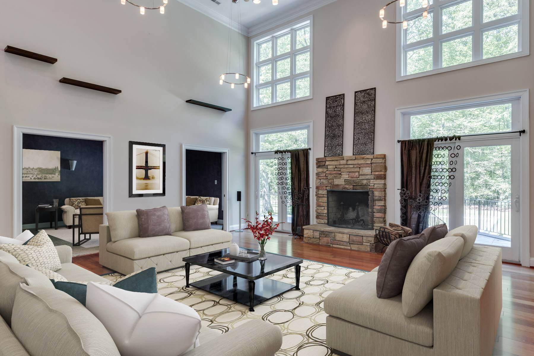
Virtual Staging is a modern way to help buyers visualize their property or home before buying any furniture. It gives them ideas that how the entire ambiance
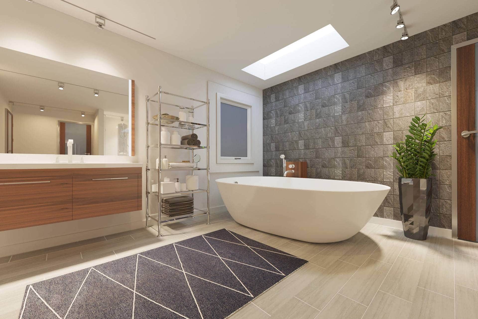
Do you dream about getting your house renovated but want to know how it may look before actually starting? Do you feel like visualizing how beautiful your house will look after the renovations?

Technology has really turned the way things work now. And when it comes to virtual staging, it is plain fascinating. A broker can easily market listings through various popular real estate sites. Nowadays, home buyers take a quick look at listing pictures and will know then whether or not to schedule a showing.

Capturing the right picture of your real estate property is very difficult. Due to the unpredictability of the weather, it may be very difficult to capture the ideal snapshot for your listing or property. It takes a certain amount of time and editing to do that! You might want to capture a stunning photo of your real estate property during dusk. However, that picture might not do justice to your real estate property. We know what it takes to attract your real estate property to potential customers and make them sell!

Have you ever listed a property and saw the great potential of a home but the furniture is too big or a bit outdated? Our Furniture Replacement product can solve this issue quickly!

If you are planning to sell a house then it’s very important that it looks absolutely perfect for those who want to buy it. Truth be told, a proper, spotless paint of simple colors adds much more value to the house.

Virtual Staging is vital to impress anyone looking into buying Real Estate properties. These days, people tend to check out various real estate properties on-screen before visiting any listing.

Before we start talking about how virtual staging is important, let us first understand what virtual staging actually is. Virtual staging is a process which is very similar to home staging.

Virtual Staging is indeed a very forward and admirable advancement in the world of technology shedding light on home staging and various techniques related to it...
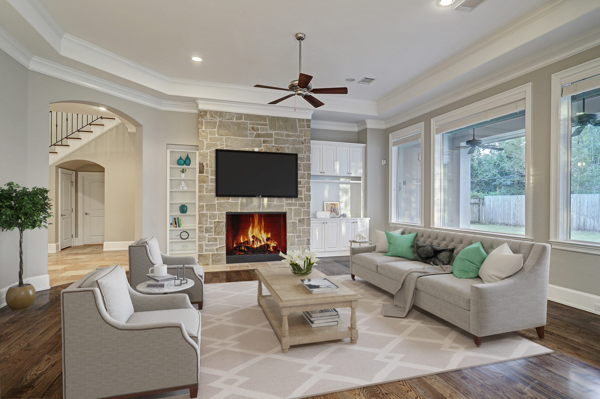
One of the biggest points of concern for people looking to sell their house is how quick their house will sell...

There’s no doubt that the Covid-19 pandemic has disrupted lives around the globe...

Can You Really Persuade Buyers Using Pictures? You may already have heard the saying, “A picture paints a thousand words”. Using images is actually an effective way of storytelling. That is absolutely true and can be applied in marketing as well. Images are said to create an impact mentally and emotionally in about 1 milliseconds compared to reading a long sales pitch.

The Magic of Virtual Staging: A Real Game-Changer in the Real Estate Industry With things mostly done virtually, real estate owners and sellers are always finding innovative and creative ways to promote properties more effectively. For instance, virtual staging is now creating big waves when it comes to the great concept of adding decors, furniture, and other items at home or commercial spaces. Since it was introduced, its magic has made buyers and sellers more inspired to join and the exciting world of the real estate industry. It’s more creative,more time-saving, more affordable, and more effective in promoting a property.

How Virtual Staging Works: Things You Need to Know You might be wondering how virtual staging works. Is it really effective in selling a property? Can it really persuade buyers to purchase from your listings? The answer lies in your deeper understanding on how virtual staging works. This is actually an interesting and a more professional way of virtual staging nowadays.

When you’re trying to highlight the selling points of real estate property, creative insights must be considered. For instance, a garden and the property’s curb appeal are both significant areas of a home property that needs to look amazing. With a personalized approach and innovative designs, you can make a garden look beyond gorgeous. But doing actual landscaping can be expensive. Good thing, there’s virtual landscaping and it can help you a lot in designing a garden that buyers will love.

Ready for home staging? Do you think you can make your potential clients interested to buy the property? Will the property entice them and close a deal with you? Maybe you need to have a final check and find out if the paint can already attract a buyer. In case you may need to have your property repainted, then it’ll be best if you go with virtual pain. VSH Media can be your best answer.

Virtual staging is an innovative marketing strategy. Just like the traditional staging, it is the process of decorating a property to show its best qualities and functions with the objective of making it more attractive to the buyers. However, as the competition becomes tougher in the real estate industry, virtual staging should also be improved. Every company who is offering a digital home staging should learn how to impress their buyers with their virtual staging strategies.

As 2021 comes, we’re all wishing for a brand new start of our personal and career development. But not only that, we’re all excited to find out the new trends to be introduced this year. When it comes to home improvement tips, who wouldn’t want to know what to be expected this year?

When it comes to home renovation, we always feel excited on how a certain area will look like after the changes made. We’re thrilled to see new colors as well as the new furniture and decors that will make a home more aesthetically beautiful. That is also what is being searched for during house staging. Buyers expect to see the highlights of a home or any property before they decide to make a purchase. However, there can also be some issues encountered when showcasing a house during house staging.

The holiday atmosphere is just around the corner. We can already feel the cold breeze and Christmas vibes. Beautiful decors are flaunting at every home, and everyone’s excited to welcome the season of loving and sharing. Have you decorated your home so it showcases the vibe of the holiday season? If not yet, then the following tips will help you make your home feel the vibe of the wonderful holiday celebration.

Adding indoor plants are now becoming the new trend when it comes to home improvement. Your home does not only look great with plants, but indoor plants can also provide various benefits to health and wellness of the whole family.

Most people nowadays have been taking advantage of what the internet has to offer. Almost everything that we daily need in our lives is done with the use of the internet - looking for something, needing to know about something - everything is there. What else could you ask for, right?

2020 has been a year full of unexpected happenings, and the biggest and most chaotic of all is the Covid-19 pandemic which immensely affected a lot of businesses around the world and especially the real estate industry. And in order to cope up on the new ways to keep everything on the run, it’s also been necessary to face immediate transformations and make adjustments on real estate marketing strategies.

It is undeniable that the main sources of a real estate website for sales and engagements are their listings. But, which are the other ways to drive more traffic to your listings?
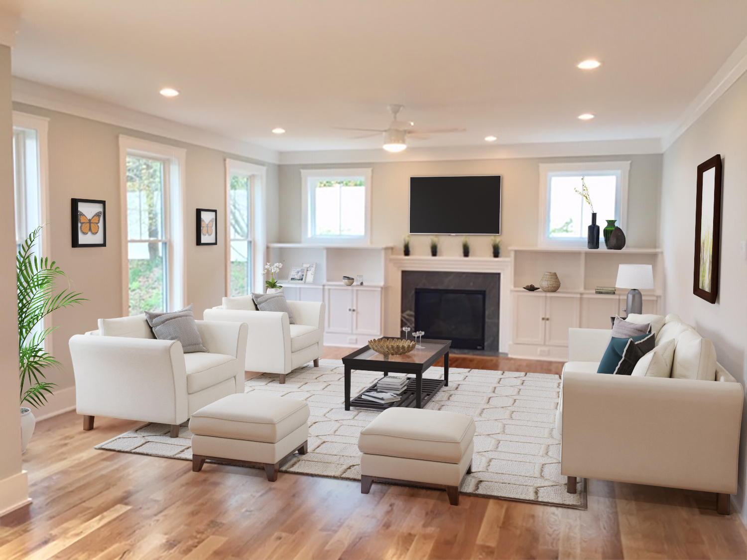
Realtors and home sellers know how quality photographs can help sell a property effectively. As a matter of fact, pictures are the first factor that entice buyers to check the listing.
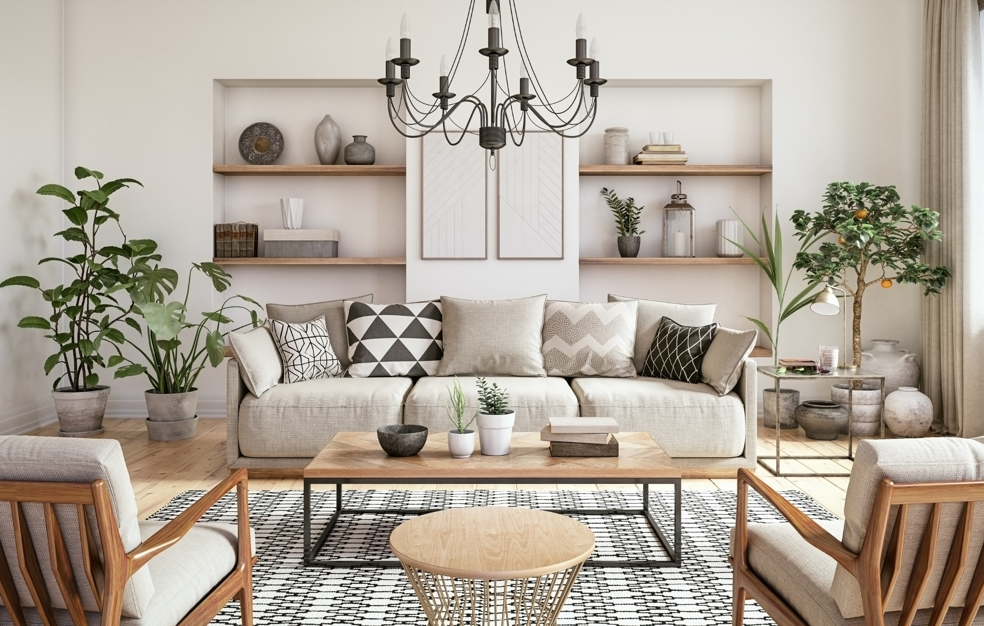
Did you know that staged homes sell 70% faster than ones that are not? However, you can now take staging to another level with virtual staging. It will allow you to sell your home quicker and show buyers its potential.

If you want a fast and cost-effective way of staging your home, virtual staging is the best option. It involves adding virtual décor, furniture, accents, and much more to bring an interior together. Of course, if you want to make the best of it, you need to follow the five golden rules.

Virtual staging is one of the best ways to attract more buyers and close the sale of your home. Many real estate agents use this tool to show their audience the potential of their home. Of course, you can use this tool too. However, if you don’t know where to start, here are five virtual staging tips that will help your home look more beautiful.

An empty room is a blank canvas. Of course, not everyone is creative enough to fill that blank canvas with different colors and items. That is where virtual staging comes in. Not every buyer can visualize what a room will look like after it is furnished. If they can’t visualize, they will not buy the property. That is where virtual staging companies come in.

A new year means new trends dominating the market. The world of home staging keeps on evolving and changing as new trends pop up every year. Sometimes, it can be overwhelming to keep up with all the latest trends for the best home staging. That is why we have rounded up the 5 best home staging trends that will take over 2021. Here are the five trends that will make your home look aesthetically pleasing and attract buyers.

If you want to make the most out of your listing, you need to market your home effectively. The best way to do that is to research the latest trends and incorporate them into your listing. If you were looking for the latest design trends, you are in the right place. Here are the top 5 design trends to market your home effectively. If you have a small home, these are the best tips to make the most out of your space.

The real estate market is always changing. You will find it to be moving from one trend to another quickly, which makes it essential for you to know what is going on in the market to make the best use out of it as a real estate agent. Let’s take a look at some of the most prominent trends in the real estate market that are sure to impact it to a great extent.

Have you ever thought you could purchase a new house without visiting it first? Well, thanks to modern technology, that may just be possible now.

When you’re planning to sell your home, you might want to consider simple home staging. Home staging has proved to be quite beneficial when it comes to making a sale of your property. So, if you’re looking for a good way to get things going for yourself, then perhaps you should simple home staging. But, can you do it all yourself? Well, experts suggest that there are a few things that you can do to enhance the home staging process, but doing it all yourself might be time consuming but nevertheless there are some simple things you can do to get started now.

Summer is just around the corner and selling a home during this time is not easy. However, many potential buyers are looking for homes during this time as they want to settle in before school begins. That is why the key to selling a home during this time is to stage it according to the season. If you want every potential buyer to fall in love with your home in the summer, here is how you can stage it.

Real estate agents have always kept an eye out or better marketing techniques, virtual staging being one of them. It has been proven tremendously effective. However, it was only applicable to high-end properties up until the recent technological advancements.

The latest trend that is dominating the real estate market is virtual staging. It allows real estate agents to save costs, time, effort, money, and much more. However, virtual staging will not be effective unless you choose the right photos for your listing. Make sure you go through each photo and select the ones that help you sell your home fast. Here are the top tips to help you determine the right photos for virtual staging.
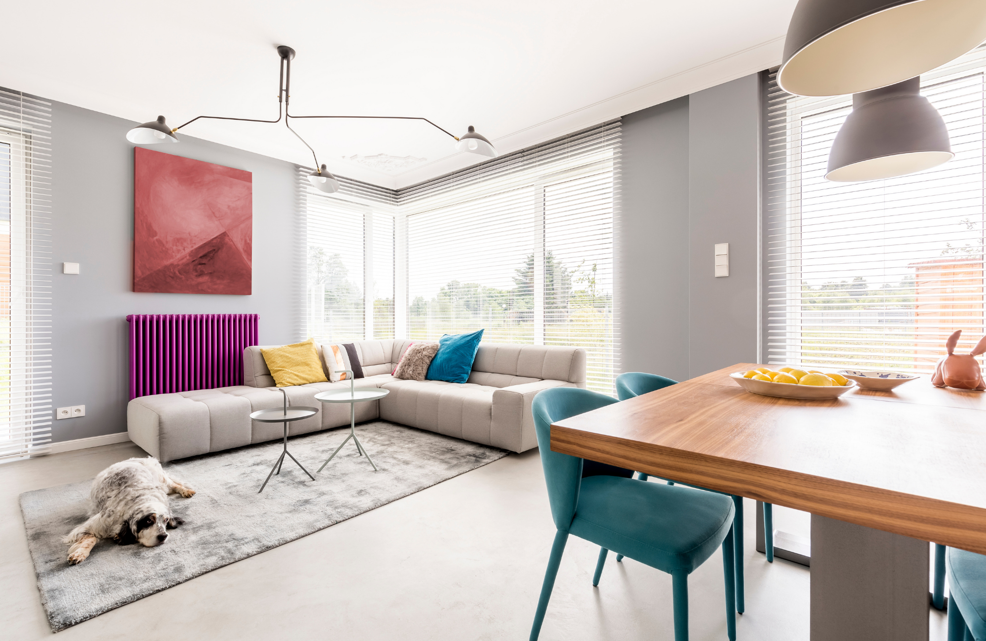
Virtual staging a property is one of the most effective forms of selling in the recent real estate market. It is cost-effective and allows you to bring prospective buyers for a tour after they see the pictures. However, before you start virtual staging, you need to prepare your home. Here are the top tips that will help you prepare your home for virtual staging.

Virtual staging is all about showing buyers the potential of the property. You can show that potential with the help of the right furniture and accessories around the house. That is why it is essential to choose the right furniture so your property can look beautiful. If you are confused about how to choose the right furniture, you are in the right place. Here is how you can select the right furniture style for your virtual staging.

Virtual staging is all the hype in the real estate market. You will find that many real estate agents are making use of this method to bag more and more sales. There has been a jump in the sales because of this very method, therefore, driving almost every seller out there to make use of virtual staging. We will get into how it is so effective when it comes to making sales shortly.

Remodeling your home can be one of the most rewarding things to do. If you think that your house needs an upgrade, then you should consider remodeling certain areas to give it a whole new look. The entire remodeling process is exciting but takes a considerable amount of time and effort to achieve the results that you wish for.

Videos can play a major role when it comes to helping you make sales in the real estate sector. But this doesn’t mean that you can just walk into the property, without any plan, with your phone, and start making the video. Instead, you need to plan it all out properly to ensure that you get the perfect virtual tour ready for your audience. It is considered the best ways to market your real estate business currently to get more and more people attracted to what you have to offer. So, let’s take a look at all of the steps that you can take when shooting for a virtual home tour.

While you may have heard of various staging techniques for homes, there is little that can be done about commercial property. Homes are much easier to stage than commercial property. While every home would have several bedrooms and a kitchen that can be staged, there are no standard rooms for a commercial building.
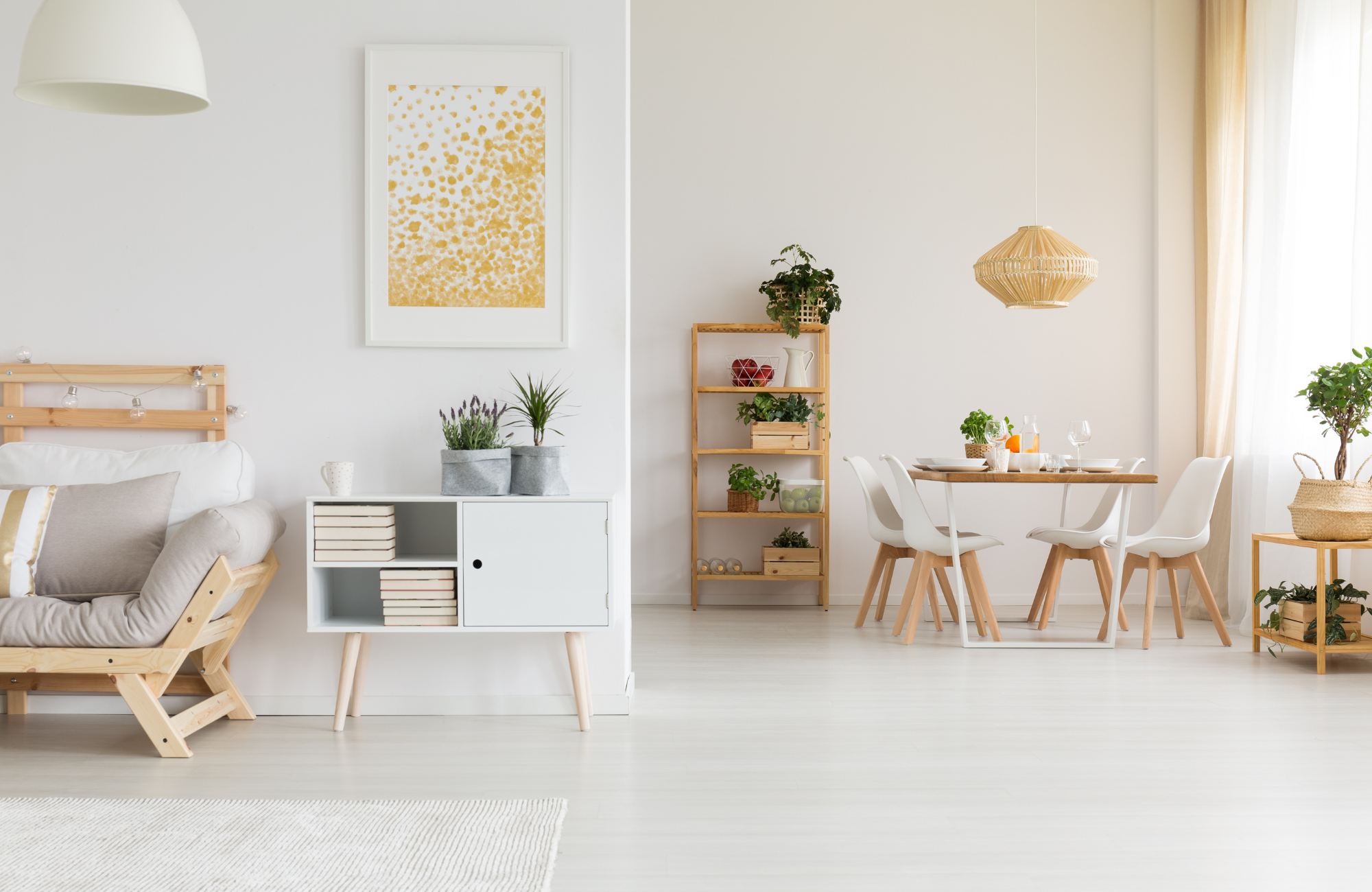
When you have a property in your real estate listing, there are many things that you can do with it. Not every space needs to be converted into a home or an office – there are many properties that could easily become commercial buildings, co-working spaces, beauty salons, or even restaurants and coffeehouses. Like we said, the possibilities are endless.
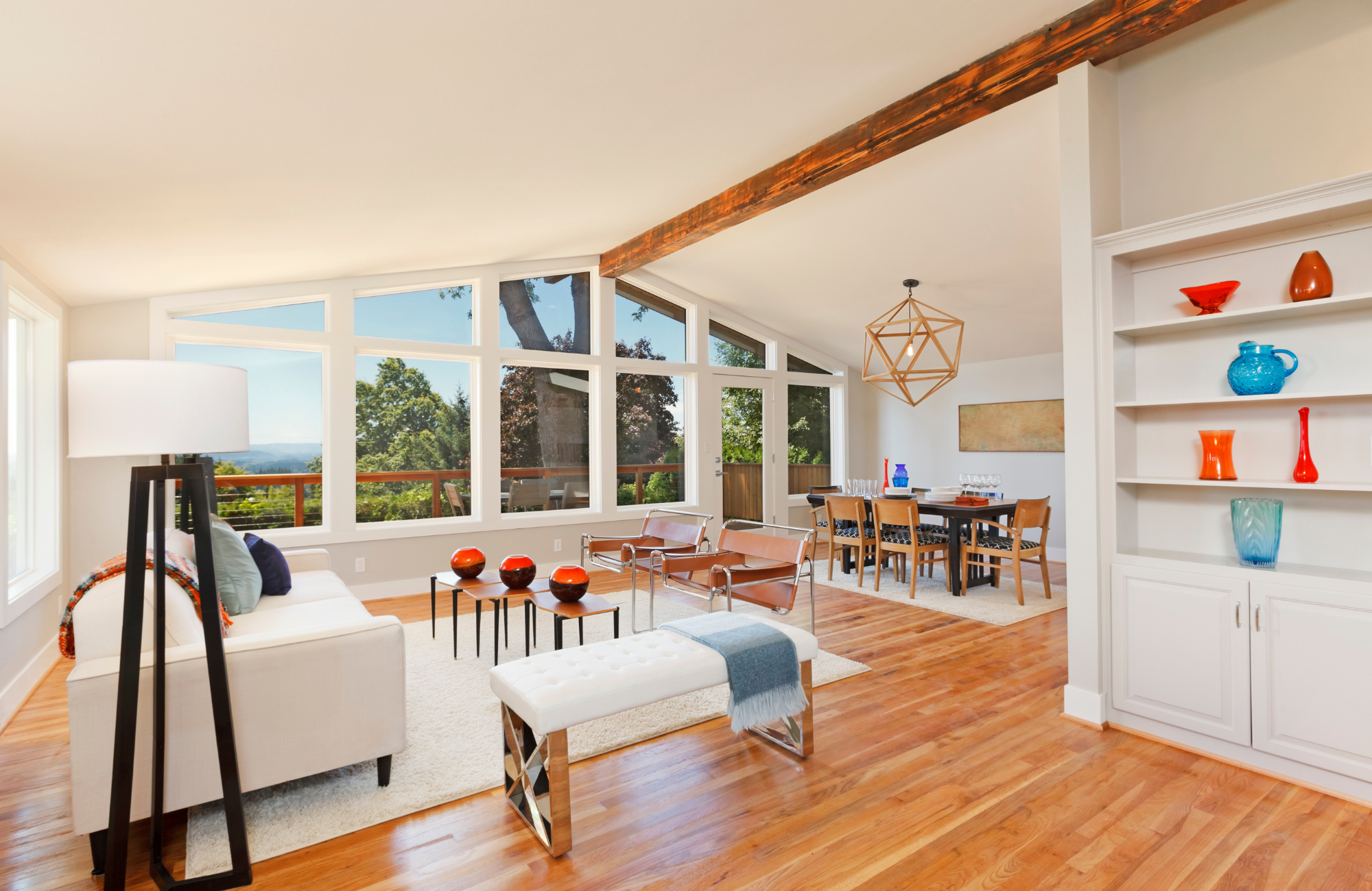
As a real estate agent, when you’re trying to market your properties, you want to make sure that you make use of virtual tours to do so. But do they even work? Well, yes they do. There have been many instances that have enabled real estate agents to market their properties effectively through the use of virtual tours and staging. You will find that these options have a lot to offer you as they offer your clients a much more expansive view of the property and better details.
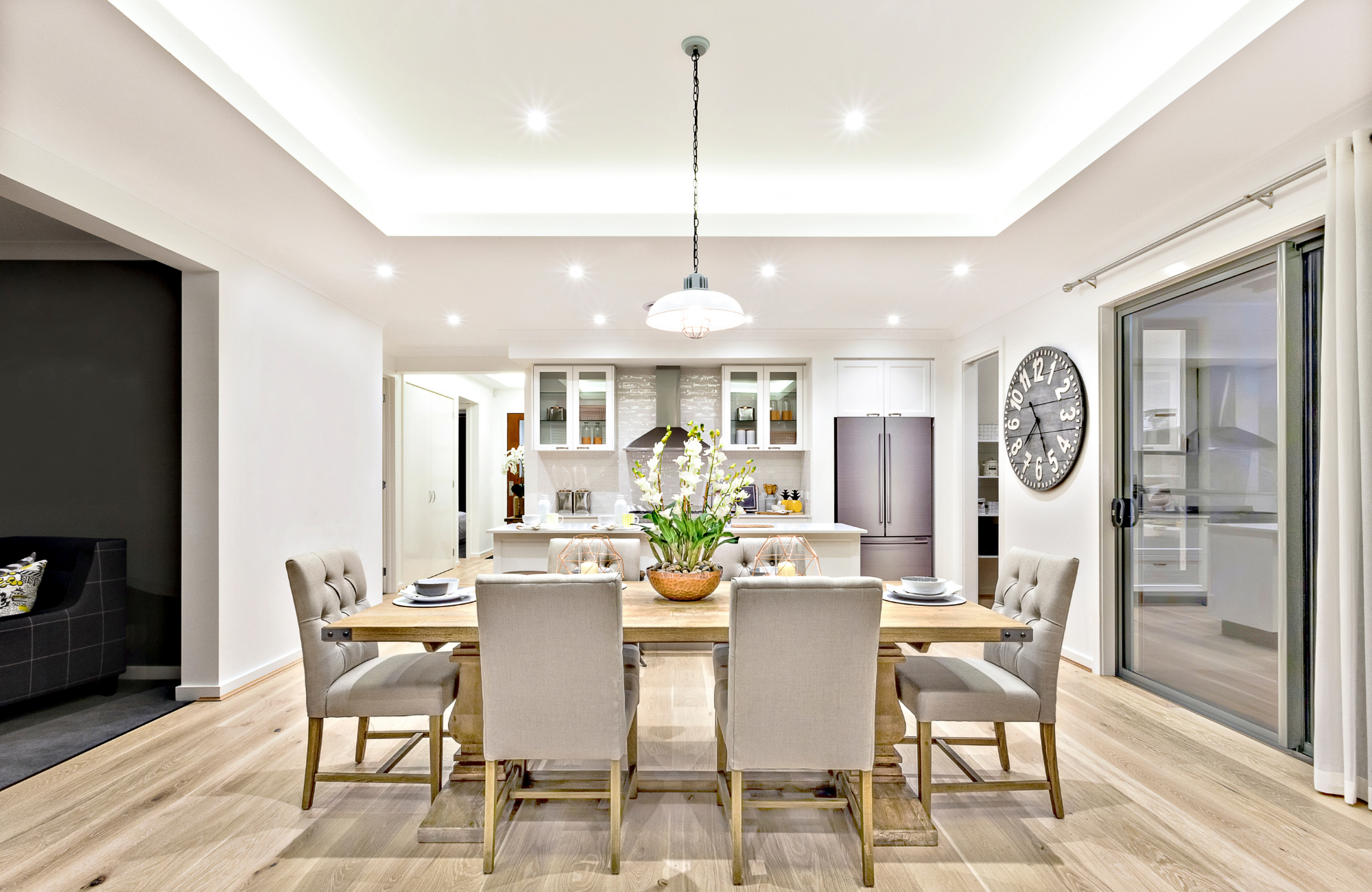
Photographs make a lot of impact when it comes to making your real estate sales. While this is a given phenomenon, there are many real estate agents who continue to not make use of this exceptional method to boost sales. If you’re one of those, then it is time to change things around. Here, we will talk to you about the power of photography on real estate when it comes to making sales.

When selling property, it should be kept in mind that the appearance of the houses plays an important part in picking the buyer’s interest. Statistics show 49% of the buyers are influenced by the aesthetics of the decorations of the property they are looking to purchase.

If you want to sell a house quickly, then you need to take appealing photographs of it first. While you may think that potential buyers are always looking for attractive kitchens and bathrooms in houses, there is no denying the importance of our beloved bedroom spaces.

The real estate market is getting more competitive each year. If you want to stay ahead of the competition, you need to have the most beautiful photographs to attract potential buyers. Thanks to technology and media, it is not difficult to create amazing photos. If you don’t know where to start with your real estate photography, here are some tips and tricks to help you in your journey.

Many real estate agents are now employing the use of virtual tours to sell their homes. It allows people to assess the home virtually from the comfort of their own home. If you are also planning to give virtual tours, you are in the right place. Here are some of the best tips to ensure your virtual tour is a success.
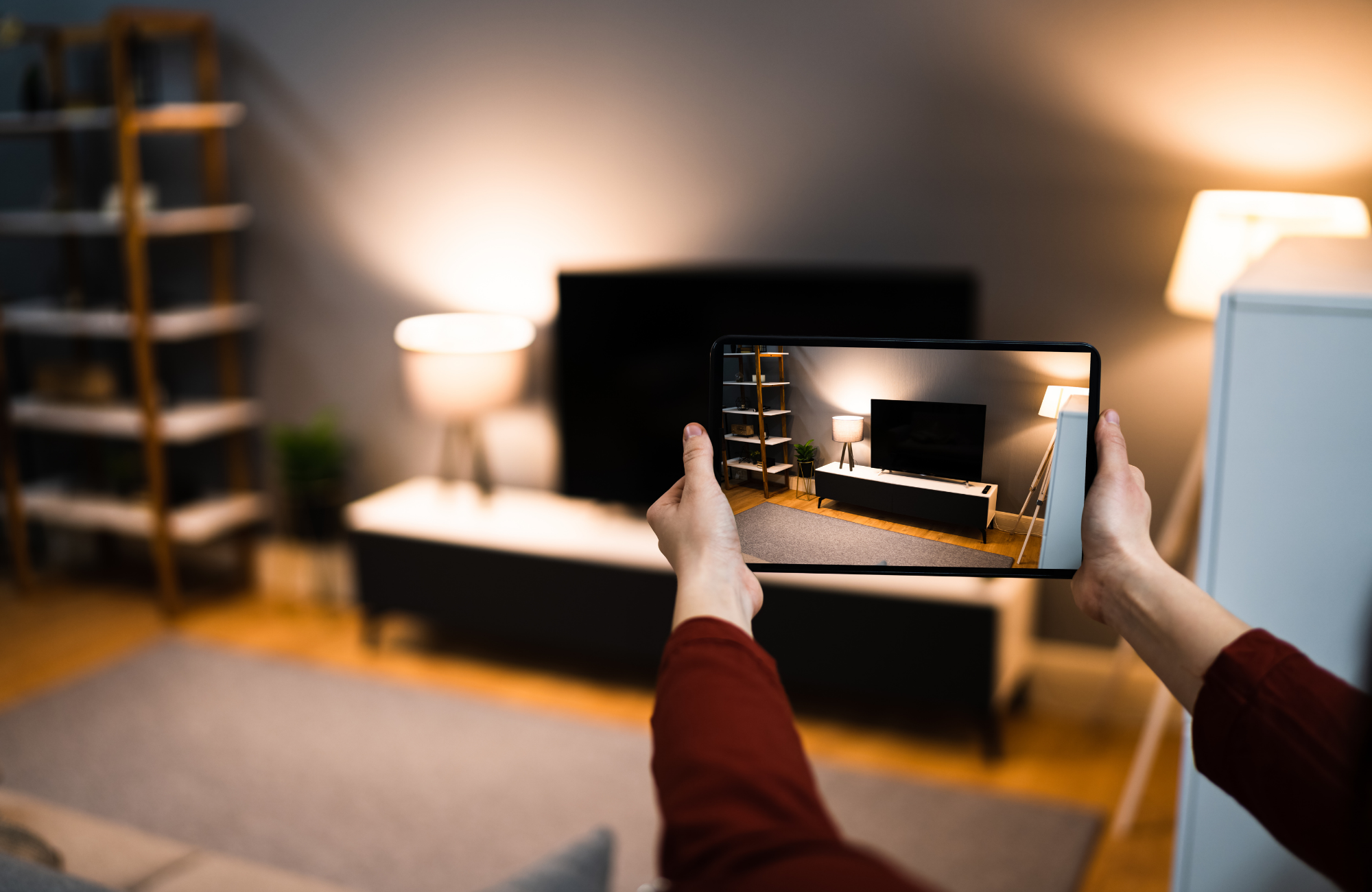
Technology is truly changing the way everything works. Gone are the days when the buying and selling of houses depended upon old-school site visits. In the modern world, real estate agents are using technology such as virtual tours and virtual staging instead of actual visits.

The landscape of real estate marketing is completely changing because of all the recent advances in technology. Instead of taking two to three weeks to stage a house, agents can simply take less than a week to virtually stage a home. All this is making the market more competitive.

You might think that taking pictures from your phone to sell the property is enough to make a sale. But that is far from the truth. In reality, you need to make sure that you make use of professional photographers for your real estate. This has more to do with the fact that they come with a multitude of benefits for your business. So, you can say that they are worth the money you spend. Let’s have a look at why you should choose a professional real estate photographer.

Virtual house staging is a popular trend in the real estate industry. It has very little to do with the actual staging of a house, which can be tedious work. Virtual staging is more about presenting a home to potential buyers in the best possible way without any of the difficult work of physical home staging. Home staging is a great option but may cost thousands of dollars and will take some time to stage. Our virtual staging is as low as $18 per image and we can have your images ready in less than 24 hours!

Virtual staging is an innovative technology that is changing the way real estate agents market their listings. This type of marketing strategy can help to sell the home for a higher price and is more appealing to potential buyers. Virtual staging also provides a significant return on investment for your company.

Preparing a house for a photo shoot can be challenging. Check out some tips to help you get the best out of your images to be ready for virtual services!

One of the best ways to make a room look larger is to use virtual staging services is through real estate photography. It's all about angles and light placement, and if done correctly, this can make a room appear much more spacious than it really is and show enough space for virtual staging.

Virtual staging is an excellent way to sell your property more quickly and attractively to potential buyers. The problem with many houses in today’s market is that they are empty. They lack furnishings, decorations or personal items making buyers less likely to be interested in them than homes that have been professionally staged.
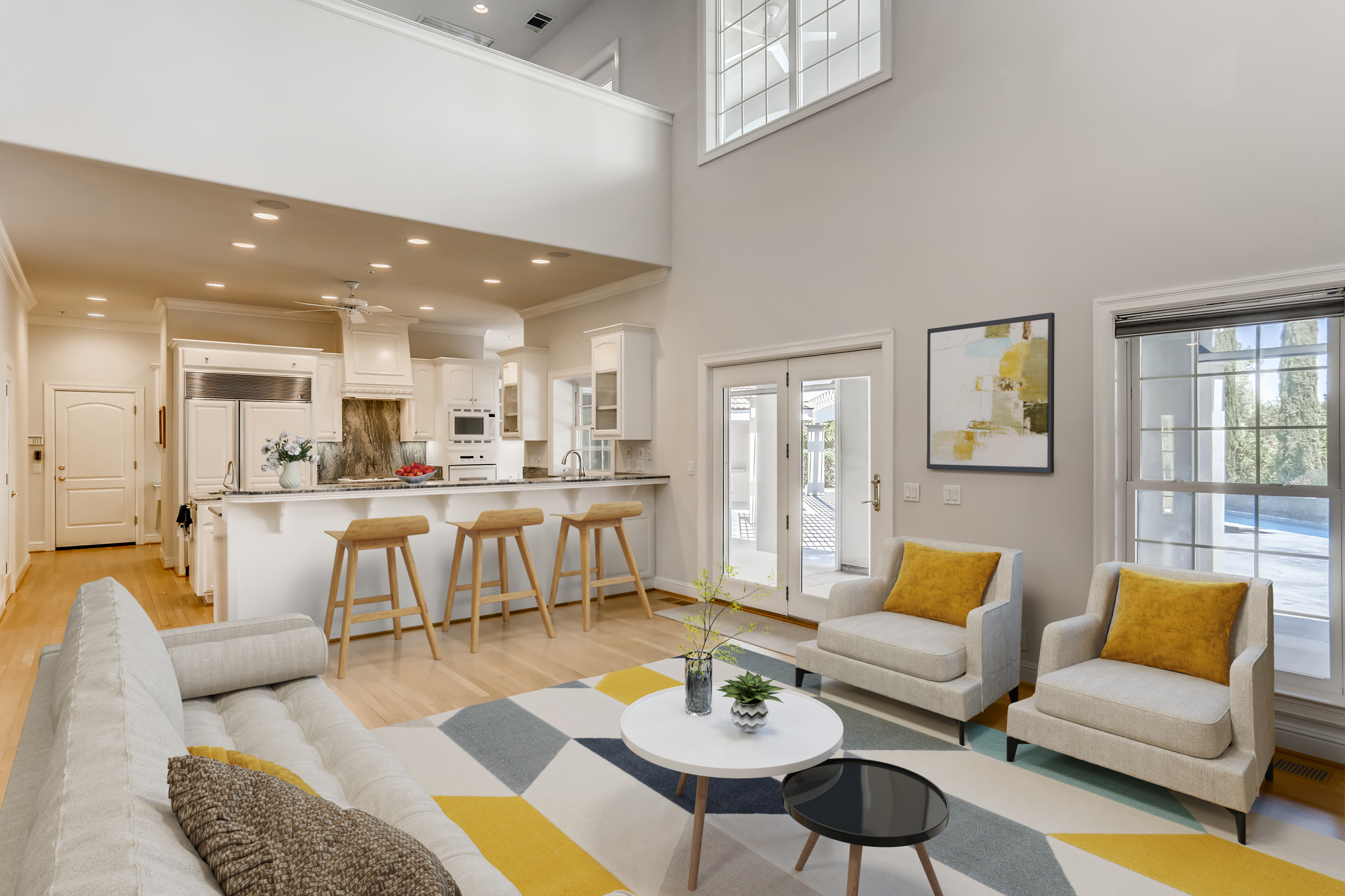
There are many types of photos that can be used to sell homes, but when it comes to moving quickly, the best shots are pictures of the interior.

Imagine you're the one showing your property to a potential buyer. What if you could do it from a distance?
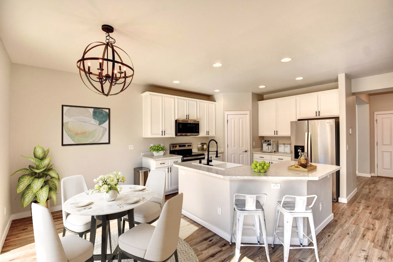
Innovative ideas about the real estate industry can make your business grow and sell more and faster.In a competitive market, the listing with the best photos and descriptions will be sold first. But, what makes a listing go from good to great?
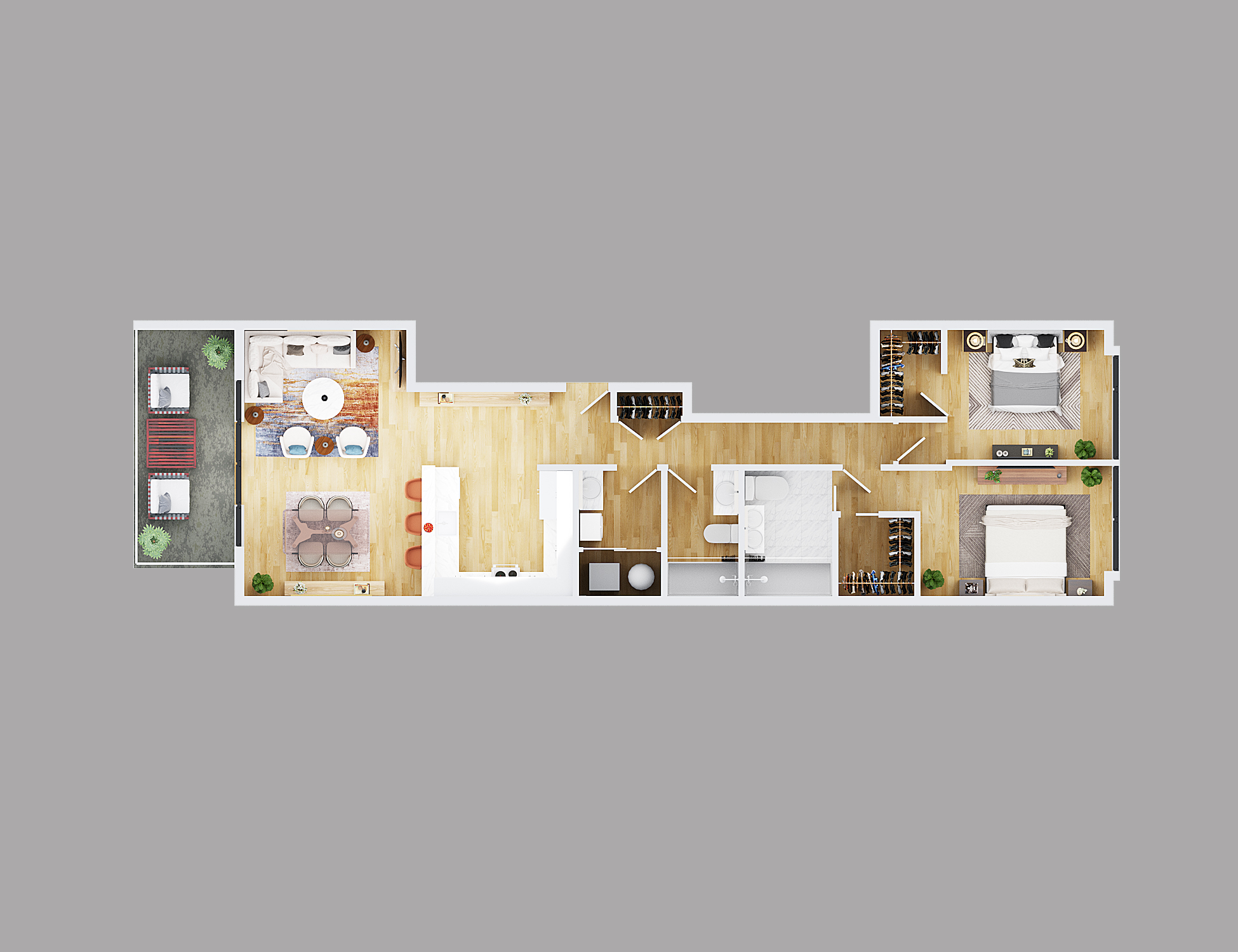
A lot of people are hesitant to buy a house if they are unfamiliar with the floor plan. They want to know where the different rooms are located and what they look like. A 3D floor plan is an excellent way for them to see this.

Throughout the last decade marketing has been all around social media as it can reach potential buyers worldwide. But one of the biggest disadvantages is that this massiveness can make your listing one of the bunch and get lost between many others.

Best Tips to Shoot The Exterior Of A Property The exterior of a property is also an important part of the listing. It sets the tone for what is to come and offers the best opportunity to showcase and sell your property in a way that will entice potential buyers.

Did you know? Virtual Staging is not just for residential properties. This kind of service can also be used for commercial listings, such as office space or retail stores.

Virtual furniture replacement is the best way of making the house look better and ready to be in the market. This will improve the selling time and can also show a new look on the house. It helps to get rid of old furniture which doesn't have any space or use for it and may not look good on a professional listing. When one wants to sell a property, furniture replacement is a must.

Virtual staging, 3D floor plans and listing writing services are some of the digital marketing services that real estate agents can use to sell their properties.

Virtual Exterior Rendering is thought to help potential buyers, investors and contractors visualize how the exterior of a property will look once finished. Showcasing a property when it is not ready yet can be a challenging task

In a changing world where marketing has extended not only to products and services but also to people, having a marketing briefcase can help you make the difference in the Real Estate industry.
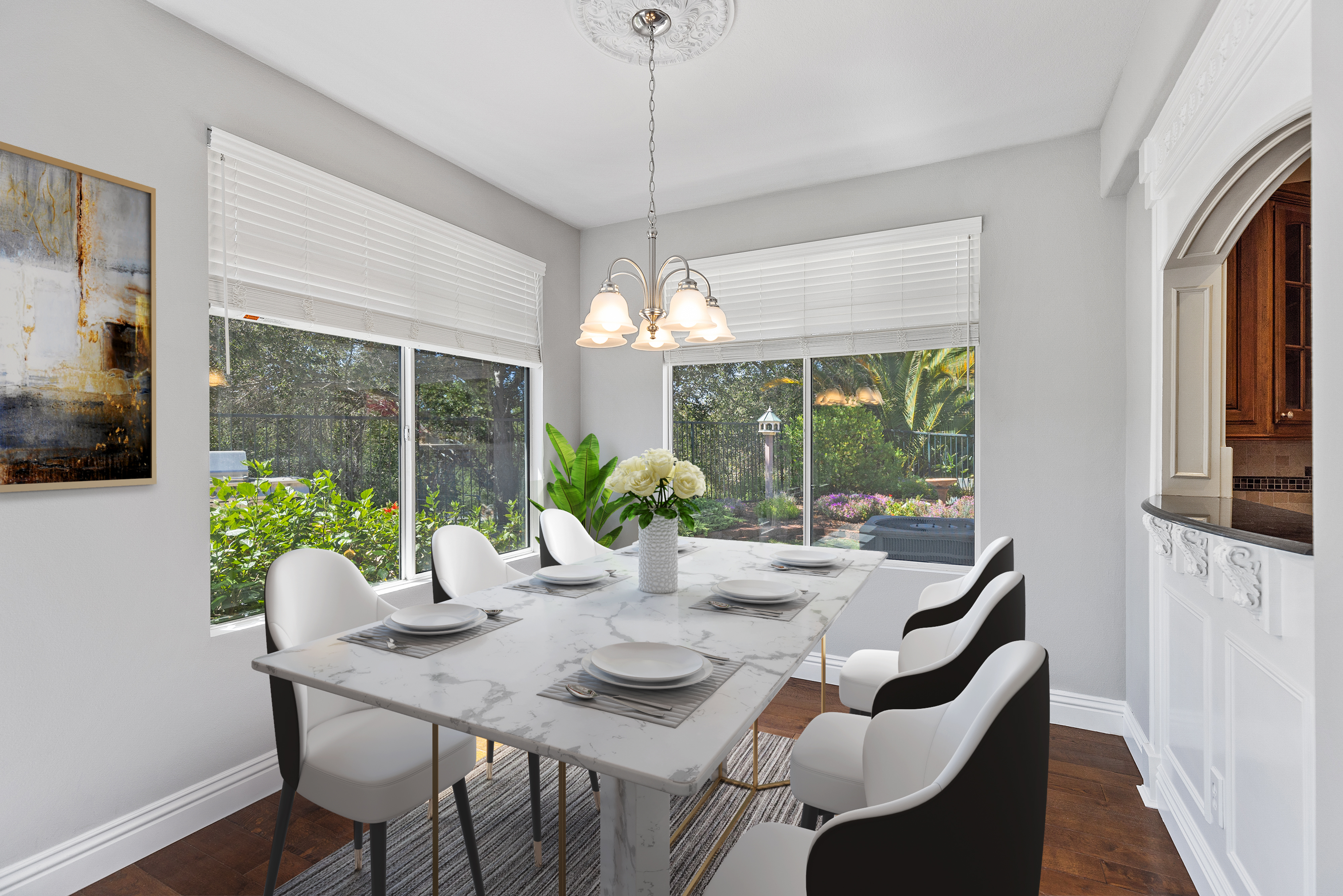
A lot has been said about interior design and trends. Whether you might think that choosing the ultimate furniture style shown in magazines might be the perfect match for your virtually staged images, this is not always true.

As per definition, centennials are the first generation born in this century. They make up to 25% of the population in America and they have lived all their life in contact with technology and have minor or no knowledge about life without internet, social media or smartphones.

In today's technologically advanced world, virtual staging has become an increasingly popular tool for the real estate industry. The traditional method of staging a property involves hiring a professional to bring in furniture and décor to create an appealing atmosphere that potential buyers can visualize themselves living in. However, this method can be expensive and time-consuming, especially when it comes to properties that are vacant or not currently occupied.

The real estate industry is a highly competitive and fast-paced industry. To stand out and succeed, real estate agents and companies need to have a comprehensive marketing strategy that effectively promotes their services and properties. With the right marketing tools, they can reach a wider audience, generate leads, and ultimately improve sales and grow their business.
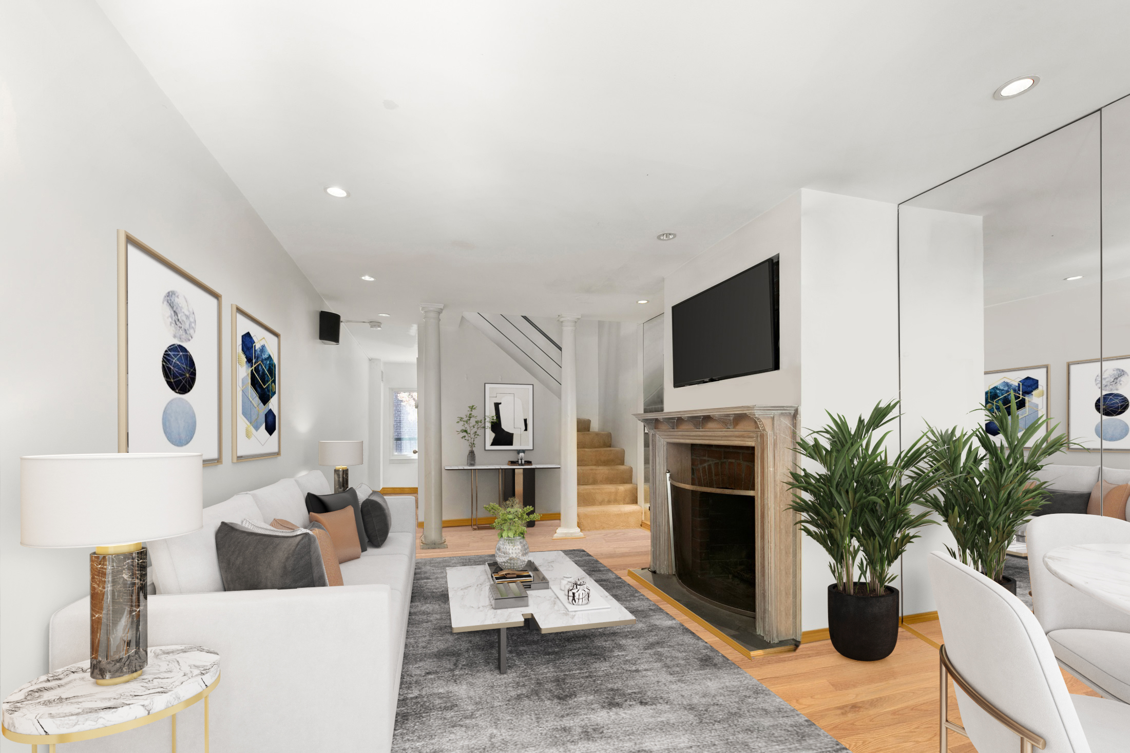
As we move further into 2023, the world of interior design and virtual staging is buzzing with new furniture style trends. From bold colors to sustainable materials, the 2023 furniture style trends are all about making a statement while still staying functional and comfortable.
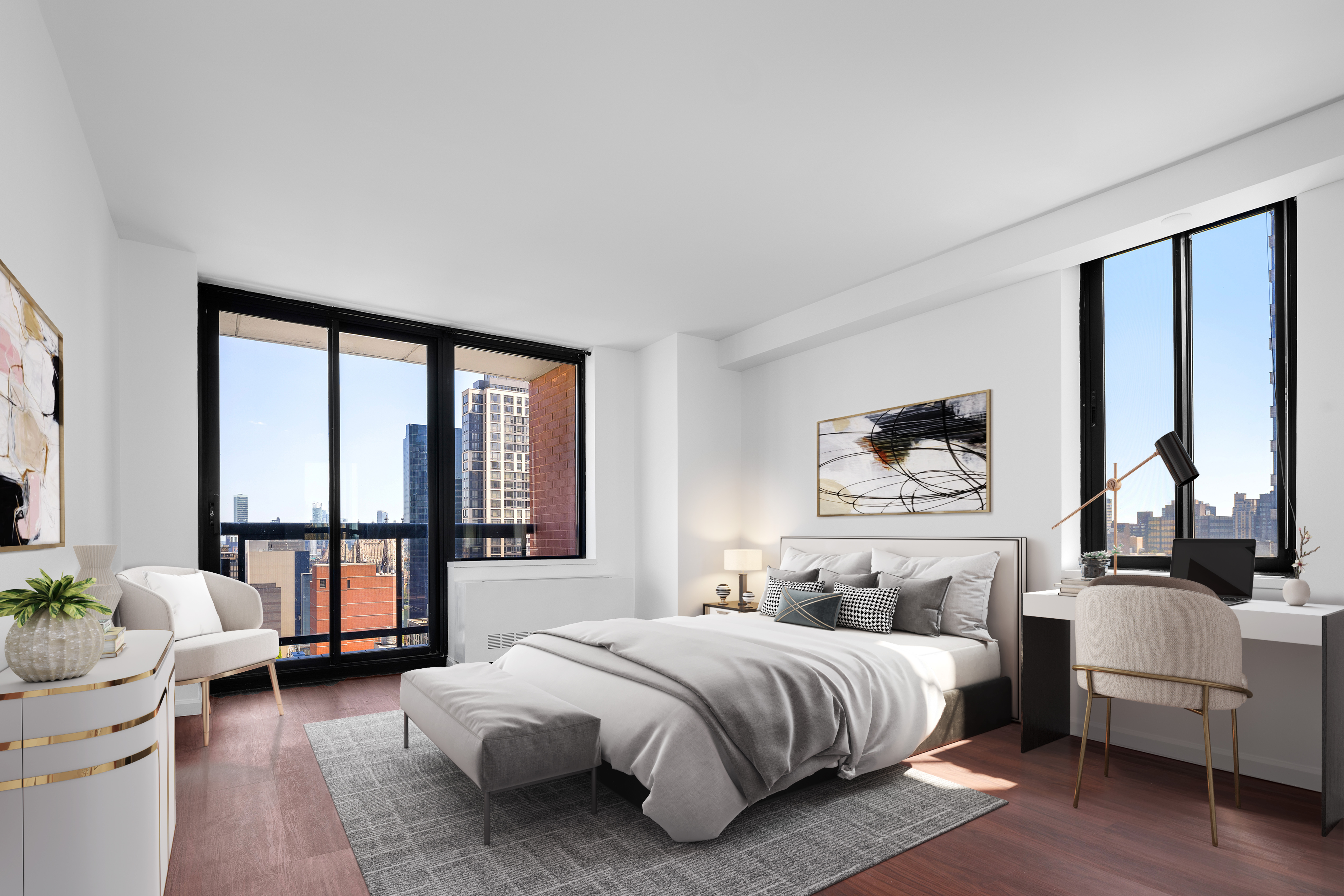
Renting out a property can be a great source of income, but it can also be a challenging process. One of the biggest hurdles is finding the right tenant who is interested in your property and is willing to sign the lease agreement. Fortunately, there are some things you can do to increase your chances of renting out your property quickly.

As a real estate agent, you know that presenting your properties in the best possible light is crucial to closing a sale. One of the most effective tools at your disposal is a 3D floor plan. With its stunning visualizations and accurate measurements, a 3D floor plan can make all the difference in getting potential buyers interested in a property. Here are a few reasons why 3D floor plans can help a listing sell faster.

When it comes to selling a property, the way a room looks can make all the difference in whether potential buyers will be interested or not. One important aspect of real estate photography is making a room look larger and more spacious than it may actually be. Here are some tips on how to achieve that effect, along with information on how professional photography and virtual staging services can help

Virtual staging is an innovative and cost-effective way to showcase a property’s potential to prospective buyers. With virtual staging, sellers can digitally furnish and decorate a room, making it more appealing to potential buyers. It is an excellent way to present a property in its best light without the expense of traditional staging. However, virtual staging can also be tricky and needs to be done correctly to be effective. In this article, we will explore the do's and don'ts of virtual staging.
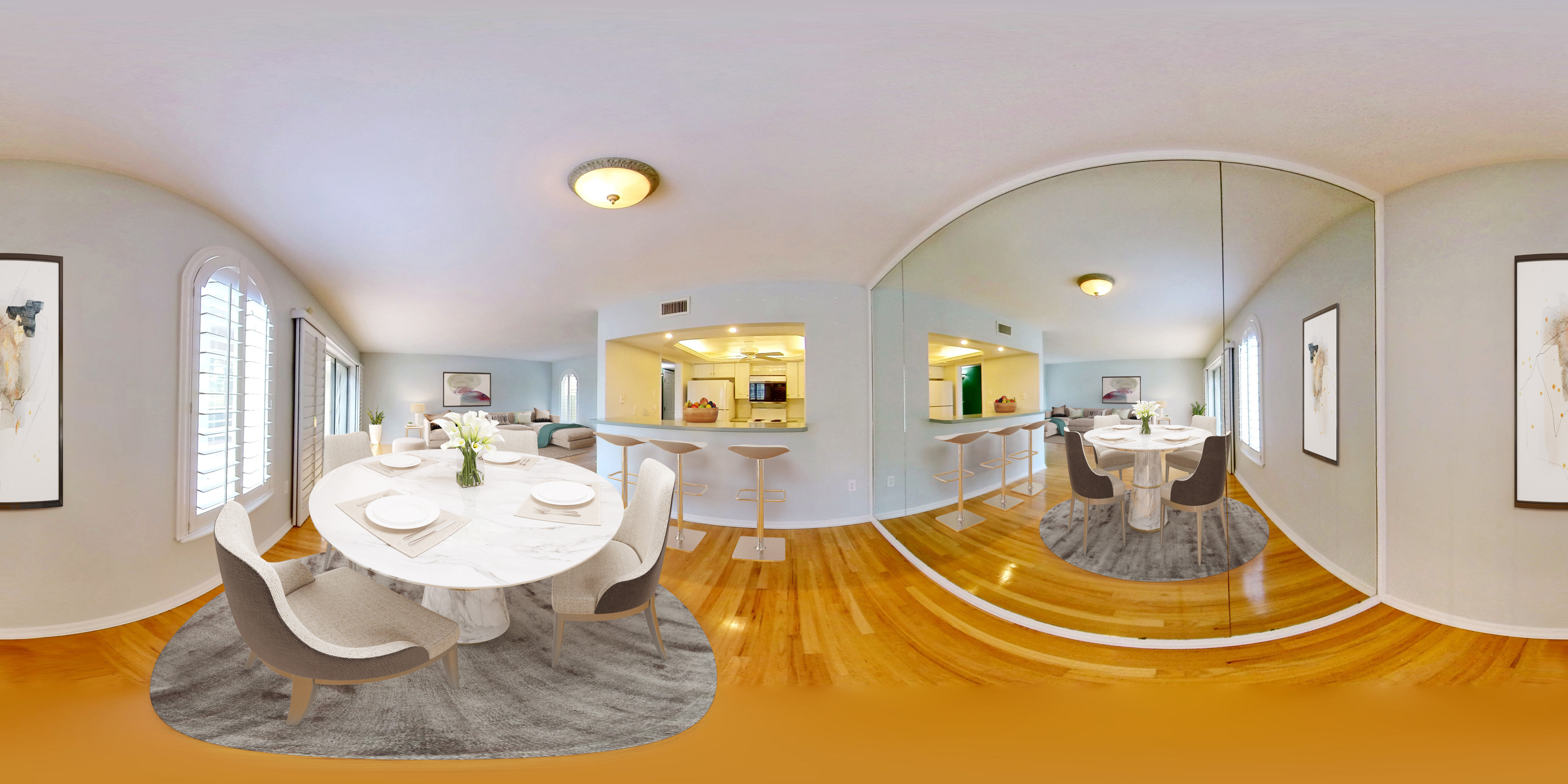
The world has rapidly shifted to the digital age, and the real estate industry is no exception. With more than 50% of home buyers searching for properties online, virtual tours have become a game-changer in the real estate industry. In this article, we will explore the importance of virtual tours and why they should also be virtually staged.

In the real estate industry, having high-quality photographs of your property is essential for attracting potential buyers. While professional photography is ideal, not everyone has access to a professional camera or the budget to hire a professional photographer. Fortunately, with the advancements in technology, it's possible to take great real estate photos with non-professional cameras like cell phones or point-and-shoot cameras. In this article, we'll provide tips on how to take great real estate photos with non-professional cameras and how to virtually stage those images to further enhance their appeal.

In today's digital age, establishing a strong online presence is essential for the success of any business, including the real estate industry. With potential buyers and sellers increasingly turning to the internet for their property needs, leveraging the power of online platforms has become paramount. One such platform that holds significant potential for real estate professionals is Google Business Pages. This article explores the importance of having a Google Business Page and how it can serve as a valuable tool to propel your real estate business forward.

In the fast-paced world of real estate, capturing the attention of potential buyers and standing out among competitors is essential. One of the most crucial elements in attracting buyers is the quality and appeal of your property listings. A well-crafted listing not only highlights the unique features and selling points of a property but also entices and engages potential buyers. Recognizing the significance of professional listing writing, VSH Media offers its expertise in creating compelling property listings that leave a lasting impact. This article explores the importance of having a professional listing writer and the value that VSH Media's services bring to the real estate industry.
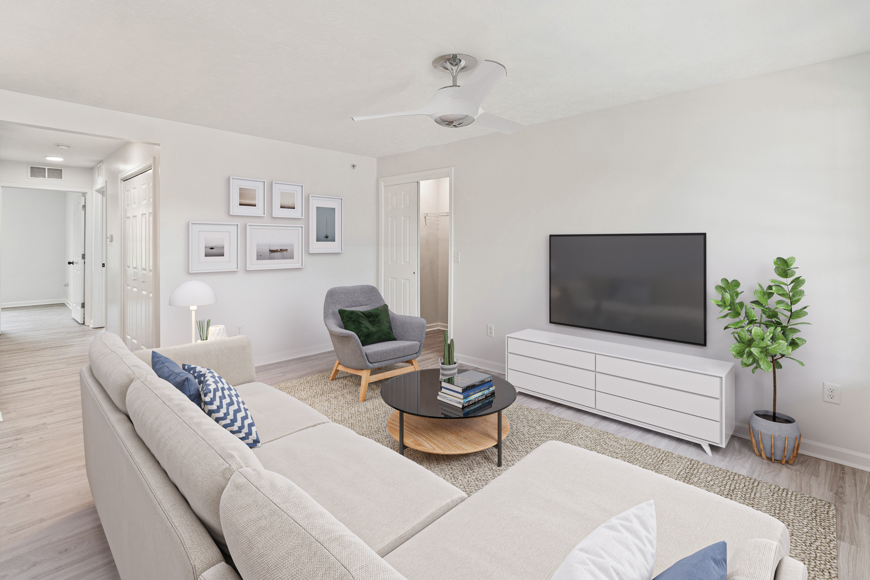
Urban properties present unique opportunities to blend style, functionality, and the vibrant spirit of city living. With ever-evolving design trends, decorating urban spaces has become an exciting endeavor. In this article, we will explore some of the top decoration trends that can transform urban properties into stylish and inviting havens.

In the ever-evolving world of real estate, staying ahead of the curve is essential to capture the attention of potential buyers and make a lasting impression. One technology that has revolutionized the way properties are showcased is aerial drone photography. With their ability to capture stunning, high-resolution images and videos from unique perspectives, drones have become a game-changer for the industry. Let's explore the potential of aerial drone photography and how it has transformed the real estate landscape.

When it comes to showcasing interior spaces, having high-quality photographs is crucial. Professional images not only capture the essence and beauty of a property but also serve as a canvas for the transformative power of virtual staging. In this article, we will explore some of the best cameras available for shooting interiors, enabling you to elevate your photography game and create visually captivating images that seamlessly blend with virtual staging.

When it comes to real estate listings, the outdoor area plays a crucial role in making a lasting impression on potential buyers. Enhancing outdoor spaces not only adds value to a property but also creates an inviting and appealing atmosphere. In this article, we will explore some effective strategies to elevate outdoor areas and make your real estate listings stand out.


Becoming a successful real estate agent requires more than just knowledge and skills. It requires cultivating certain habits and adopting a mindset that sets you apart from the competition. In this article, we will explore the most relevant habits of highly successful real estate agents, providing you with valuable insights on how to thrive in the industry.

In today's competitive real estate market, staying ahead of the curve is crucial. One innovative tool that has revolutionized the industry is virtual rendering services, particularly for front elevations. This advanced technology has proven to be a game-changer, offering numerous benefits for the real estate business. In this article, we will explore the advantages of virtual rendering services and how they contribute to the success of the real estate industry.
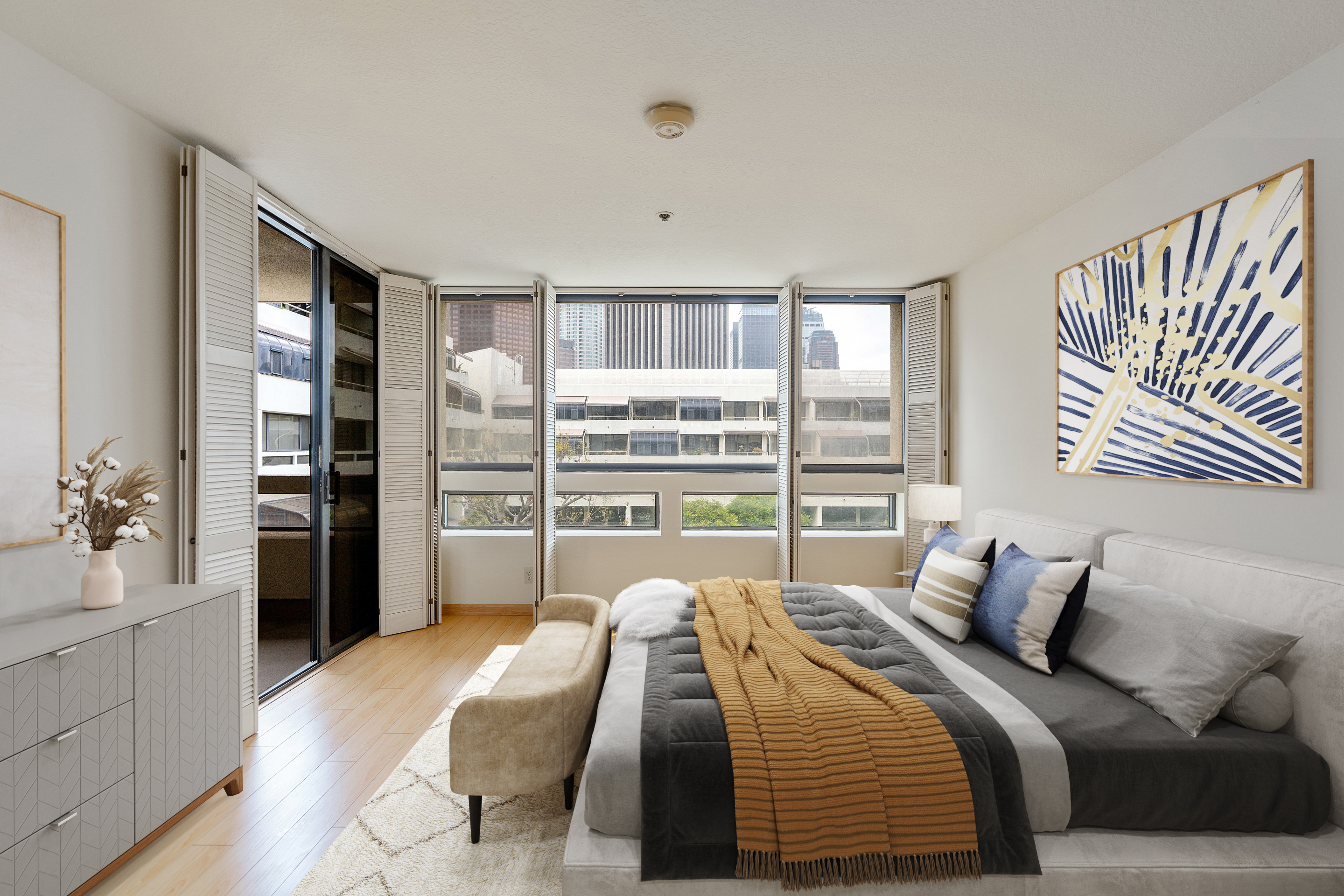
When it comes to selling a property, a well-crafted and visually appealing real estate listings presentation can make all the difference. A professional and comprehensive approach can captivate potential buyers and increase the chances of a successful sale. In this article, we provide a detailed checklist to help real estate professionals create compelling listings presentations while ensuring adherence to copyright guidelines.
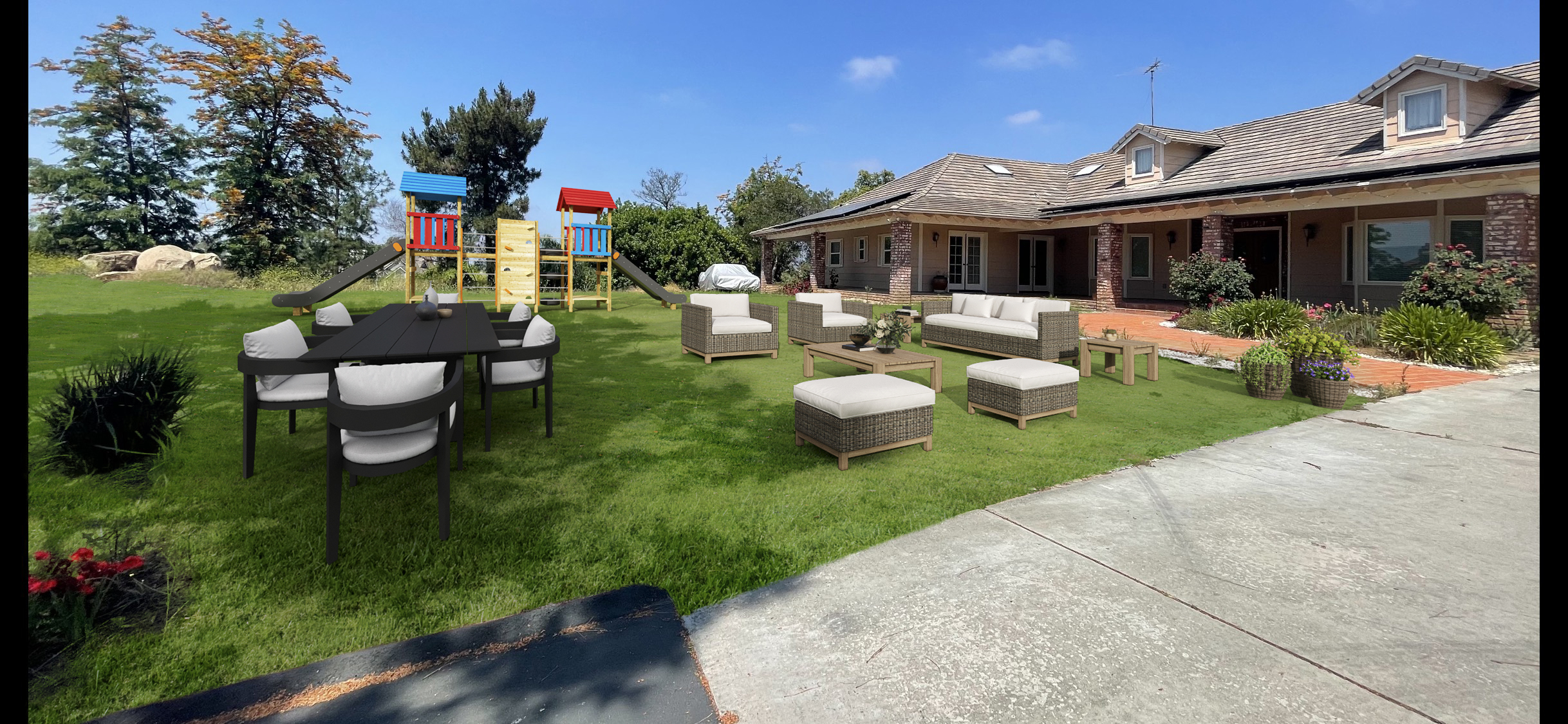
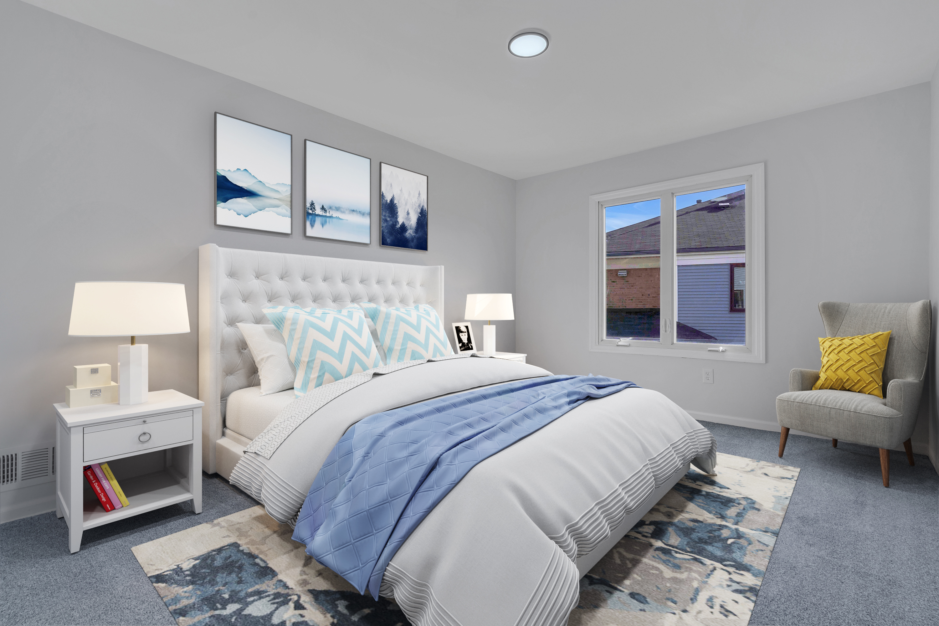
For real estate professionals, generating a steady stream of listings is essential for business growth. While cold calling has long been a popular approach, there are alternative strategies to attract listings without the need for traditional cold calling. In this article, we'll explore effective methods to expand your listing inventory and increase your chances of success without relying on cold calling.
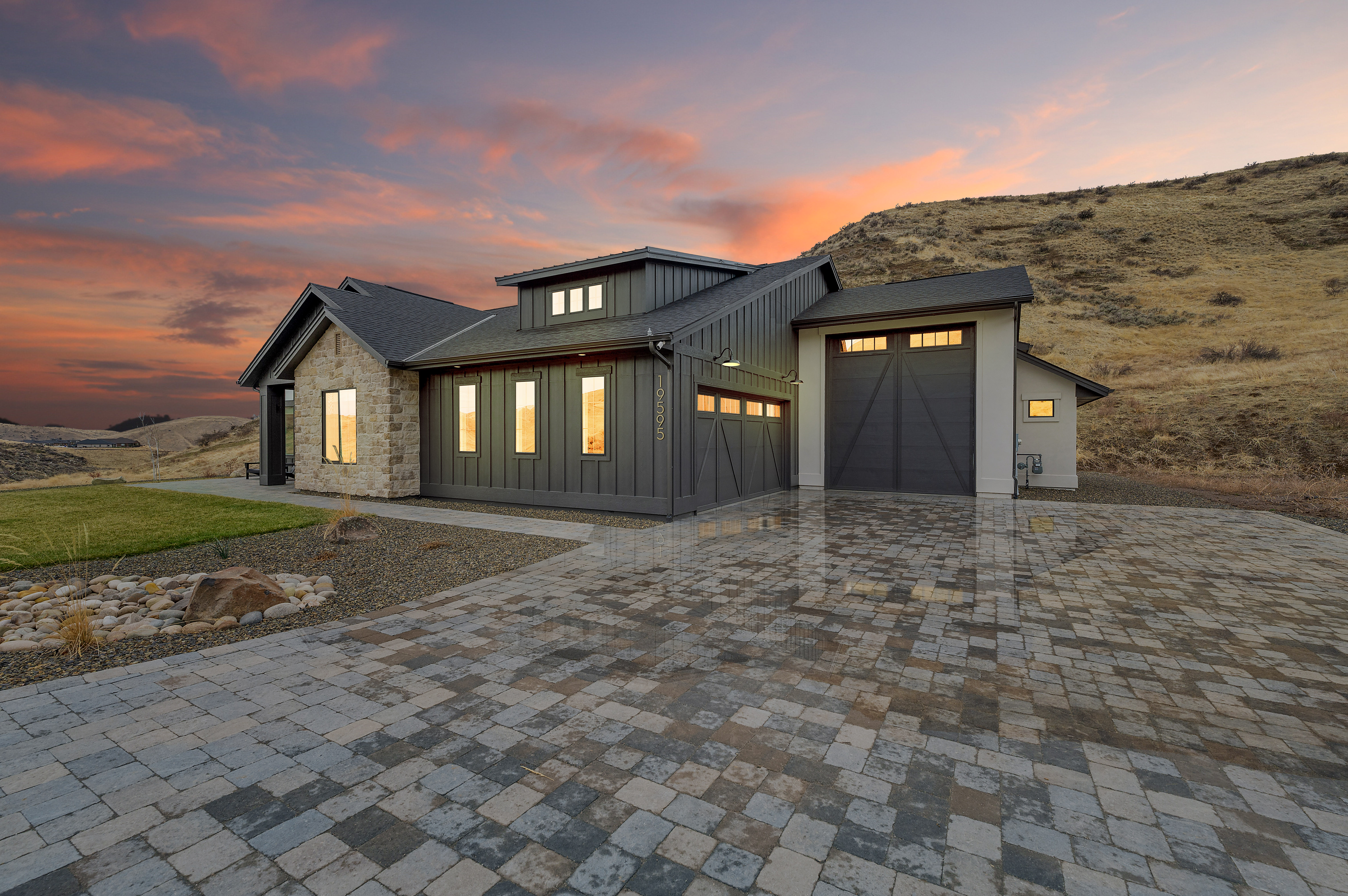
In the competitive world of real estate, it's crucial to make your listings stand out and capture the attention of potential buyers. One effective way to do this is by utilizing virtual twilight services, which offer a unique and visually appealing perspective of the property's exterior. In this article, we will explore the benefits of using virtual twilight services and highlight the importance of showcasing the exterior in a whole new light.
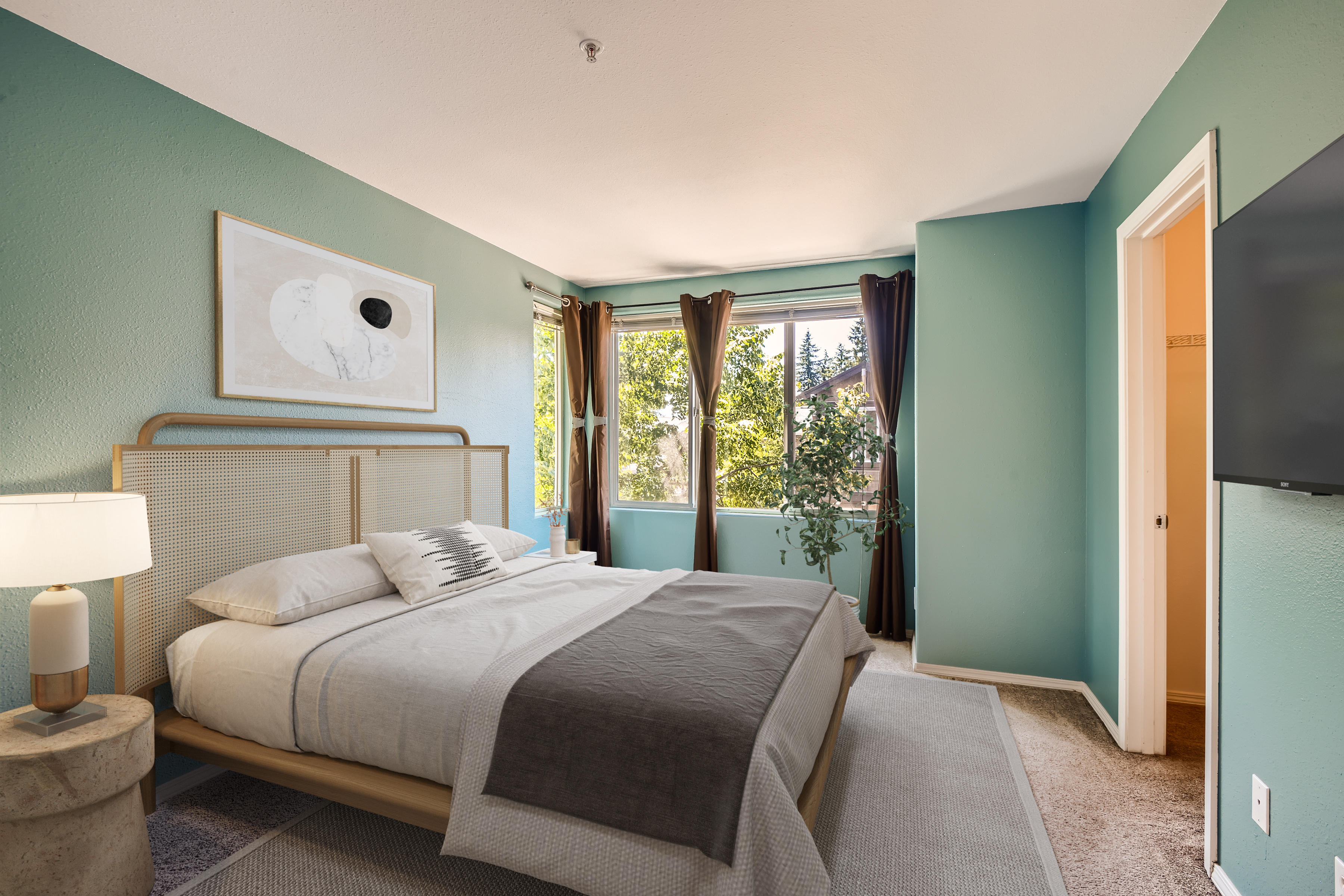
In the competitive world of real estate, generating quality leads is essential for a successful business. While there are various strategies to attract leads, it's crucial to focus on trusted methods that yield long-term results. In this article, we'll explore proven and reliable ways to generate real estate leads that can help you unlock success in the market.
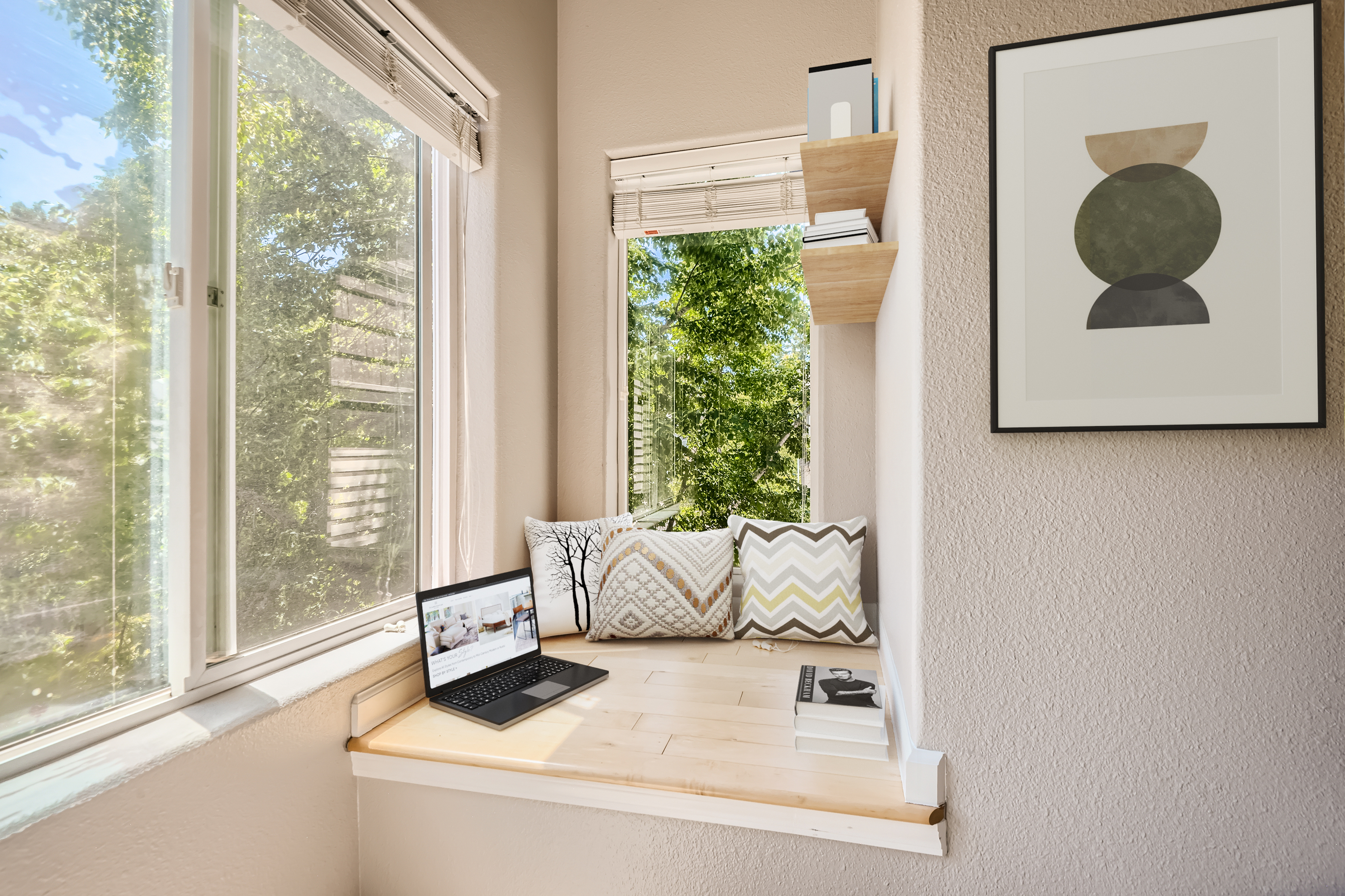
In today's digital age, social media has become an essential tool for real estate professionals to connect with potential buyers and sellers. However, effective social media posting requires a strategic approach to engage your audience and build a strong online presence. In this article, we will explore the dos and don'ts of real estate social media posting, providing valuable insights to help you maximize your impact and achieve success.
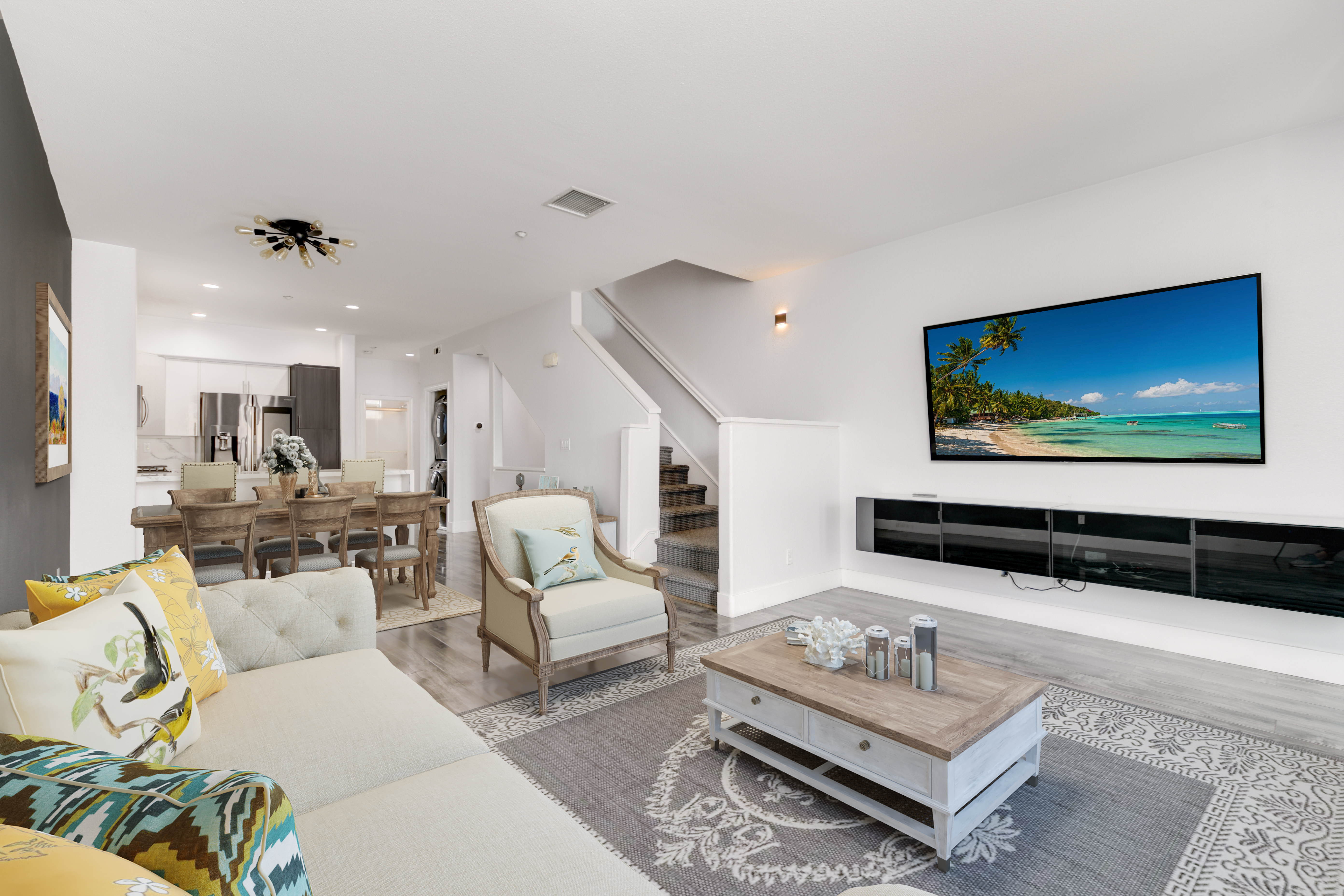
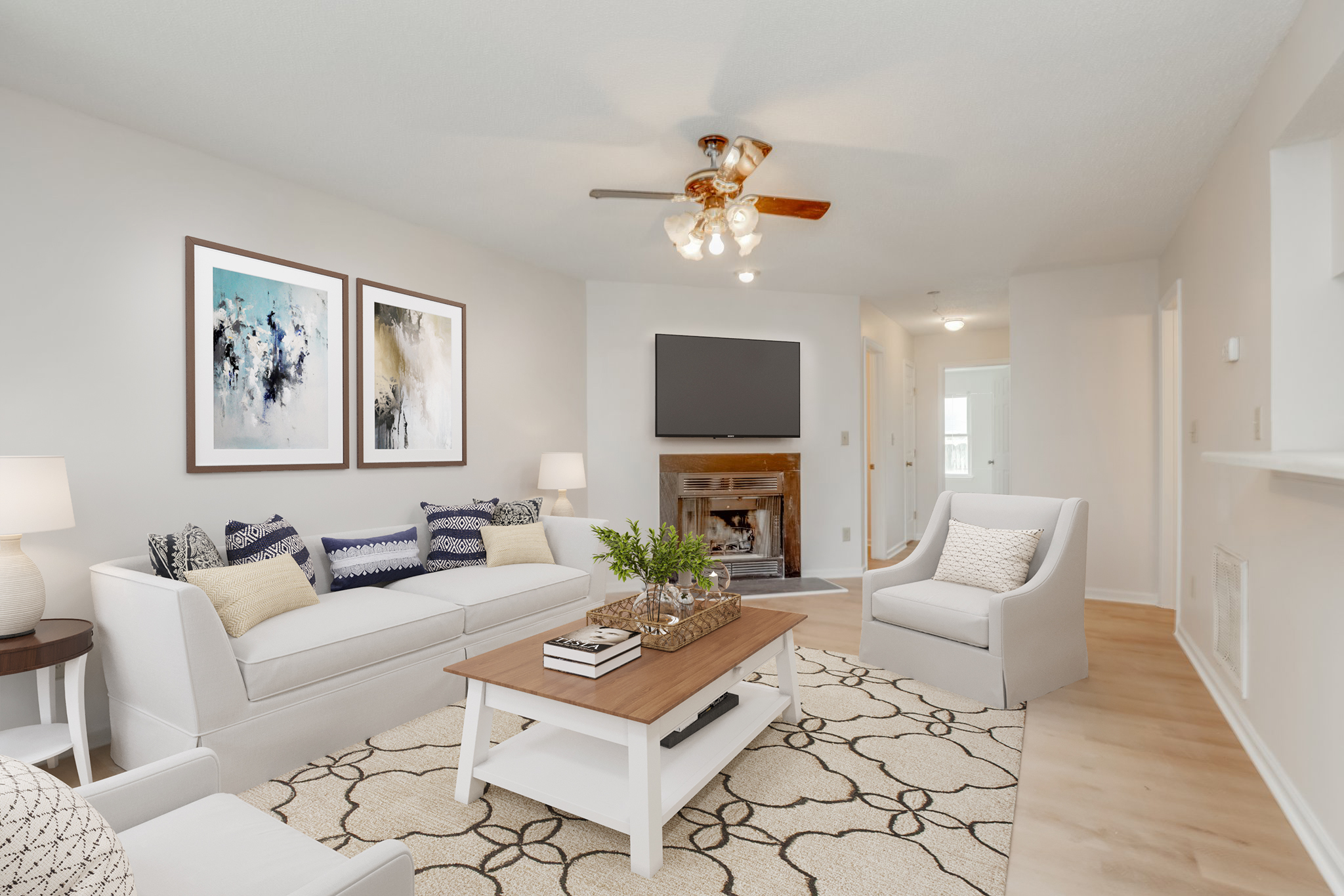
Selling a property that requires renovation can present unique challenges and opportunities for sellers. In this article, we will explore effective strategies for selling such properties and highlight the benefits of using virtual renovation services compared to traditional renovations. Let's delve into it!
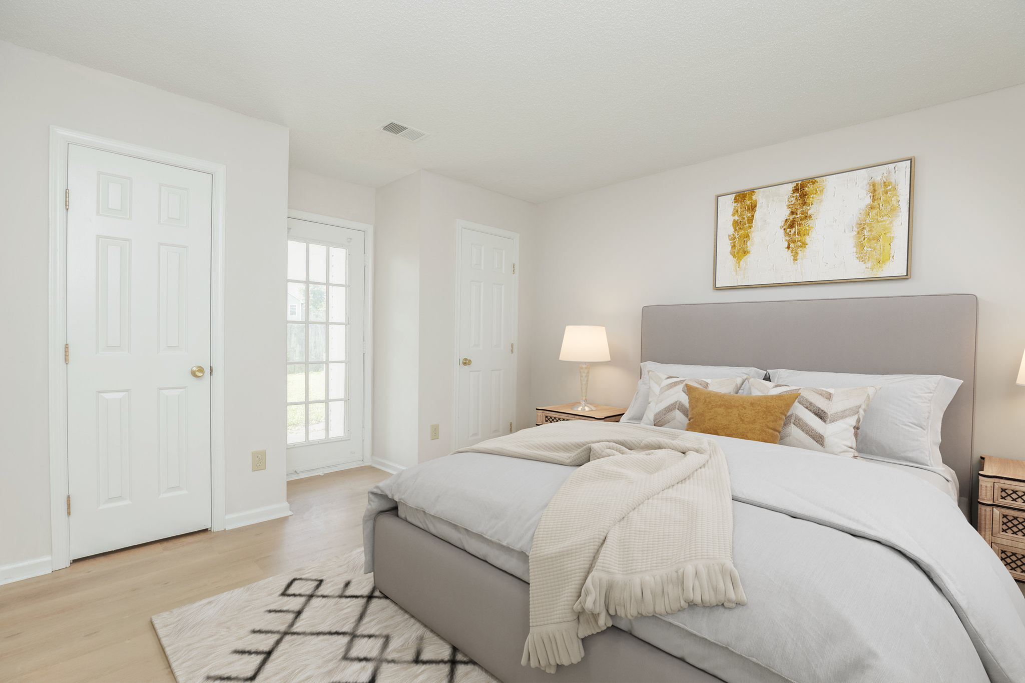
Having a property that has been on the market for an extended period can be frustrating for sellers. However, with the right strategies and a fresh approach, it's possible to generate renewed interest and attract potential buyers. In this article, we will explore effective methods to revitalize a long-time sitting property and breathe new life into its listing. Let's get started!
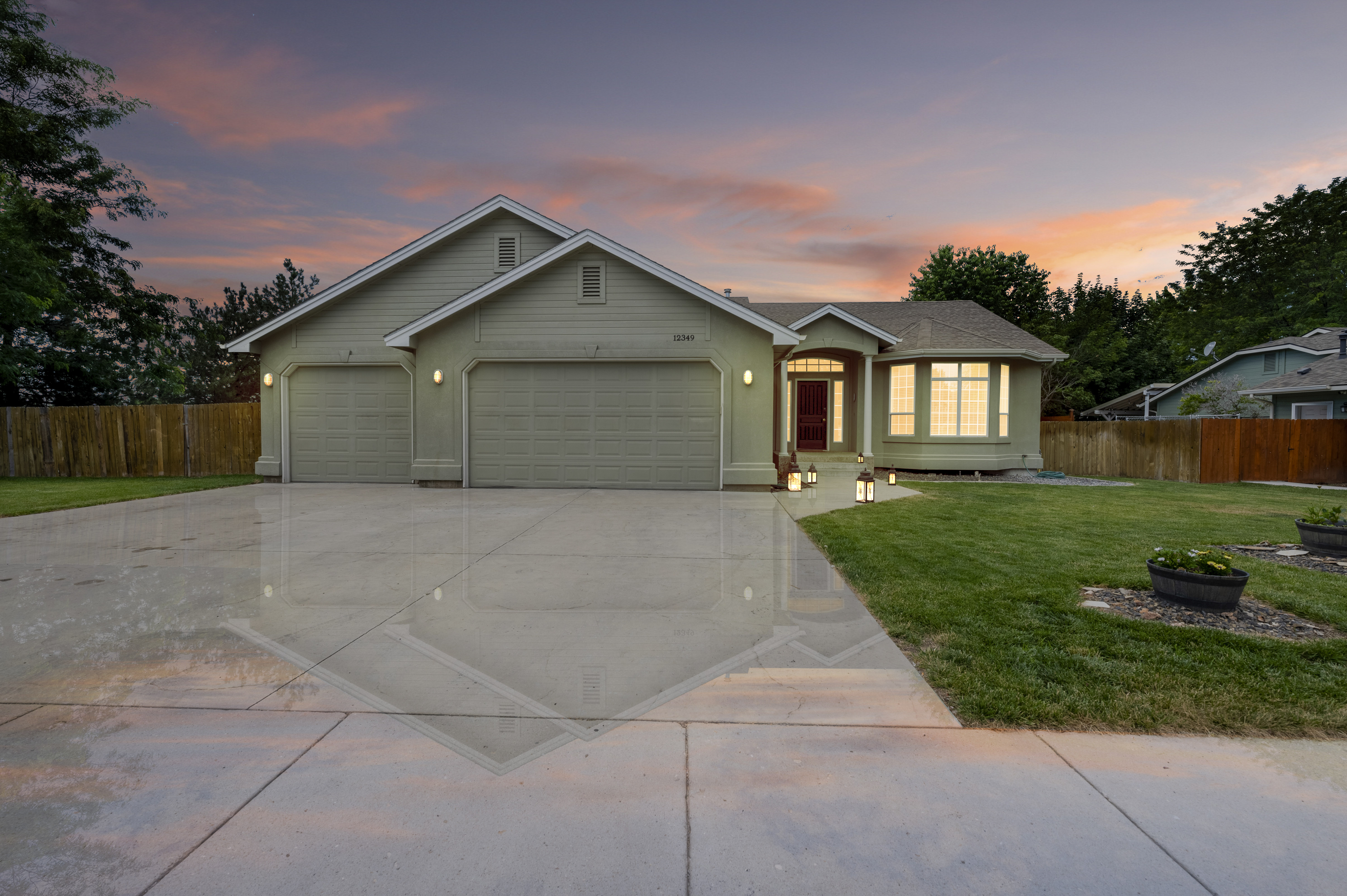
When it comes to photographing a house, bad weather can be a major obstacle. Rain, fog, or gloomy skies can make it challenging to showcase the property's true potential. However, with the advancements in virtual solutions and professional services, capturing stunning images of a house even in adverse weather conditions has become possible. In this article, we will explore techniques to shoot a house in bad weather and highlight the benefits of virtual twilight services, virtual true blue sky services, and landscaping services.
In the world of photography, capturing the perfect shot often requires meticulous planning and attention to detail. However, despite our best efforts, undesired objects can sometimes find their way into our images. In such cases, the traditional approach would involve retaking the shot or opting for expensive staging services. Thankfully, virtual item removal services have emerged as a cost-effective alternative. In this article, we will explore the benefits of using virtual item removal services to eliminate unwanted items from images while highlighting their affordability in comparison to virtual staging.
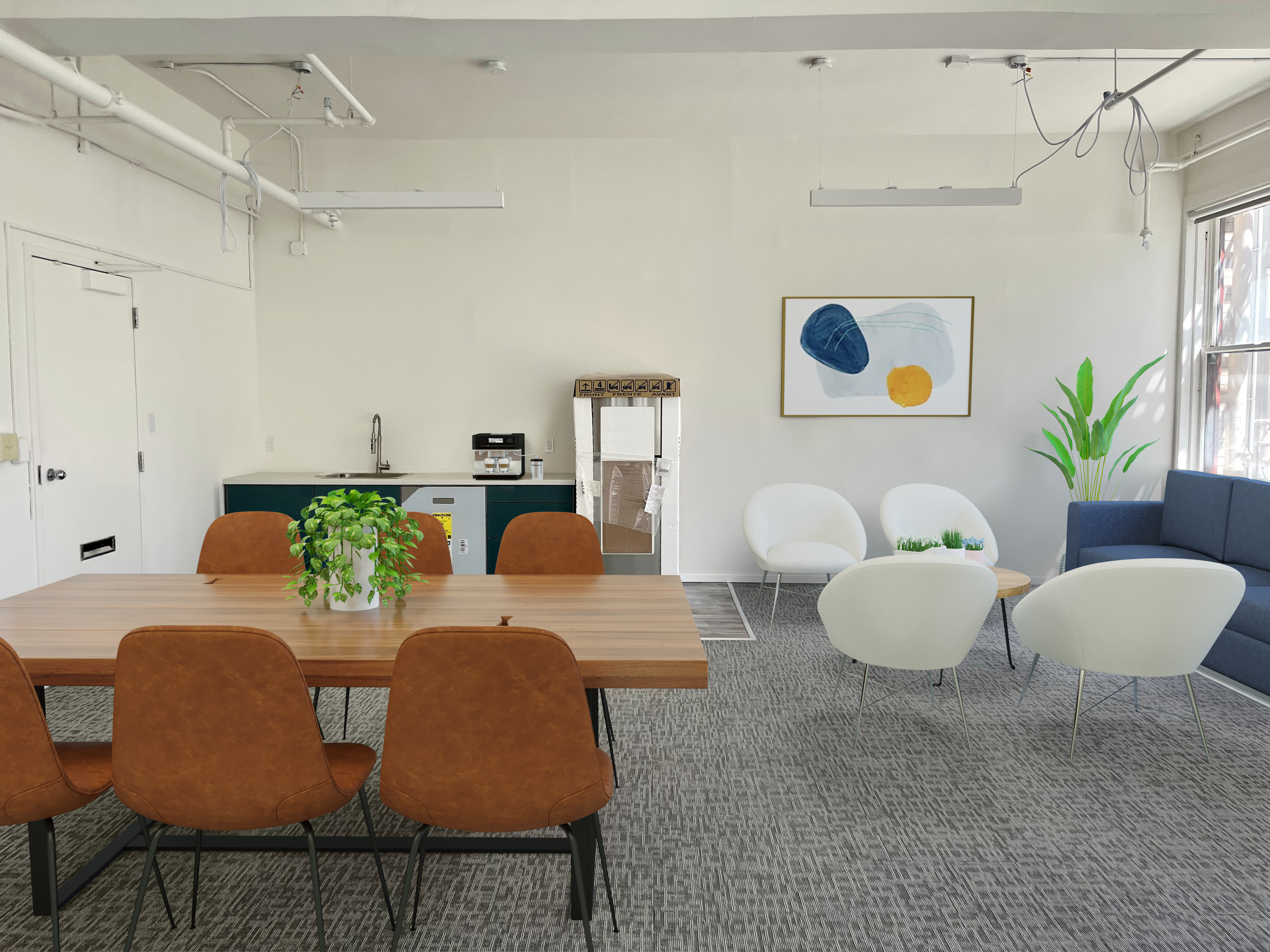
In the dynamic world of real estate, where first impressions matter, virtual staging has emerged as a game-changer. While traditionally associated with residential properties, virtual staging is now making its mark in the realm of commercial real estate. By harnessing the capabilities of technology, virtual staging offers an array of benefits that enable potential buyers or renters to envision the diverse possibilities and untapped potential of commercial properties. In this article, we explore the advantages of virtual staging in showcasing different options and unlocking the full value of commercial spaces.
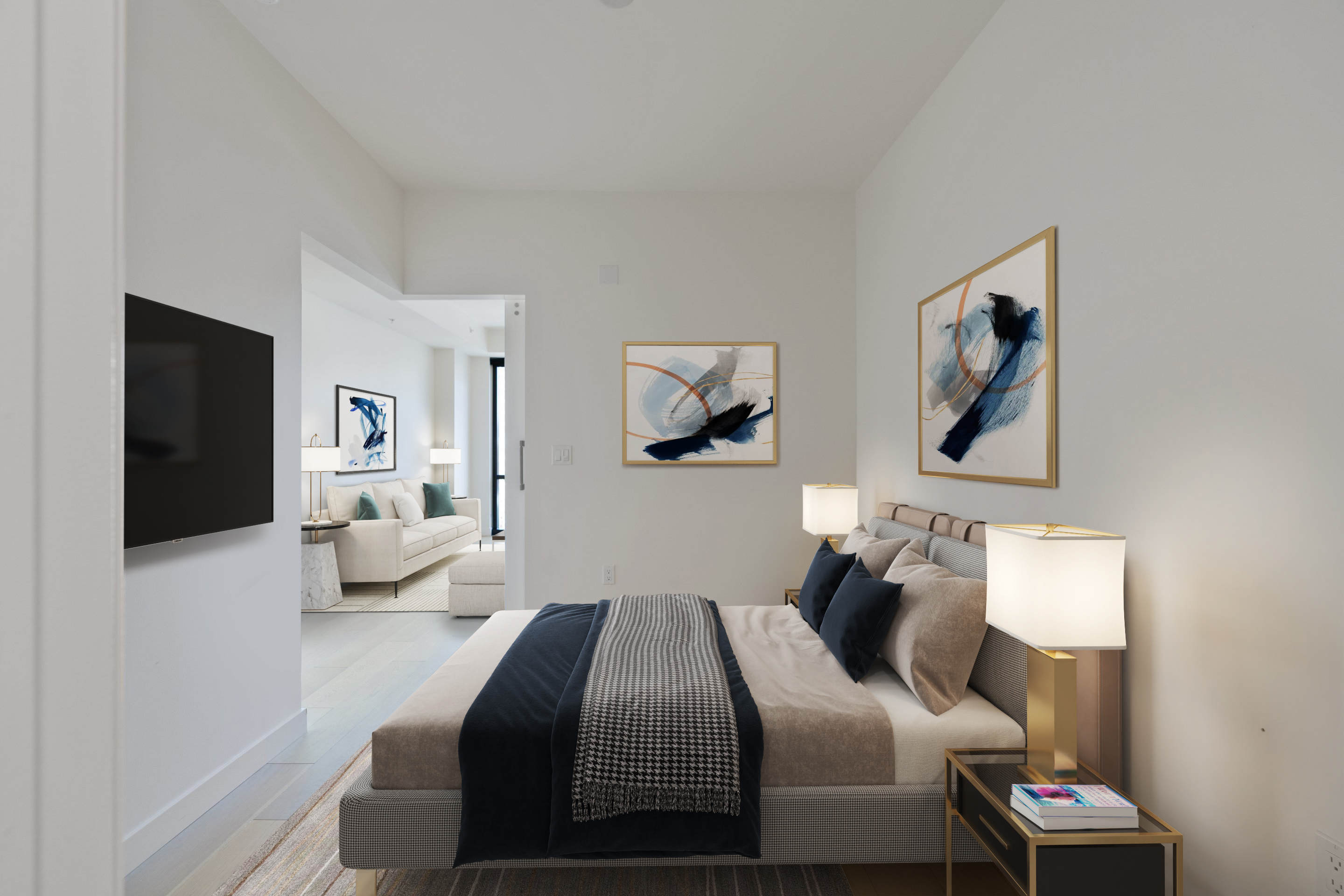
The master bedroom serves as a sanctuary, a space where you can unwind, recharge, and indulge in much-needed rest. When it comes to decorating this personal haven, it's important to strike a balance between style, functionality, and comfort. To help you create a dreamy master bedroom that exudes relaxation, here are some dos and don'ts to keep in mind:
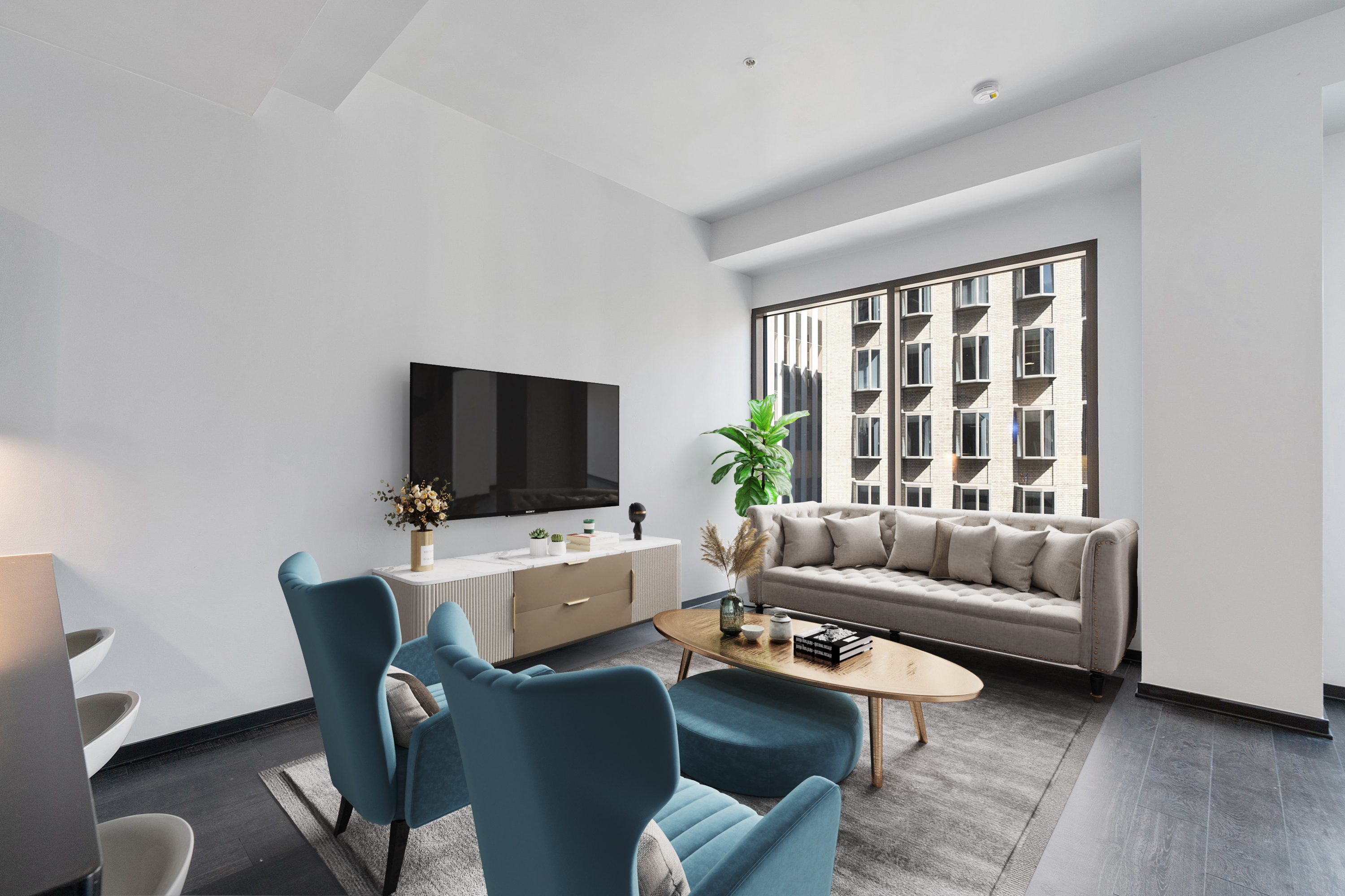
The living room serves as the heart of any home, a space where relaxation, entertainment, and connection come together. When it comes to decorating this pivotal room, striking the right balance can be a challenge. To help you create a stylish and inviting living room that reflects your personality and meets your needs, we present a guide to the dos and don'ts of living room decoration. And in the digital age, we'll also explore the benefits of virtual staging, a valuable tool that can transform your vision into a stunning reality.
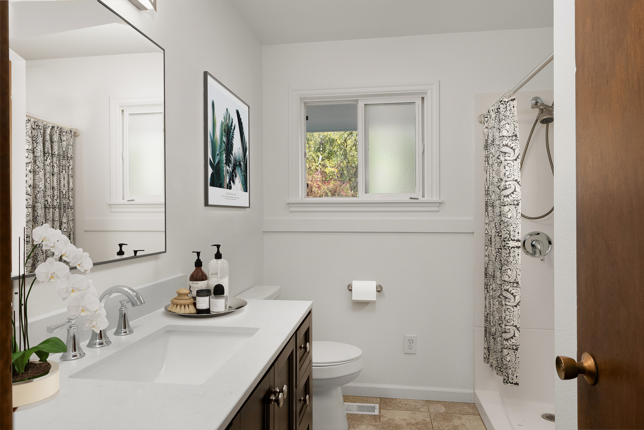
When it comes to home décor, the bathroom often receives less attention than other rooms. However, with the right design choices, it has the potential to become a serene oasis and a showcase of personal style. In this article, we will explore the dos and don'ts of decorating bathrooms, ensuring that you create a space that is both functional and visually appealing. Additionally, we will delve into the advantages of virtual staging and how it can elevate your bathroom design endeavors.
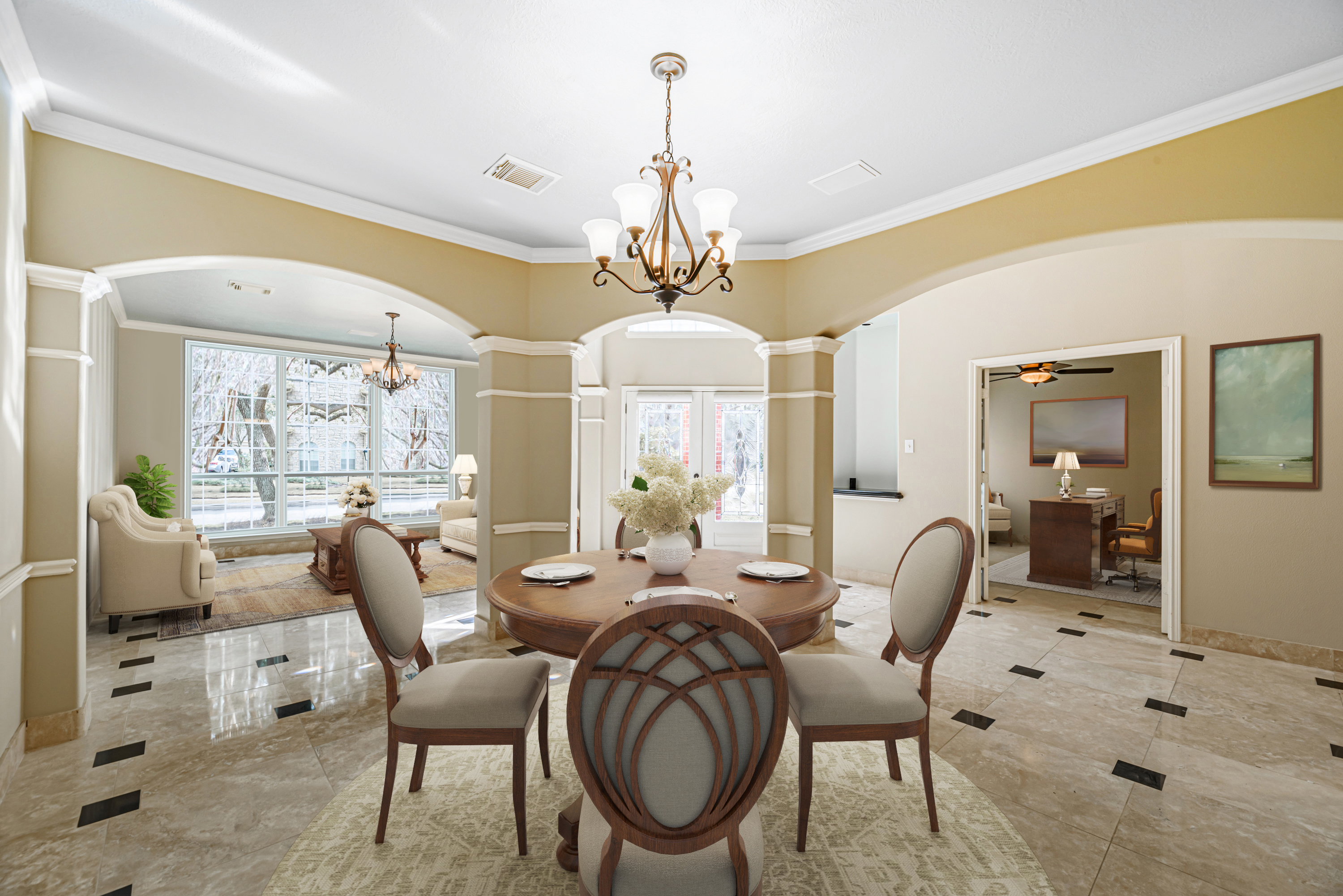
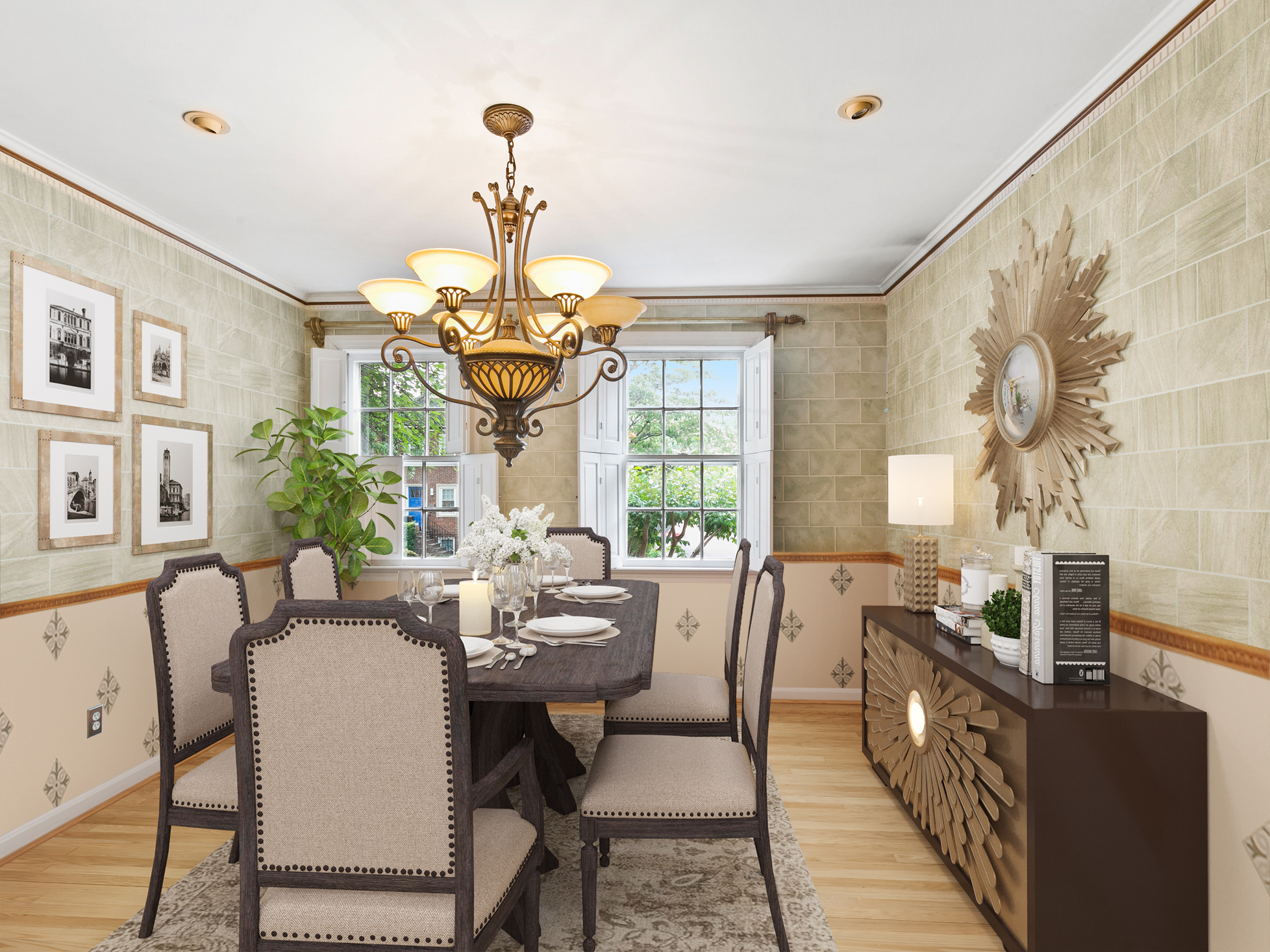
The dining room is more than just a place to enjoy meals; it's a space where cherished memories are made. Whether hosting formal dinner parties or casual family gatherings, the design of your dining room sets the stage for these special moments. In this article, we will explore the dos and don'ts of decorating dining rooms, providing valuable insights to help you create a stunning and inviting space. Additionally, we will highlight the benefits of virtual staging and how it can enhance your dining room design process.
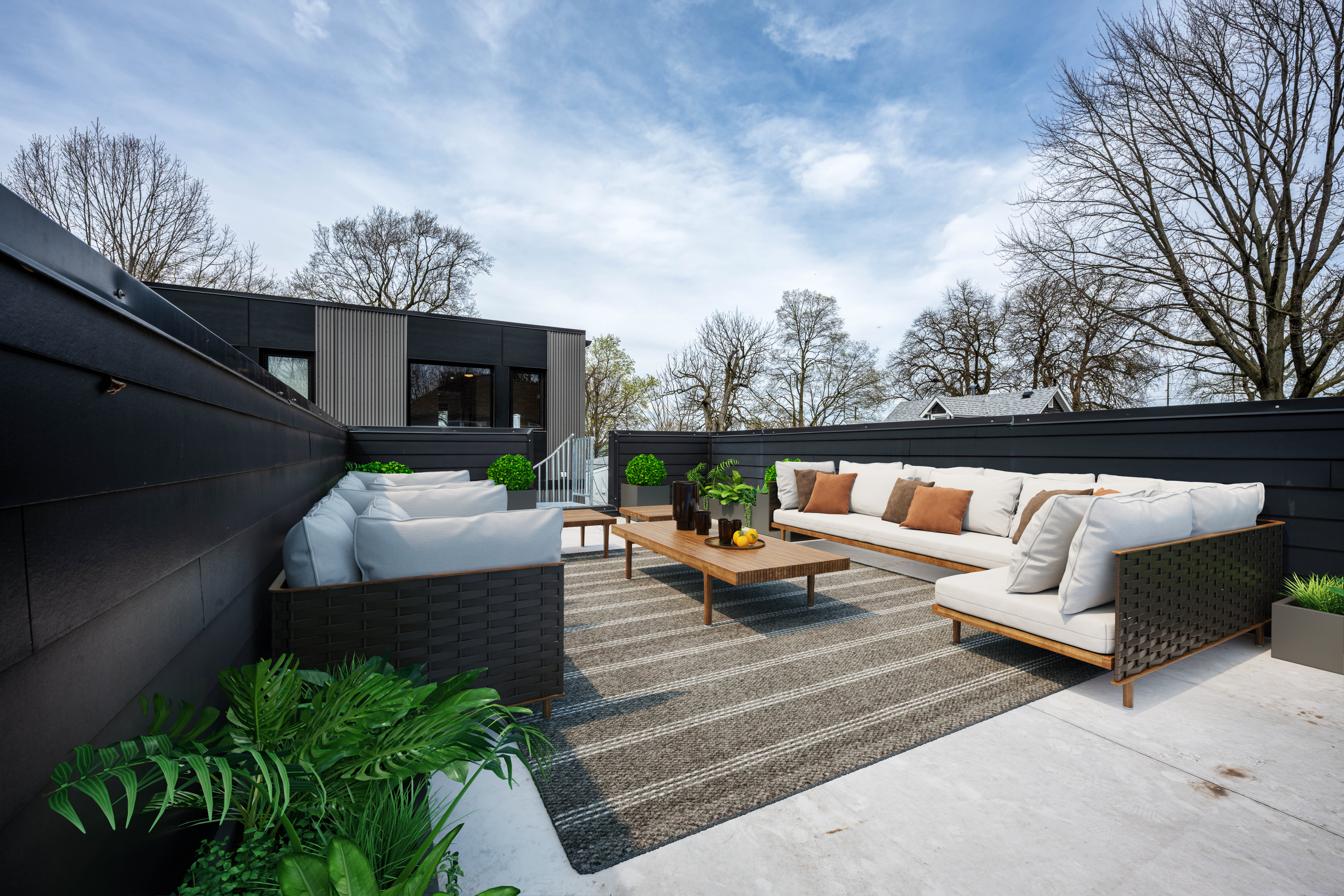
A well-designed patio can transform your outdoor space into a haven of relaxation and entertainment. Whether you have a small balcony or a spacious backyard, the patio offers an opportunity to connect with nature and enjoy the great outdoors. In this article, we will explore the dos and don'ts of decorating patios, providing valuable tips to help you create an inviting and stylish outdoor oasis. Additionally, we will delve into the benefits of virtual staging and how it can enhance your patio design process.
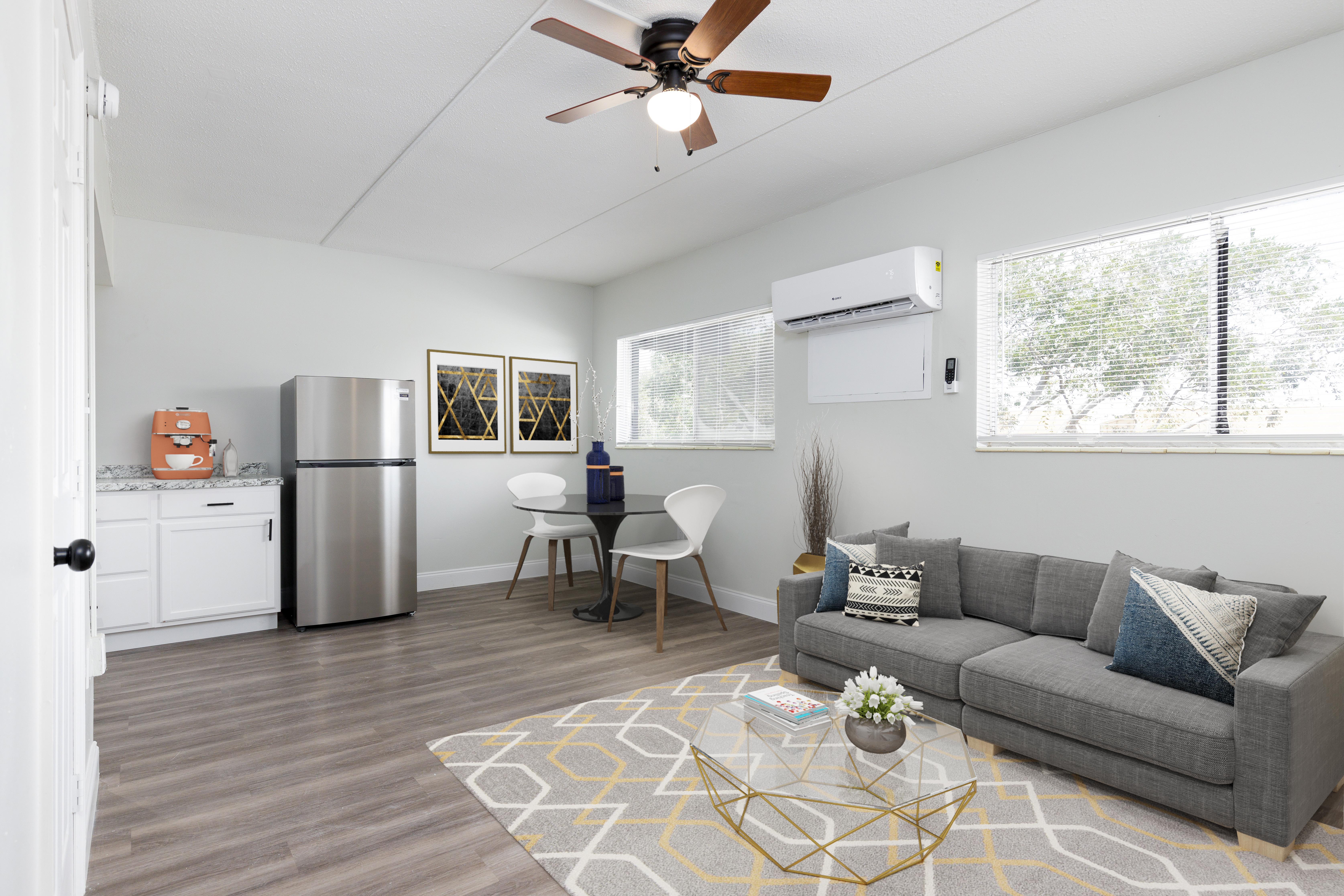
When it comes to capturing the essence and appeal of a house for real estate purposes, lighting plays a crucial role. Proper lighting can transform a space, enhancing its features, creating an inviting atmosphere, and making a lasting impression on potential buyers. In this article, we will delve into the importance of lighting in real estate photography and explore how it can significantly impact the quality and effectiveness of property visuals.

In today's digital age, social media has become an integral part of our lives, connecting people and bridging gaps. For the real estate industry, social media offers a powerful platform to reach a vast audience, build brand awareness, and drive business growth. In this SEO article, we will explore the importance of using social media in the real estate business and how it can be a game-changer for your success.

In the realm of real estate, curb appeal plays a crucial role in attracting potential buyers and creating a lasting first impression. As the world of gardening evolves, new trends are emerging that can transform outdoor spaces into captivating landscapes. In this SEO article, we will explore the latest gardening trends for the real estate industry and highlight the benefits of virtual landscape services in bringing these trends to life.

In the world of commercial real estate, the aesthetics and ambiance of a space play a significant role in attracting tenants and creating a positive impression. As the industry evolves, new trends in commercial property decoration are emerging, elevating spaces to new heights. In this SEO article, we will explore the latest trends in commercial property decoration and shed light on the invaluable role of commercial virtual staging as a powerful ally in transforming these spaces.
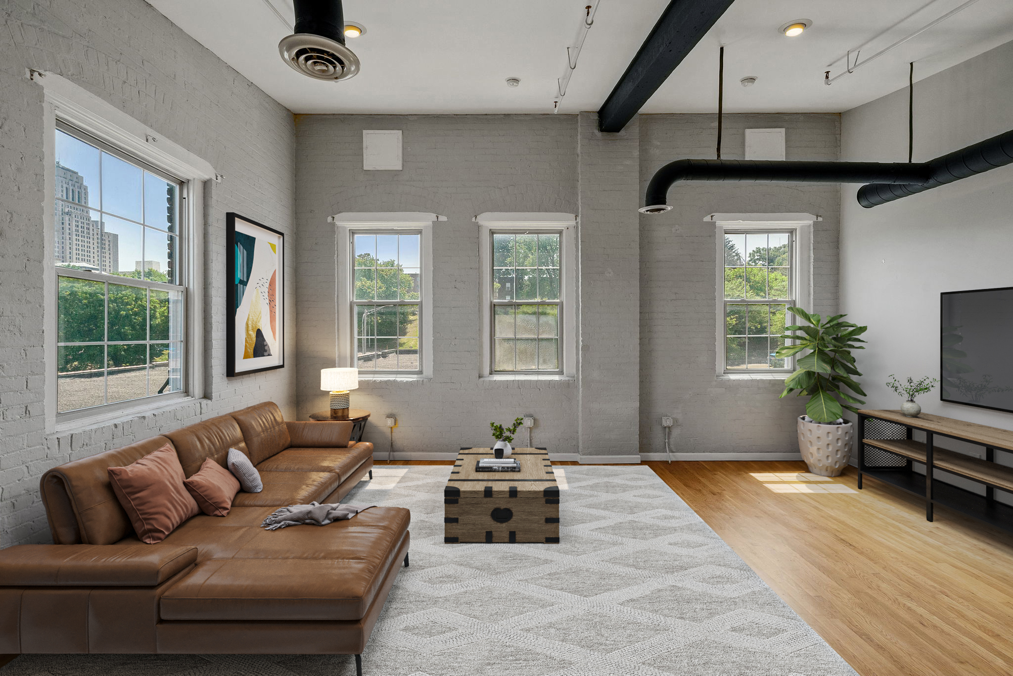
Buying a house is a significant milestone in life, representing stability, investment, and a place to call home. However, it's essential to approach this process with careful consideration to ensure a wise investment decision. In this article, we will explore key considerations when buying a house, empowering you with the knowledge needed to make an informed choice and find your dream home.
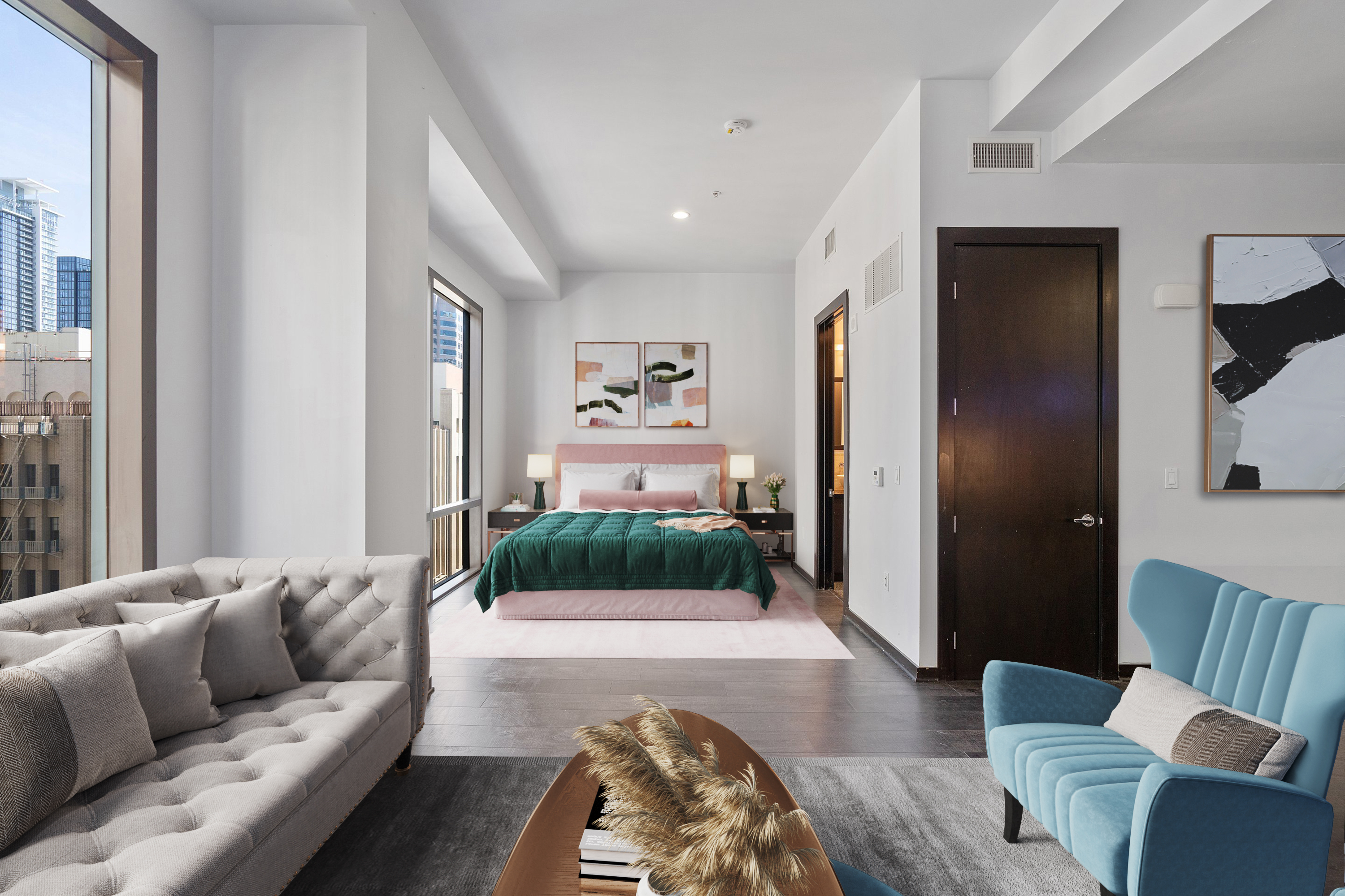
When it comes to marketing a house, presenting it in the best possible light is key to attracting potential buyers and securing a successful sale. In today's competitive real estate market, leveraging professional services can make a significant difference in how your house is perceived and marketed. In this article, we will explore the benefits of utilizing professional services, including virtual staging, listing writer services, 3D floor plans, and professional logo design, highlighting how VSH Media can elevate your marketing efforts.
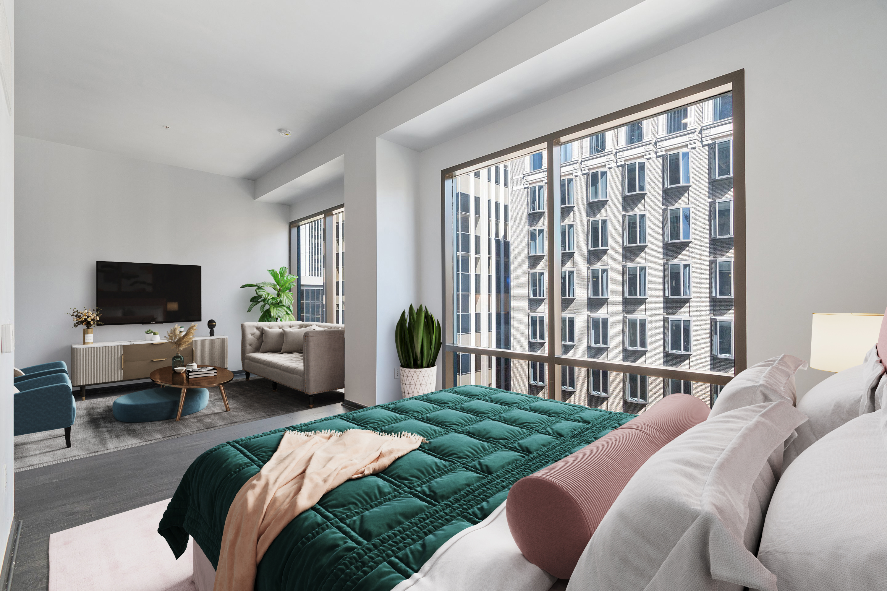
When it comes to decorating a property, plants offer a natural and vibrant touch that can transform both the interior and exterior spaces. Not only do plants add visual appeal, but they also contribute to a healthier and more welcoming environment. In this SEO article, we will explore the benefits of using different types of plants for interior and exterior décor, helping you create an inviting atmosphere that attracts potential buyers and enhances the overall value of your property.
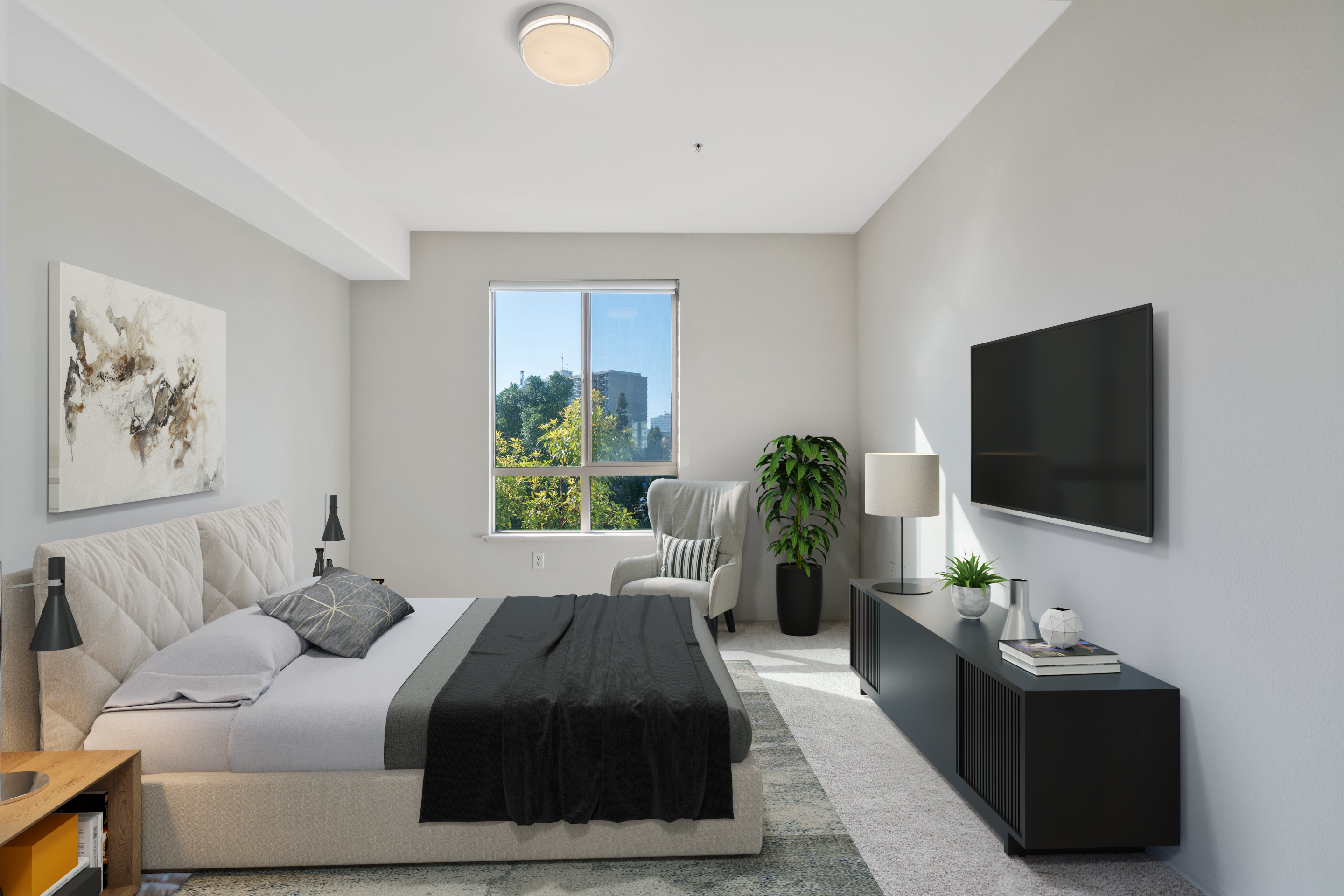
In today's digital age, the internet has revolutionized the way we search for discounts and benefits in various industries, including real estate services. By harnessing the power of online deals and promotions, you can unlock significant savings and added value for your real estate ventures. In this article, we will explore the benefits of searching for online deals and promos, highlighting the exclusive Free Image Friday deal offered by VSH Media for new customers seeking virtual staging services.
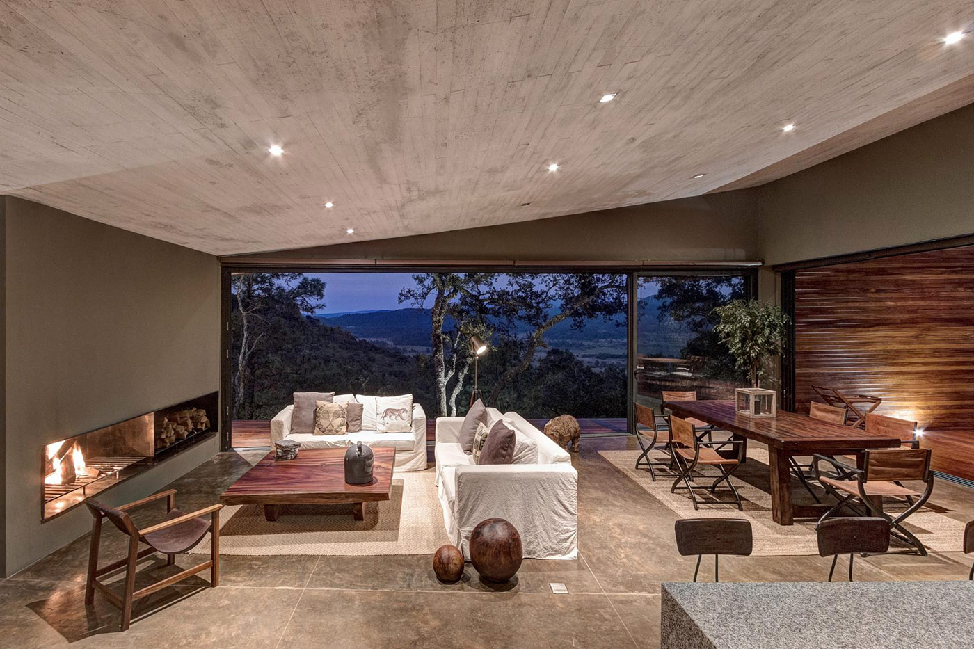
Weekend houses serve as cherished retreats, providing a sanctuary to unwind and recharge away from the hustle and bustle of daily life. Decorating these special spaces requires thoughtful consideration to evoke a serene and welcoming ambiance. In this article, we will explore valuable decoration tips for weekend houses, highlighting the innovative use of virtual staging as a versatile tool to bring your vision to life.

The world of real estate has always been a dynamic and ever-evolving space, constantly presenting new opportunities for investors, homeowners, and entrepreneurs alike. Whether you're looking to buy your dream home, invest in a property, or sell your current one, the real estate market offers endless possibilities. And now, with the revolutionary concept of virtual staging, the game has been taken up a notch, offering an exciting and innovative way to showcase properties like never before.
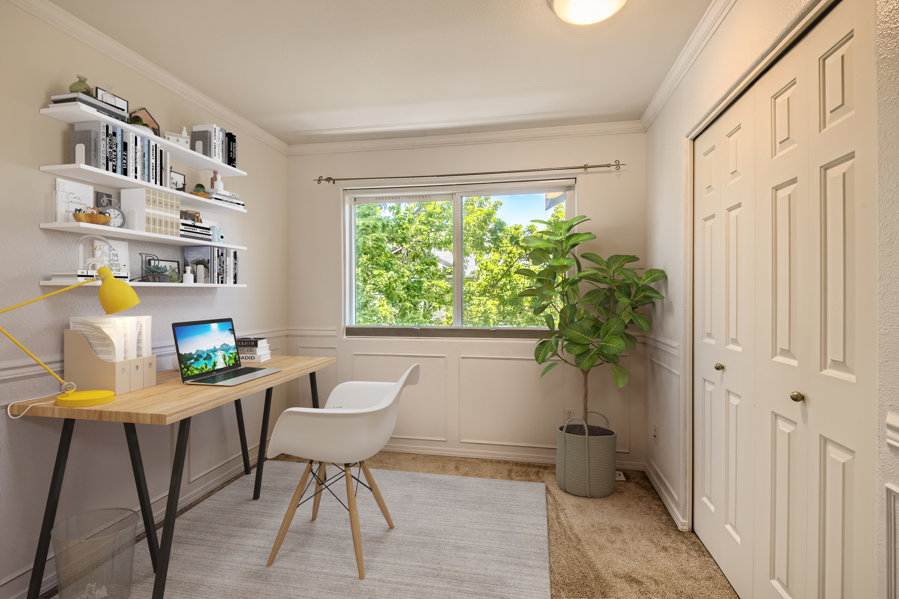
As more people embrace the flexibility of remote work, the importance of having a well-designed home office has become paramount. A thoughtfully decorated workspace not only enhances productivity but also creates a space where inspiration and creativity can thrive. In this article, we will explore decoration tips for home office rooms, highlighting the valuable role of virtual staging in visualizing and transforming your ideal workspace.
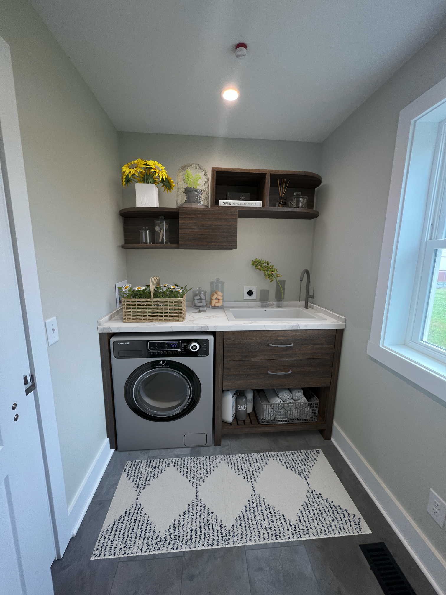
Laundry rooms, often overlooked in terms of design, play a vital role in our homes. With a little creativity and attention to detail, you can turn your laundry room into a functional and visually appealing space. In this article, we will explore decoration tips for laundry rooms, highlighting the innovative use of virtual staging as a tool to enhance the aesthetics of these often-underutilized areas for the real estate industry.
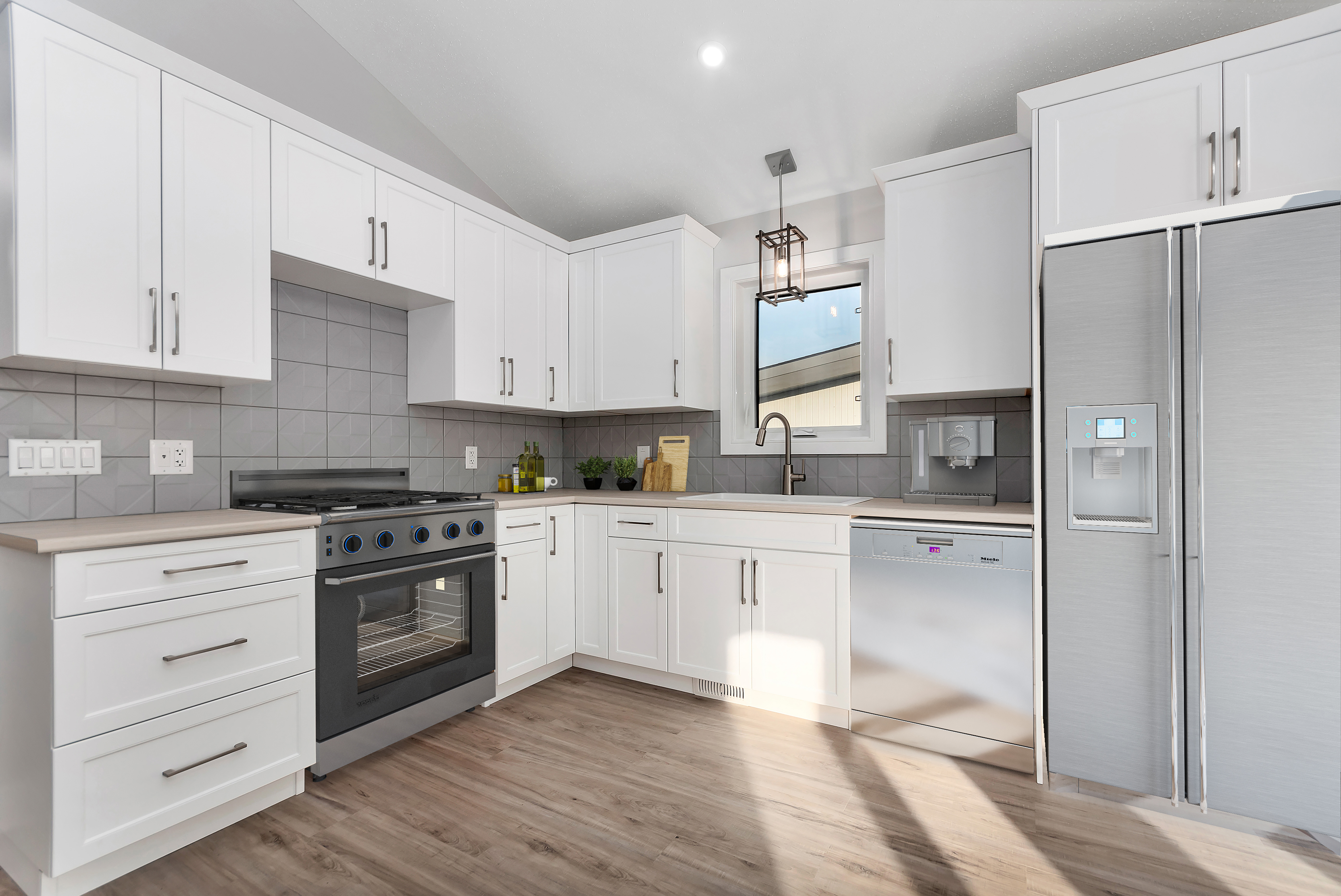
The kitchen is the heart of the home, a space where culinary creations come to life and cherished memories are made. Decorating your kitchen not only enhances its aesthetic appeal but also improves its functionality. In this article, we will explore valuable tips to decorate your kitchen, highlighting the innovative use of virtual staging as a tool to optimize images for the real estate industry.

A swimming pool can be a captivating feature that adds value and allure to a property. When selling a home with a swimming pool, it's essential to showcase this appealing amenity effectively. In this article, we will explore valuable tips for showcasing a swimming pool in the real estate industry, highlighting the innovative use of virtual pool services as an alternative to give potential buyers a glimpse into their future dream house.

A swimming pool can be a captivating feature that adds value and allure to a property. When selling a home with a swimming pool, it's essential to showcase this appealing amenity effectively. In this article, we will explore valuable tips for showcasing a swimming pool in the real estate industry, highlighting the innovative use of virtual pool services as an alternative to give potential buyers a glimpse into their future dream house.

A swimming pool can be a captivating feature that adds value and allure to a property. When selling a home with a swimming pool, it's essential to showcase this appealing amenity effectively. In this article, we will explore valuable tips for showcasing a swimming pool in the real estate industry, highlighting the innovative use of virtual pool services as an alternative to give potential buyers a glimpse into their future dream house.
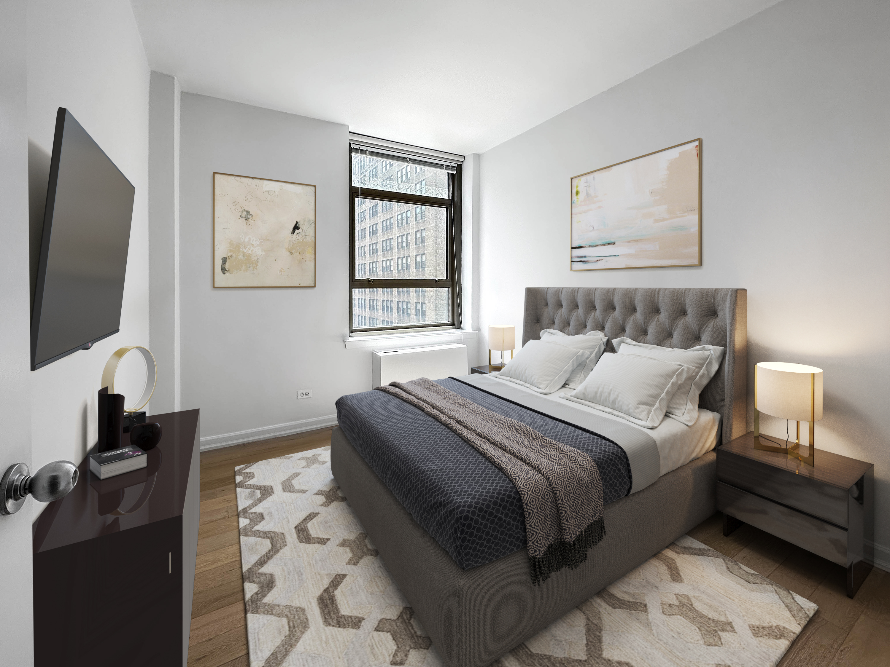
Virtual staging is a powerful tool that allows homeowners and real estate professionals to reimagine and transform rooms with existing furniture. By strategically adding extra decoration and removing undesired pieces, virtual staging can elevate the appeal of a space and cater to the specific needs and preferences of potential buyers. In this article, we will explore valuable tips for virtually staging rooms that already have furniture, providing insights into how to maximize the impact of virtual staging and create a captivating visual experience.
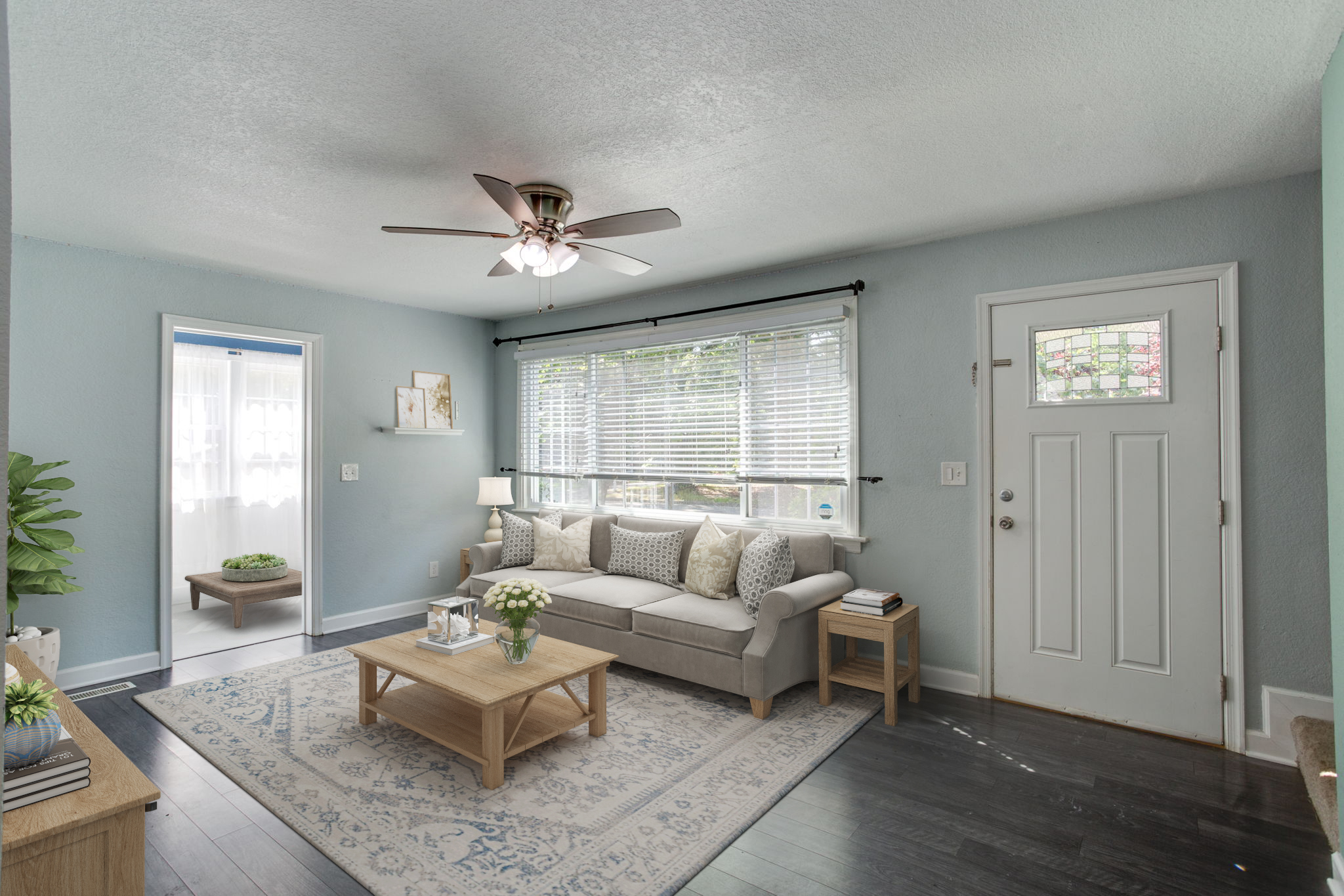
The farmhouse style has captured the hearts of many with its cozy, rustic charm and timeless appeal. Whether you live in a rural area or a bustling city, incorporating farmhouse elements into your home can create a warm and inviting atmosphere. In this article, we will explore some key tips to help you decorate with farmhouse style and infuse your space with the beauty of the countryside.
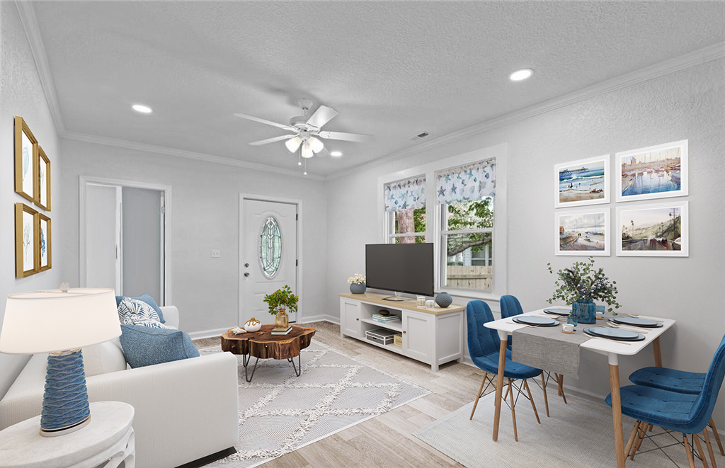
Beach houses hold a special allure with their serene coastal vibes and breathtaking views. Decorating these spaces to reflect the beauty of the beach while maintaining a sense of comfort and relaxation can be a delightful endeavor. In this article, we will explore some valuable tips for beach house decoration, and we'll also introduce the concept of virtual staging—a fantastic tool that can help you visualize and transform your beach house dreams into reality.
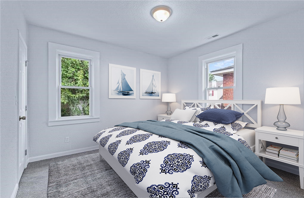
As the sun shines brighter and temperatures soar, it's the perfect time to infuse your home with the refreshing spirit of summer. Embrace the season's laid-back and vibrant ambiance with these tips to decorate your house for a summer vibe. Plus, we'll explore how virtual staging can help you envision your summer-inspired dream home with ease.
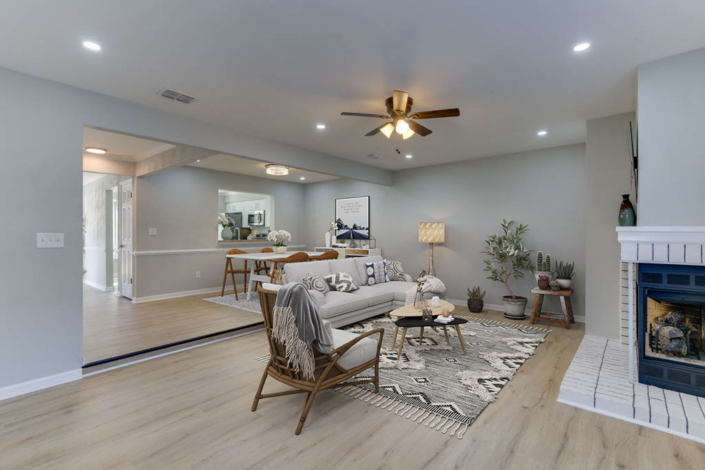
The Scandinavian style of interior design has gained immense popularity over the years, celebrated for its simplicity, functionality, and elegance. Originating from the Nordic countries, this design philosophy has taken the world by storm with its emphasis on clean lines, natural elements, and a neutral color palette. In recent times, virtual staging has emerged as a revolutionary tool to effortlessly incorporate Scandinavian aesthetics into any space. In this article, we will explore the key principles of Scandinavian decor and how virtual staging can elevate your home to a whole new level.

Virtual staging has become a powerful tool for transforming empty spaces into visually stunning and inviting homes. When it comes to virtual staging, selecting the right furniture style is paramount to creating an atmosphere that resonates with potential buyers or renters. While this task may seem daunting, partnering with experienced designers can make all the difference. In this article, we will explore essential tips to help you choose the best furniture style for virtual staging and the invaluable role of professional virtual staging with experienced designers.
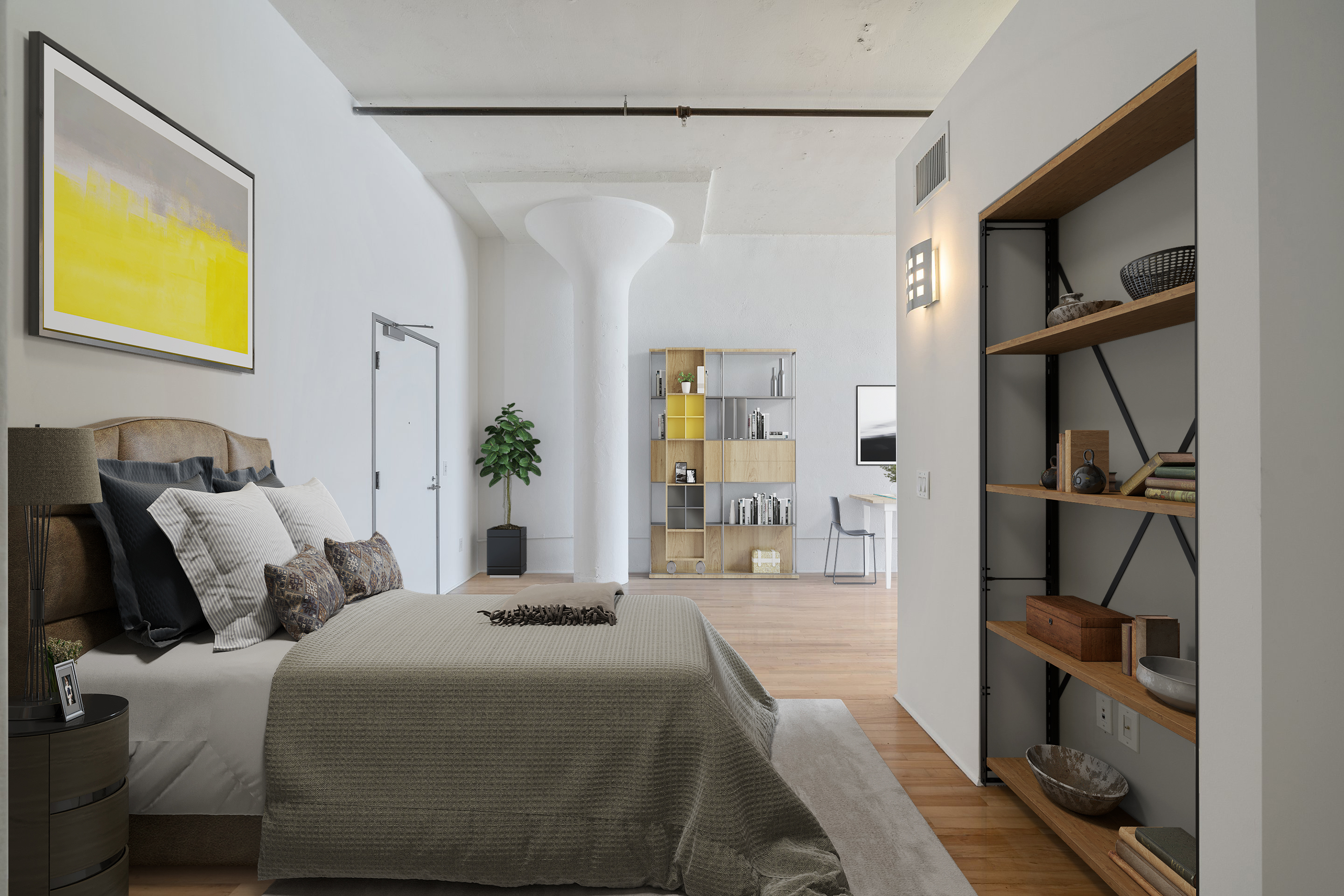
Decorating your home according to the seasons not only adds a fresh and vibrant touch to your living spaces but also enhances the overall ambiance. Each season brings its unique colors, textures, and themes that can be beautifully incorporated into your interior design. In this article, we will explore some delightful decoration tips for each season and how virtual staging can be a valuable tool to assist you in achieving your desired look effortlessly.
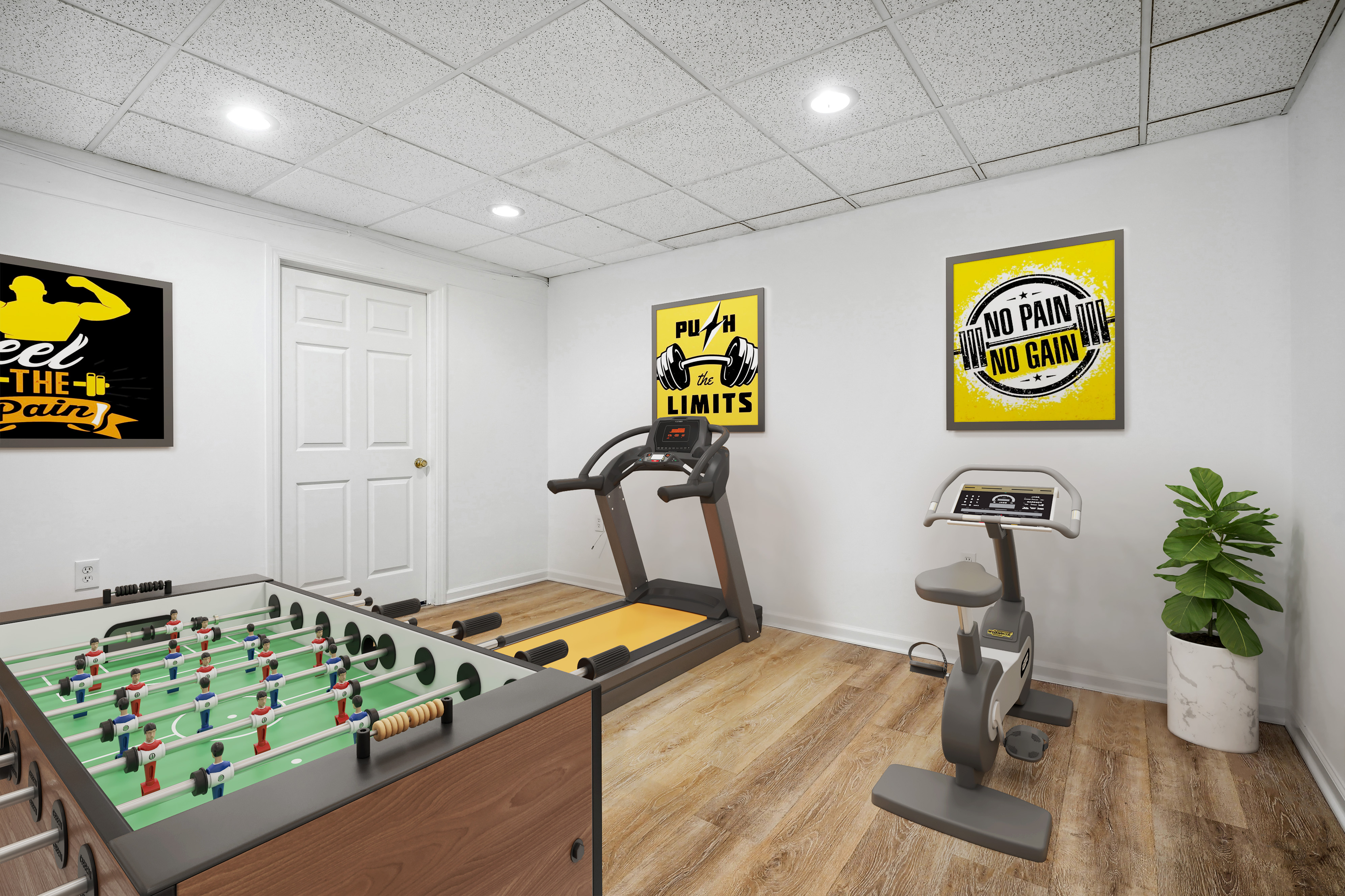
Game rooms are a haven for entertainment, creativity, and bonding among friends and family. Whether you're a seasoned gamer or a casual player, designing a game room that reflects your passion and style can significantly enhance your gaming experience. In this article, we'll explore exciting decoration tips to transform your game room into a gamer's paradise. Additionally, we'll delve into the remarkable benefits of using virtual staging to visualize and showcase the perfect game room setup.
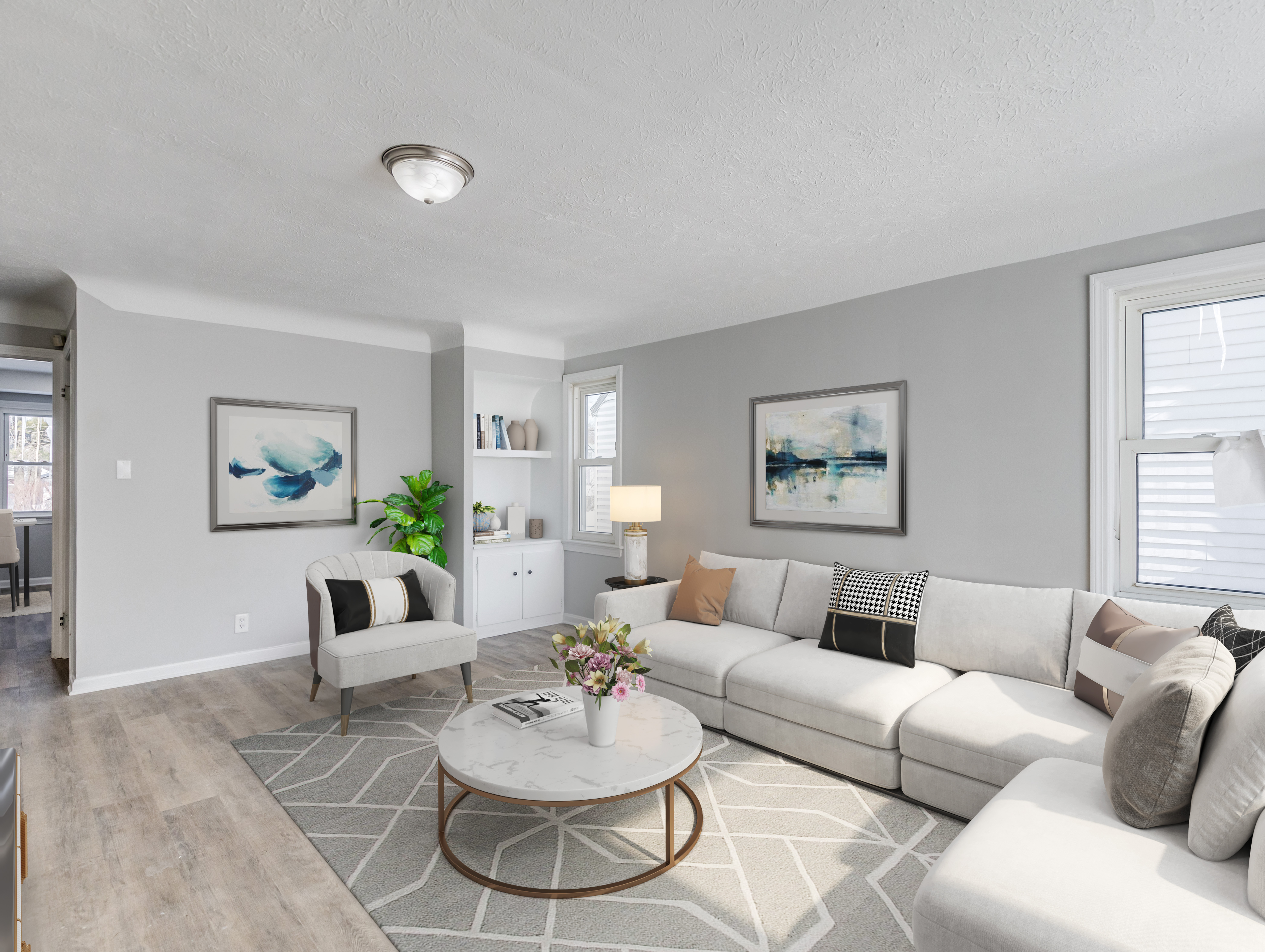
Selling a property is often an exciting endeavor, but it can become a source of frustration when the process drags on for an extended period. Various factors can contribute to a property staying on the market longer than anticipated. In this article, we'll delve into some common reasons why a property takes too long to be sold and shed light on the significance of virtual staging and other virtual services, such as the VSH Media Marketing Briefcase, in boosting a listing's appeal and expediting the sales process.
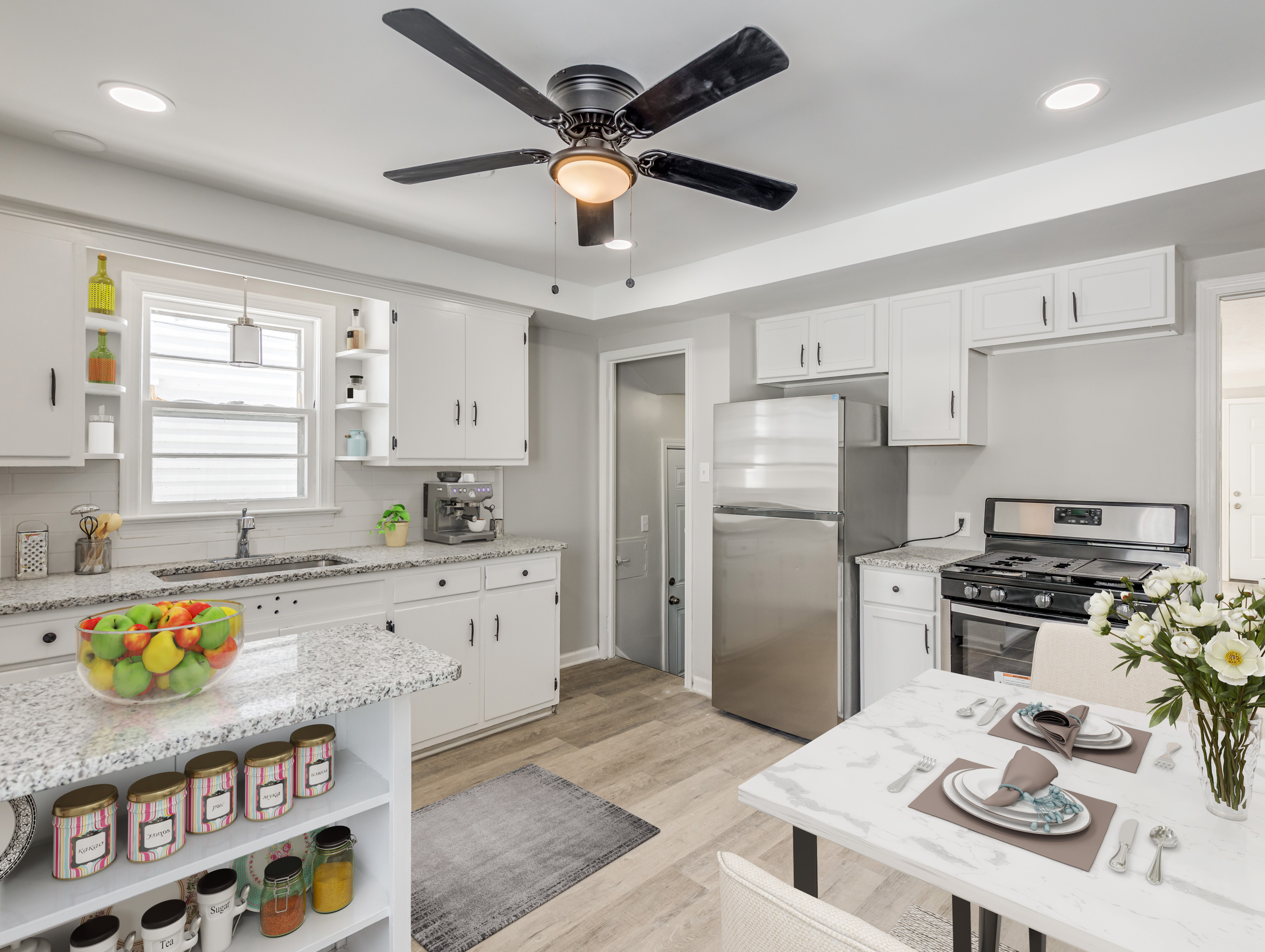
In the competitive real estate market, showcasing a property in its best light is essential to attract potential buyers and secure a quick sale. As buyer preferences evolve, staying up-to-date with the latest trends in property presentation can make all the difference. In this article, we'll explore the best trends to showcase a listing and expedite the process of selling a property, ensuring you stay ahead in the game.

First impressions are everything, and the exterior of a property plays a crucial role in captivating potential buyers. A fresh and inviting exterior can significantly enhance a property's curb appeal, drawing in more viewers and increasing the likelihood of a quick sale. In this article, we'll explore the transformative power of exterior painting and how virtual paint services can help you make the best first impression on prospective buyers.
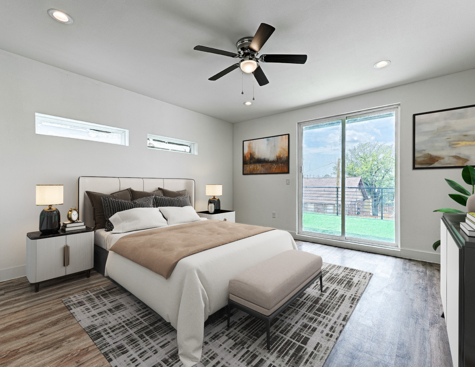
Seasonal decoration is a secret weapon that can transform a property and create an emotional connection with potential buyers. When done right, seasonal decor can enhance the property's charm, create a warm and inviting atmosphere, and showcase its versatility throughout the year. In this article, we'll explore the magic of seasonal decoration and how virtual staging can bring the essence of each season to life, attracting more viewers to your listing.
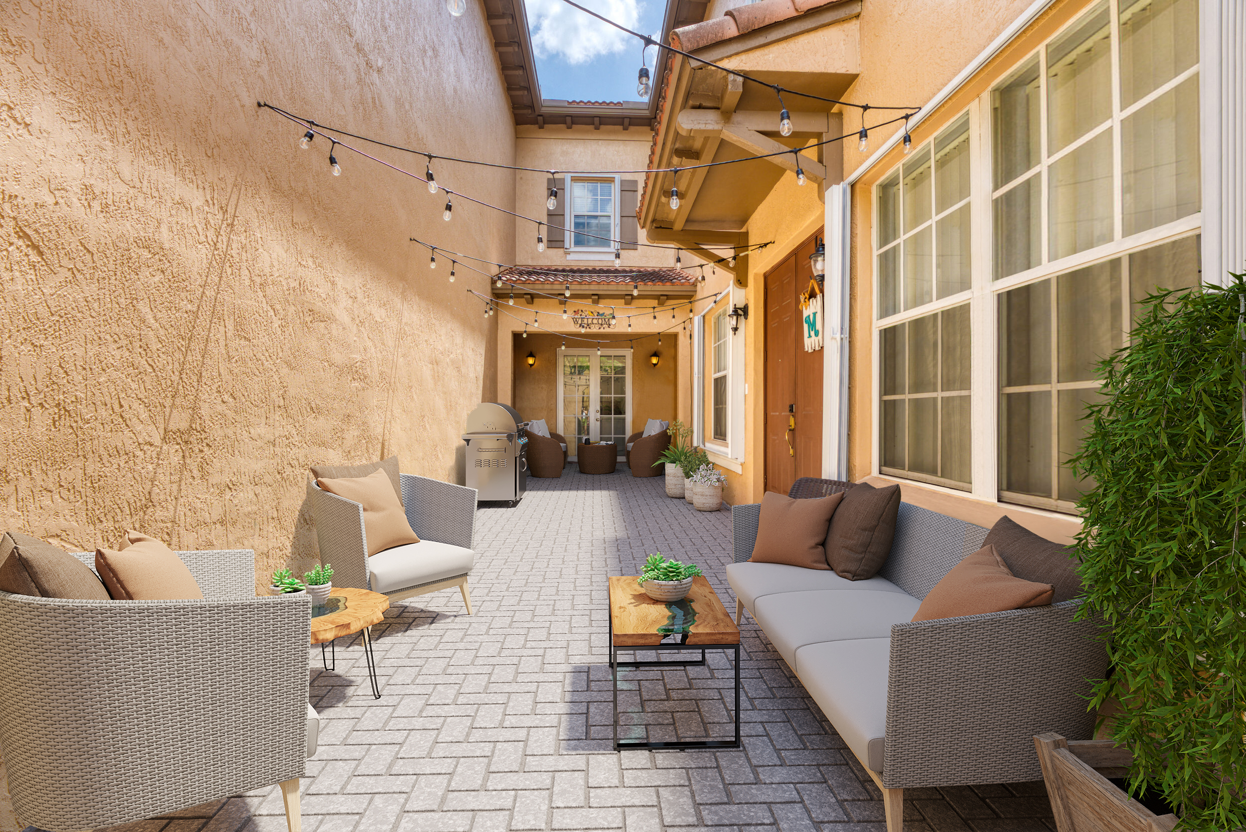
The exterior of a property is the first thing potential buyers see, making it a critical factor in shaping their overall impression. A well-designed and inviting frontyard and backyard can greatly enhance a property's curb appeal and draw in potential buyers. In this article, we'll explore essential tips to transform the exterior of a property and make it appealing to potential buyers. Additionally, we'll highlight the power of virtual services like virtual staging, virtual twilight, and virtual landscape to visualize and elevate the property's outdoor spaces.
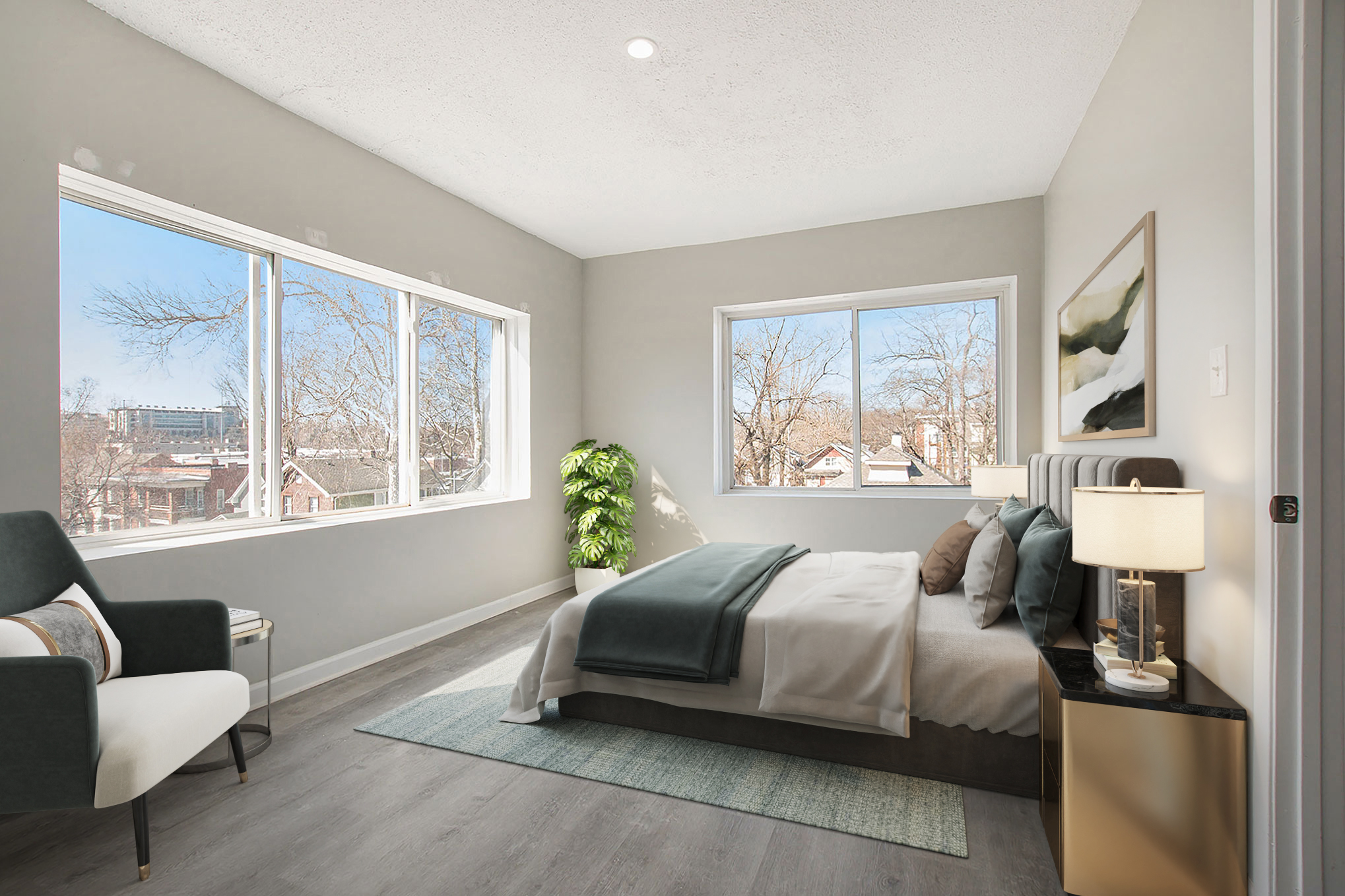
Interior designers play a crucial role in creating beautiful and functional spaces that reflect their clients' preferences and lifestyle. In today's digital age, virtual staging services have emerged as a valuable tool for interior designers to showcase their expertise and elevate their design projects. In this article, we'll explore the numerous benefits that virtual staging offers to interior designers and how it revolutionizes the way they present their designs to clients.
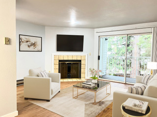
In recent years, virtual internal renovation services have emerged as a revolutionary solution for property owners with unfinished or remodeling projects. These innovative services leverage cutting-edge technology to provide efficient and cost-effective solutions for transforming properties into personalized and functional spaces. In this article, we will explore the numerous benefits of using virtual internal renovation services and how they can help turn your unfinished property or outdated space into your dream home.

In the digital age, virtual landscaping services have emerged as a revolutionary solution for homeowners and businesses seeking to transform their outdoor spaces. Gone are the days when designing a beautiful and sustainable landscape required tedious site visits and complex planning processes. With the rise of virtual landscaping services, individuals can now visualize, create, and implement their dream landscapes from the comfort of their own screens. This article will delve into the numerous advantages that virtual landscaping services offer, showcasing how they are changing the landscape industry for the better.
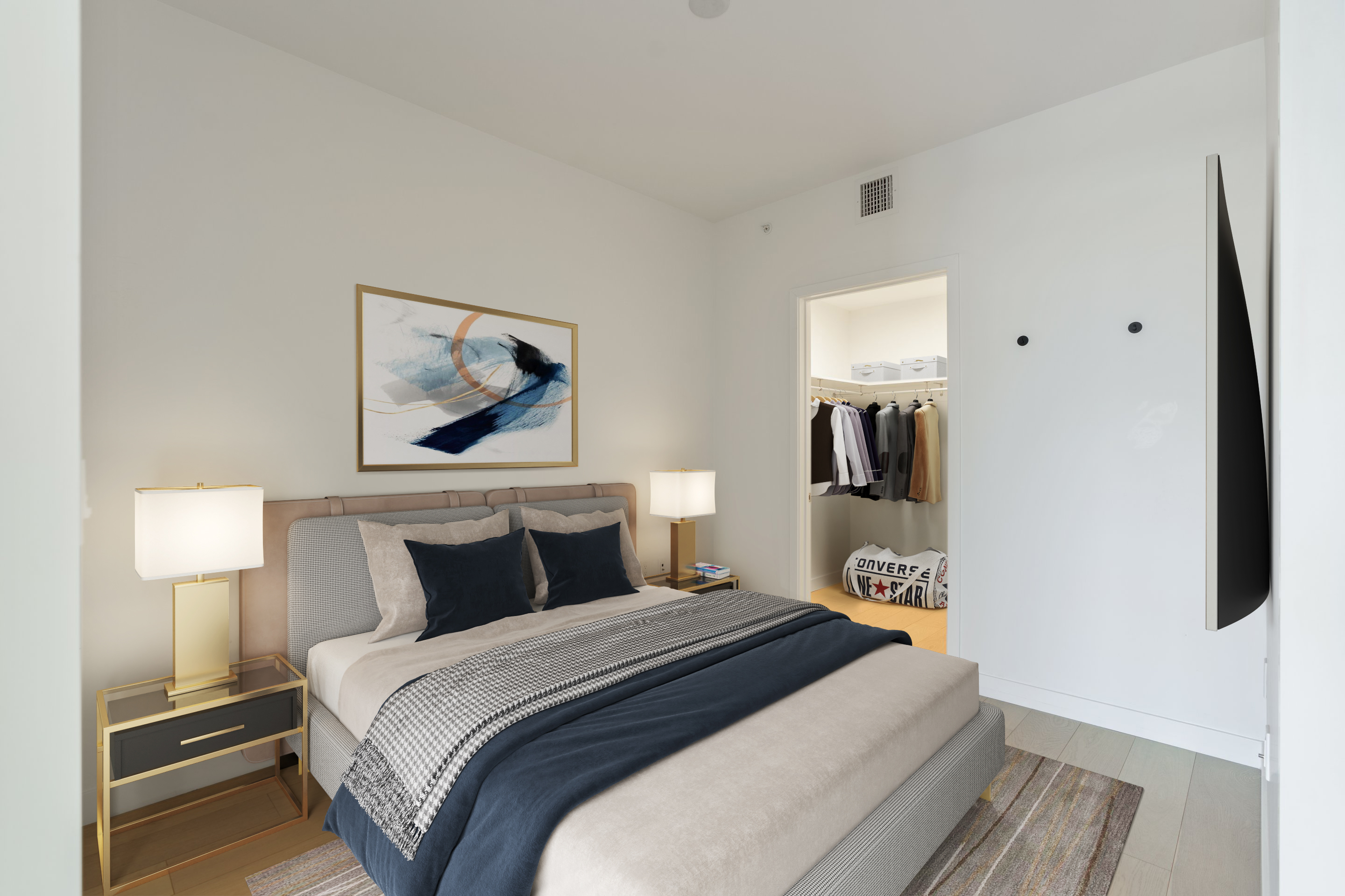
Just like fashion trends change with each season, home decoration styles also evolve over time. Homeowners and interior designers alike are always on the lookout for fresh and innovative ways to spruce up living spaces. While it may seem unusual to draw parallels between fashion and home decor, they share a fundamental similarity – both are expressions of personal style and taste. In this article, we will explore how fashion trends can be seamlessly adapted to home decoration, with a special focus on the game-changing tool of virtual staging.
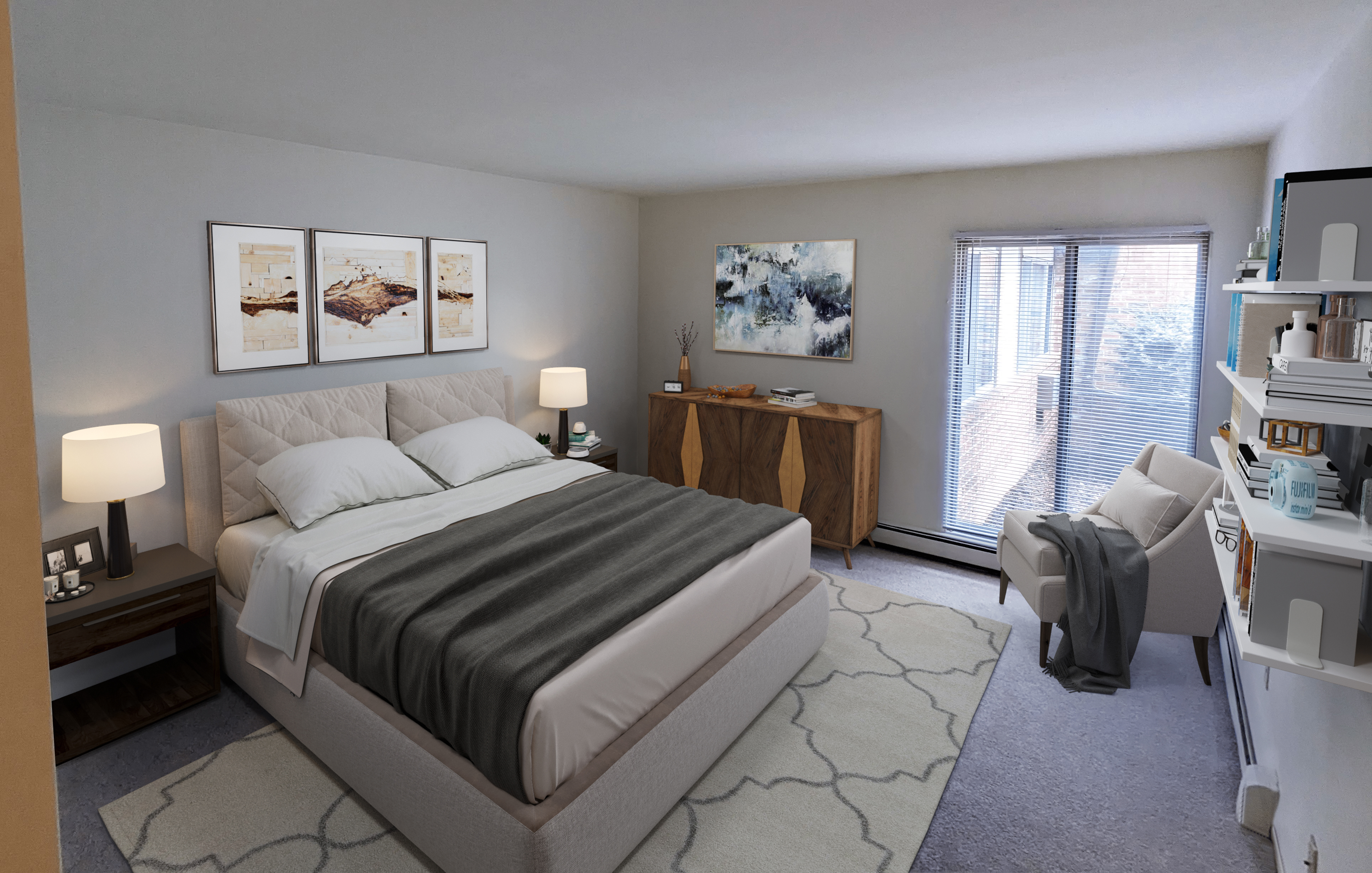
Artwork has an undeniable allure that goes beyond mere aesthetics; it possesses the power to transform a house into a home and elevate the ambiance of any living space. As an integral aspect of interior design, art plays a crucial role in shaping the character and personality of a home. Moreover, its presence can have a significant impact on the type of potential buyers a property attracts. In this article, we will explore the importance of artwork in home decoration and how it can define the appeal of a property to potential buyers.

When it comes to selling a house with a swimming pool, there's no denying the added allure and potential it brings to the property. A well-maintained pool can be a significant selling point, enticing potential buyers seeking a home that offers relaxation, entertainment, and a taste of luxury right in their backyard. In this article, we'll explore some effective ways to showcase a house with a swimming pool to attract those interested in these types of properties, while also exploring the benefits of virtual pool services in today's real estate market.
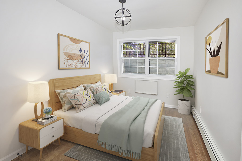
Scandinavian furniture style, with its timeless elegance and cozy simplicity, has captured the hearts of design enthusiasts worldwide. Originating in the Nordic countries of Denmark, Sweden, Norway, Finland, and Iceland, this design movement has become synonymous with modern living and the pursuit of hygge – a Danish term representing a feeling of coziness and contentment. In this article, we'll delve into the essence of Scandinavian furniture style, exploring its key features, history, and why it continues to be a beloved choice for interior design.
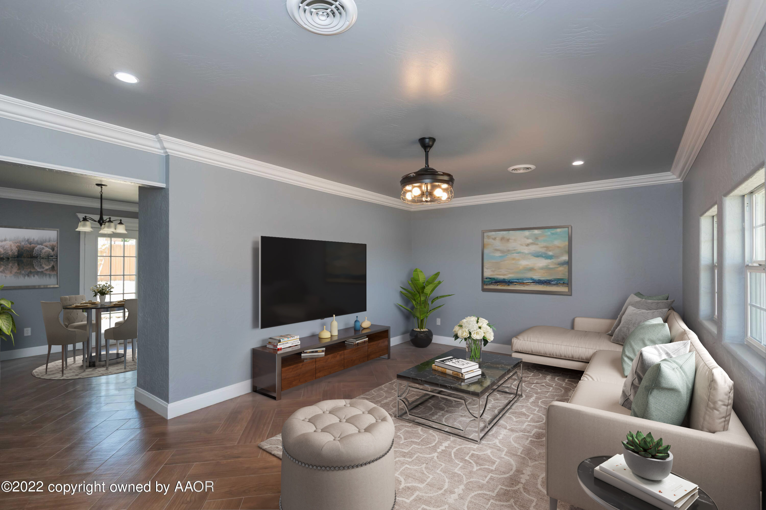
When it comes to showcasing a property's true beauty, real estate photography is an invaluable tool. A single photograph has the power to capture the essence of a home, conveying its unique features and inviting potential buyers to imagine themselves living within its walls. But what's the secret to achieving that perfect shot? The answer lies in the timing. In this article, we'll explore the best time of day for shooting real estate photography and how VSH Media's professional photography services can transform your listings into visual masterpieces.
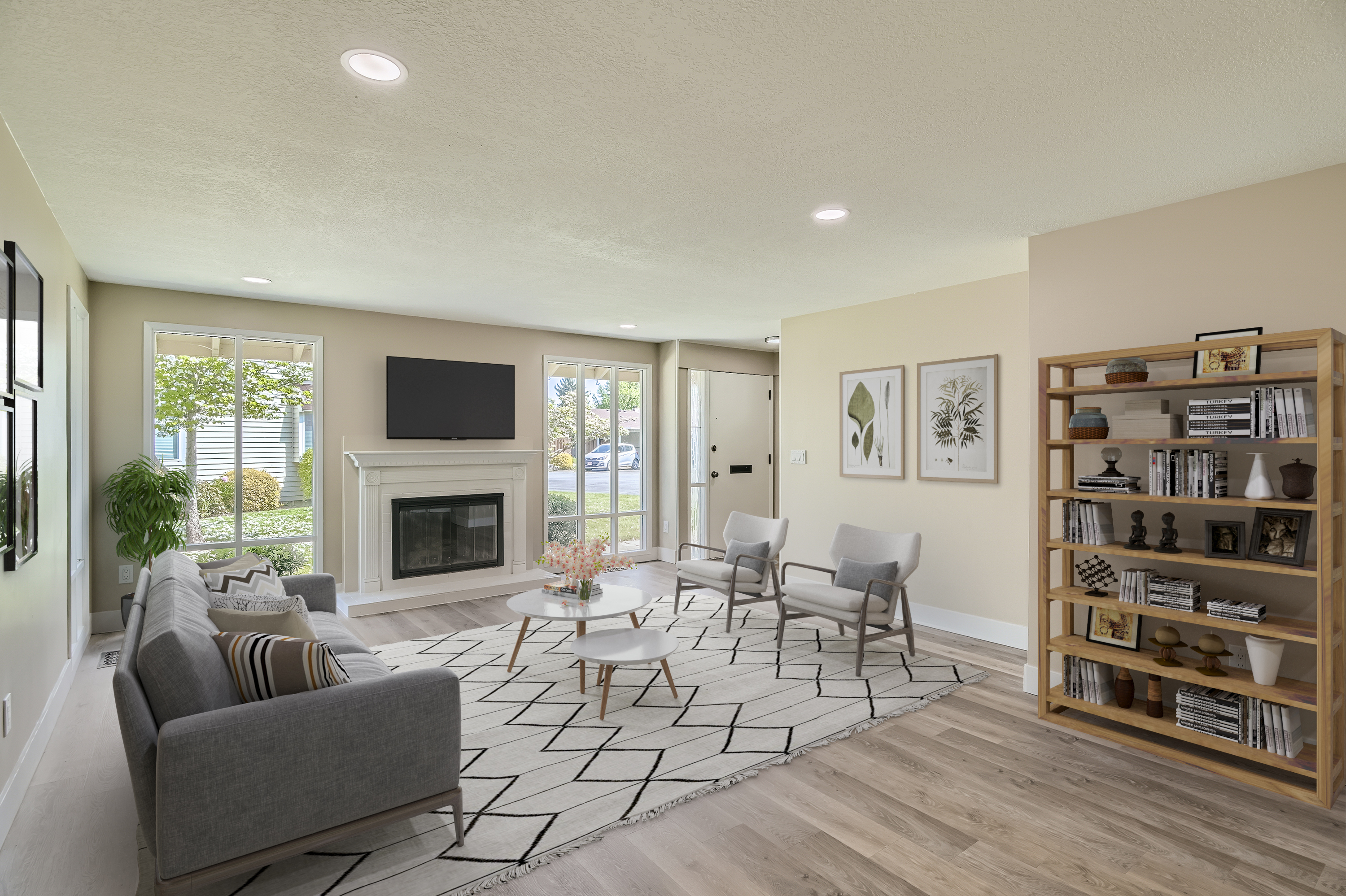
In the world of interior design, trends often come and go like the seasons. What was once considered outdated can experience a remarkable revival, as old decor and design tendencies resurface with a fresh perspective. Nostalgia plays a significant role in shaping our preferences, and lately, there has been a noticeable resurgence of vintage aesthetics, bringing back the charm of yesteryears. From mid-century modern to Art Deco, let's delve into some old decor and design tendencies that are making a stylish comeback.
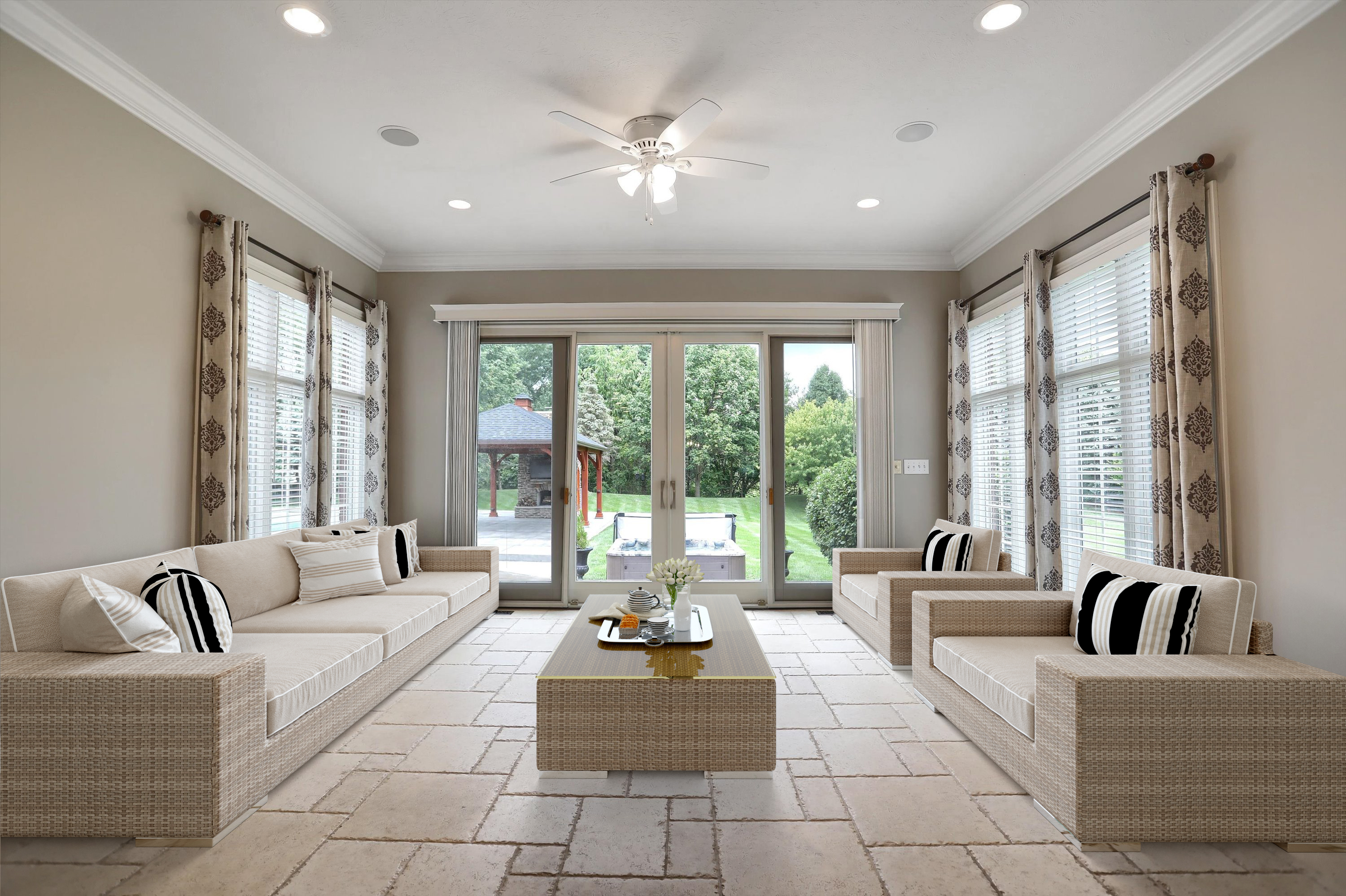
As temperatures rise, designing and decorating properties in hot weather climates becomes a unique challenge. Balancing aesthetics, comfort, and functionality is crucial to create spaces that are both visually appealing and suitable for the climate. From choosing the right materials to incorporating cooling decor elements, let's explore how to transform properties into oases of comfort during scorching summers.
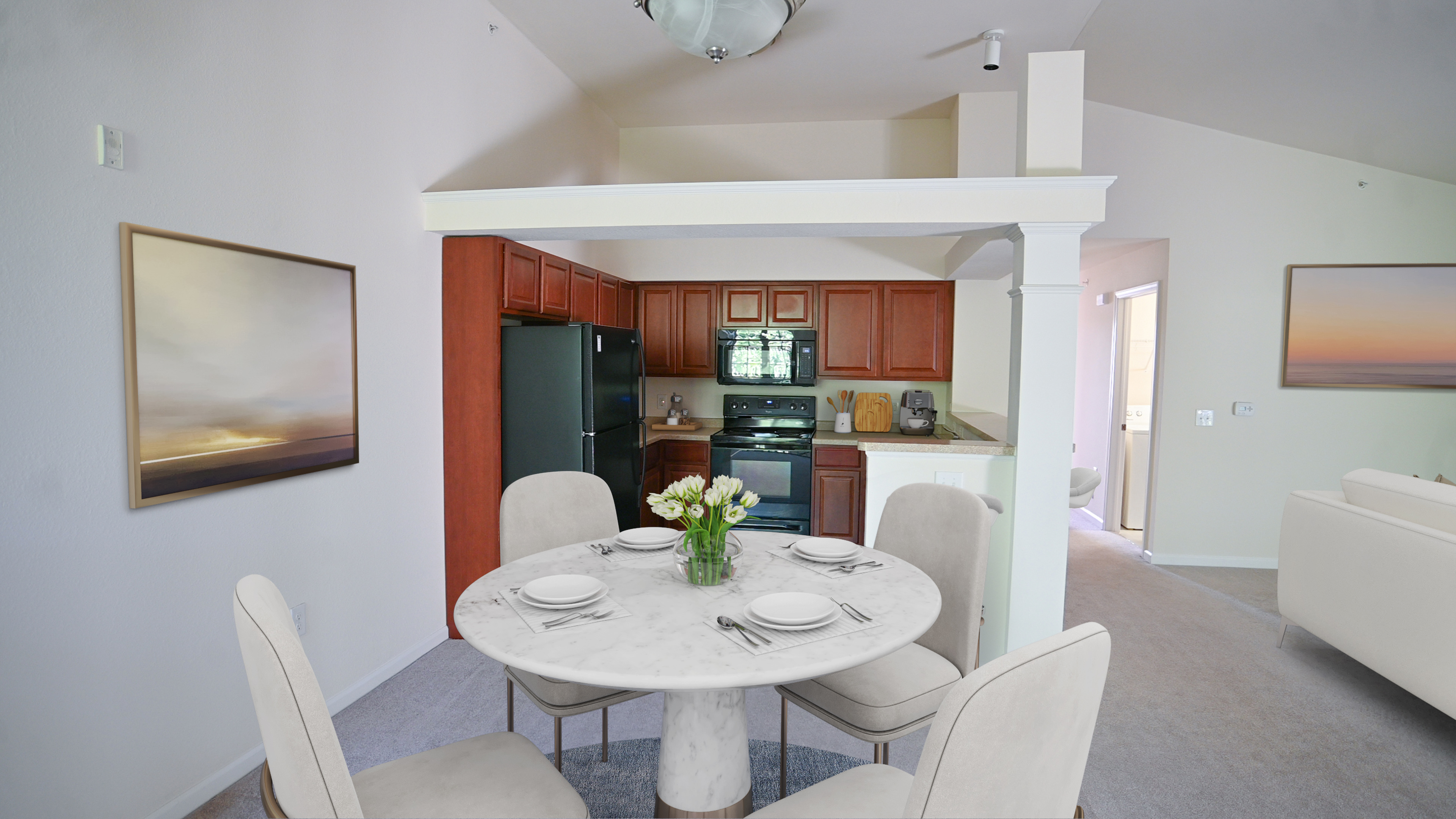
Nature's beauty has a remarkable way of enhancing our surroundings, and what better way to bring the outdoors in than with flower decorations? Fresh blooms not only add color and fragrance but also infuse your home with a sense of vitality and tranquility. In this article, we'll explore creative ways to adorn your living spaces with flowers, turning your house into a blooming haven.

In today's fast-paced digital landscape, timing can be the key to unlocking the full potential of your online listing. Whether you're selling a product, offering a service, or promoting an event, the moment you choose to publish your listing can significantly impact its visibility, engagement, and ultimate success. With careful consideration of various factors, you can strategically time your listing release to maximize its impact. But what is the best time of day to publish a listing, and why does it matter?
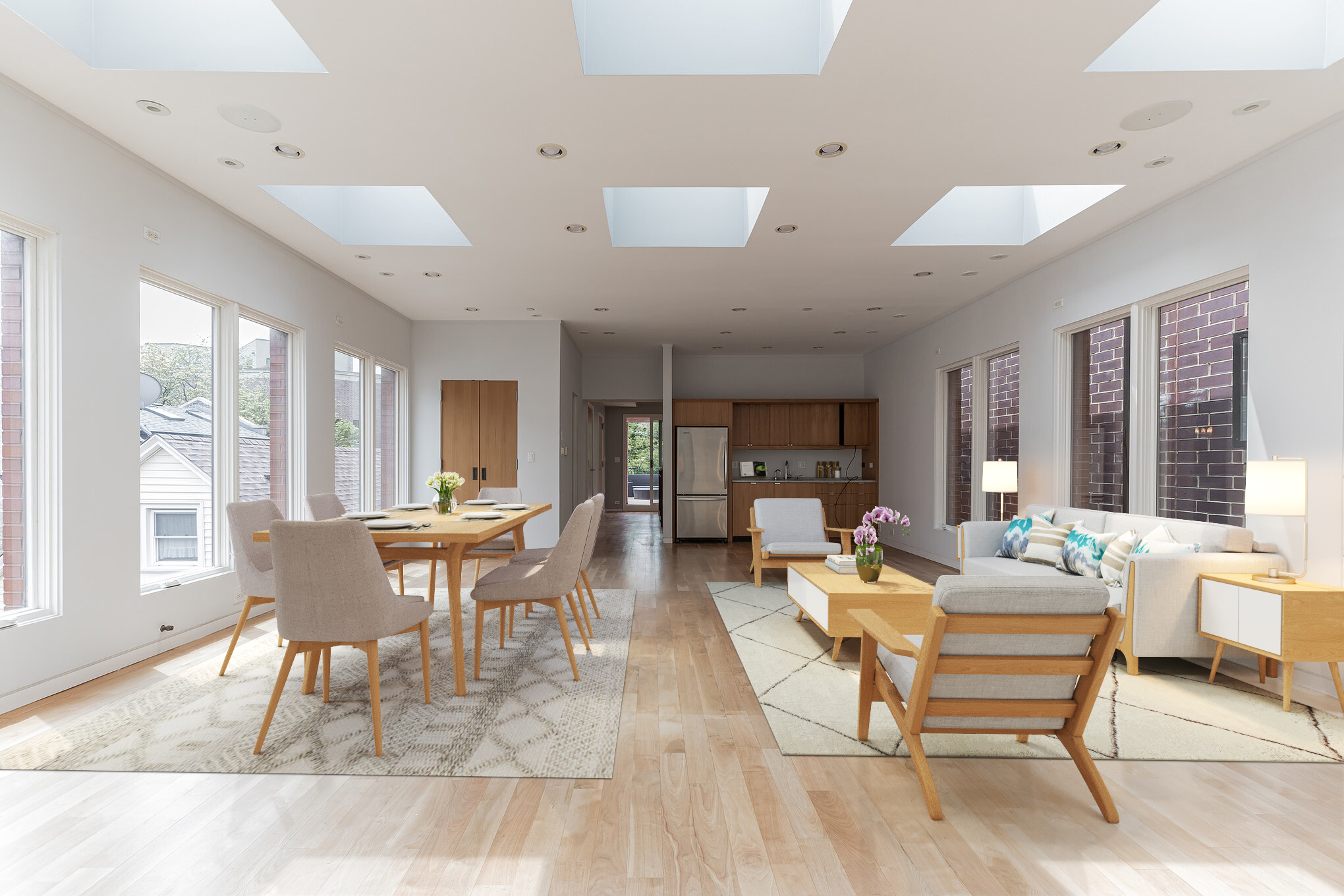
In the ever-evolving world of interior design, staying attuned to the latest trends is a journey that transcends age boundaries. Whether you're a young adult embarking on your first solo living arrangement or someone simply looking to refresh their home, the following trends offer a fresh perspective on modern interior decoration.
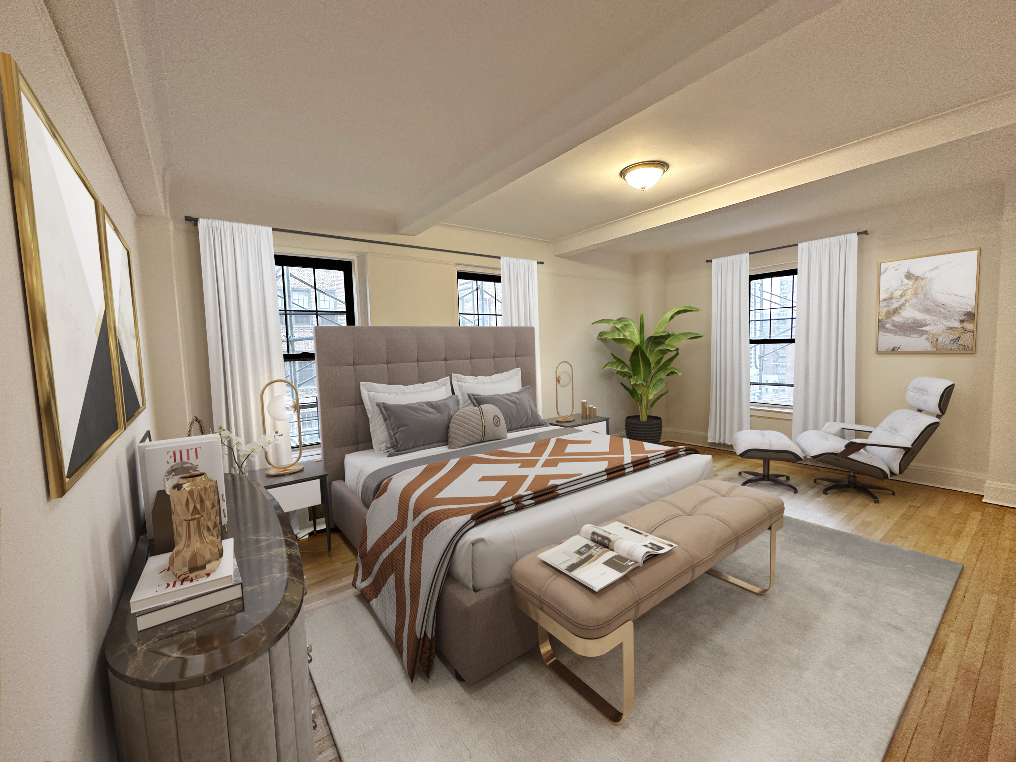
Curtains, often regarded as the unsung heroes of interior design, have the power to transform a room from ordinary to extraordinary. Beyond their practical function of providing privacy and controlling light, curtains play a vital role in setting the tone, mood, and style of a space. Whether you're aiming for a cozy haven or a vibrant showcase, here's a comprehensive guide to using curtains to enhance your room decor.
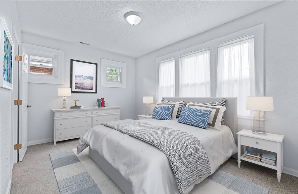
Nestled along the picturesque shores of Long Island, the Hamptons have long been synonymous with sophistication, relaxation, and a distinct coastal lifestyle. The Hamptons beach style, characterized by its elegant yet laid-back vibe, has captured the hearts of many seeking to infuse their homes with a sense of seaside serenity. Whether you're near the ocean or simply want to bring a touch of coastal elegance to your space, here's a guide to embracing the timeless charm of Hamptons beach style.

When it comes to interior design, the boundaries of style are becoming increasingly fluid, giving homeowners the freedom to break away from conventional norms and create spaces that are a true reflection of their personalities. One exciting trend that has gained momentum is the art of mixing different furniture styles to produce a truly unique and captivating interior. This trend embraces a harmonious fusion of contrasting elements, offering a fresh perspective on design aesthetics that are sure to impress.Embracing Diversity in Design
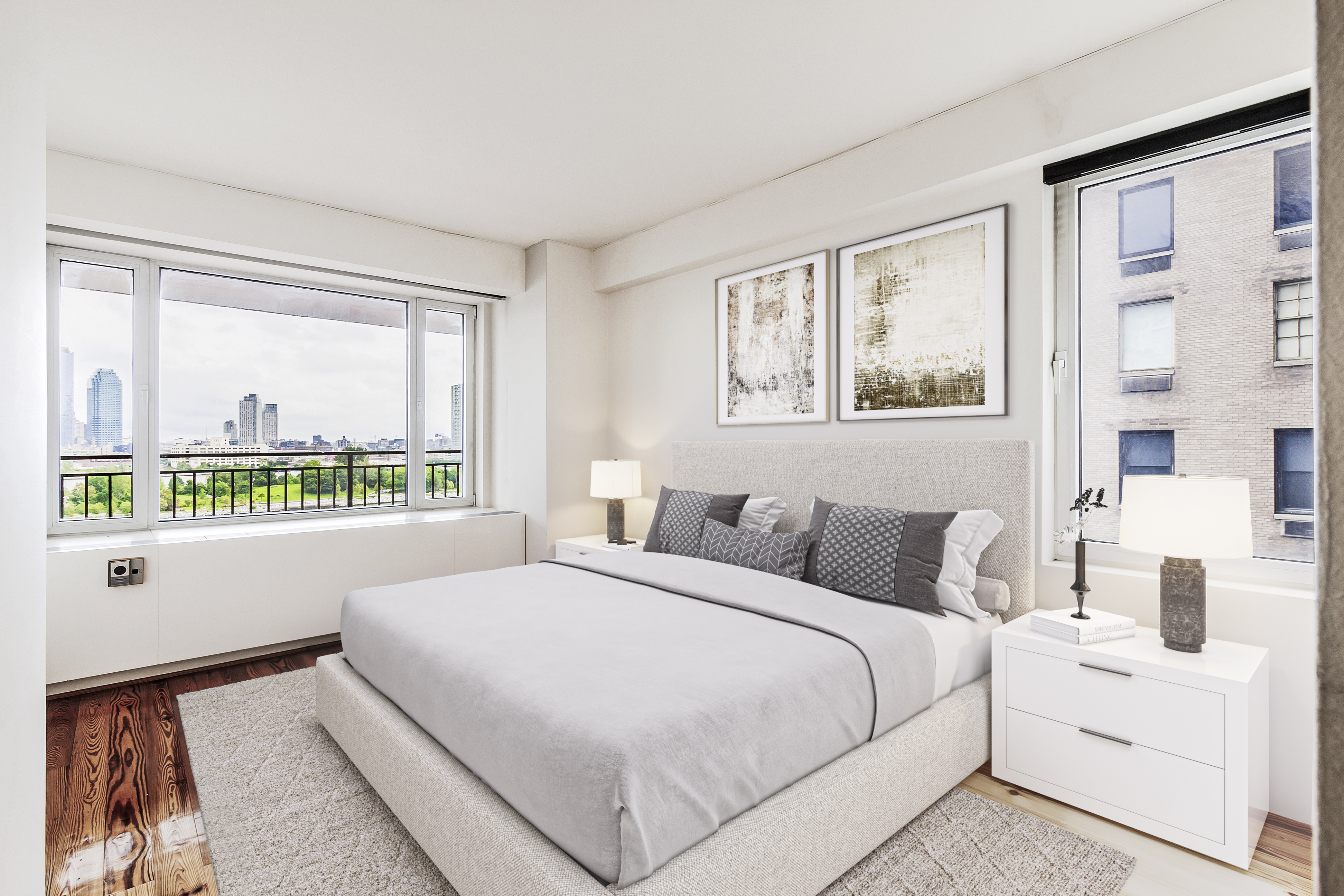
Light fixtures are more than just functional elements in a home; they are also integral components of interior design, adding style, ambiance, and character to any space. From sleek and modern to ornate and vintage, light fixture styles have the power to transform a room's aesthetic. In this guide, we will explore a variety of light fixture styles to help you choose the perfect illumination for your home decoration.
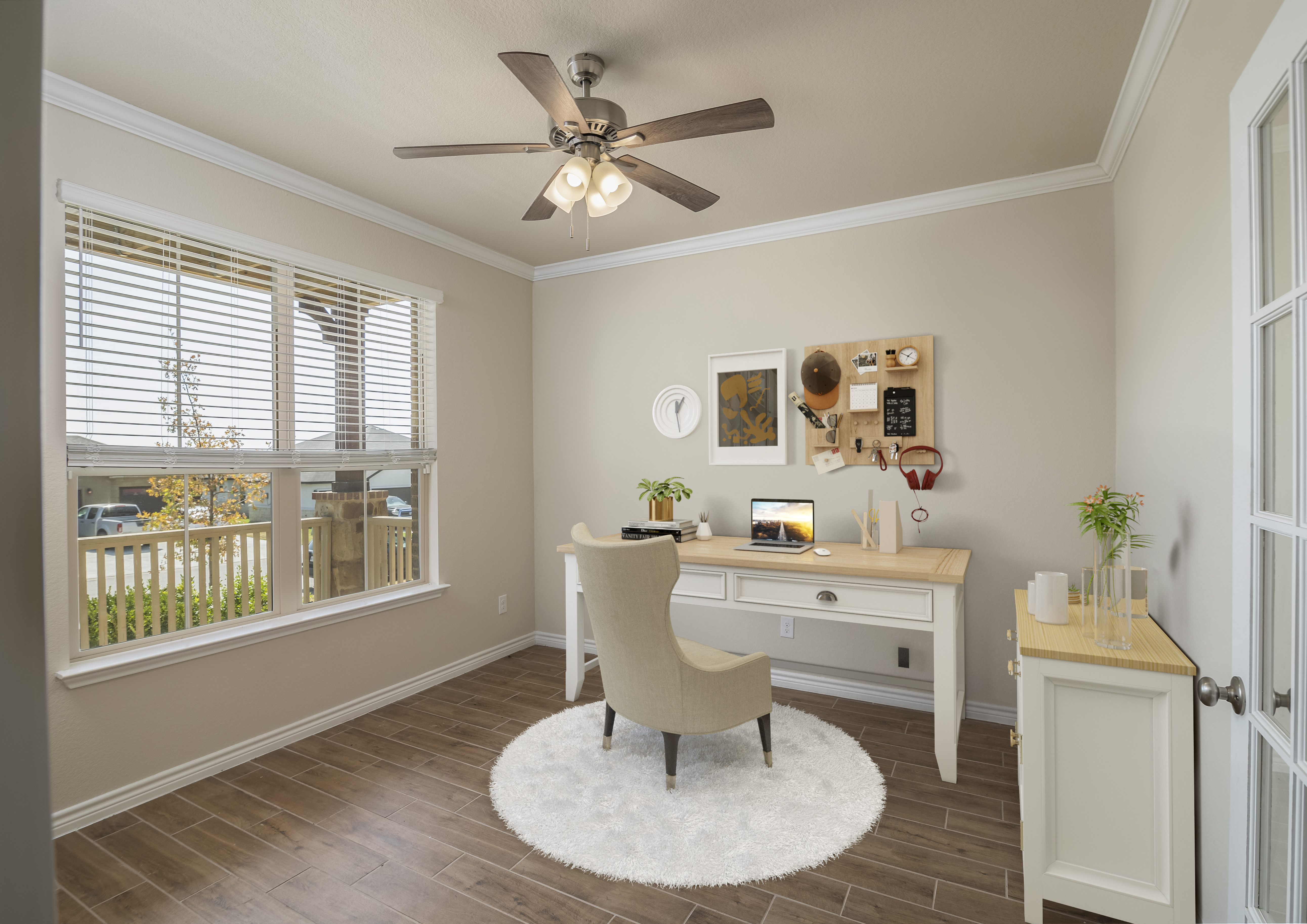
As remote work continues to shape our professional lives, the home office has evolved from a mere corner of a room to a space that demands functionality, comfort, and aesthetics. Designing a home office that promotes productivity and reflects your personal style requires careful consideration of various elements. Whether you're working with limited space or a dedicated room, here are some home office styles and decoration ideas to help you curate a workspace that empowers your best work.
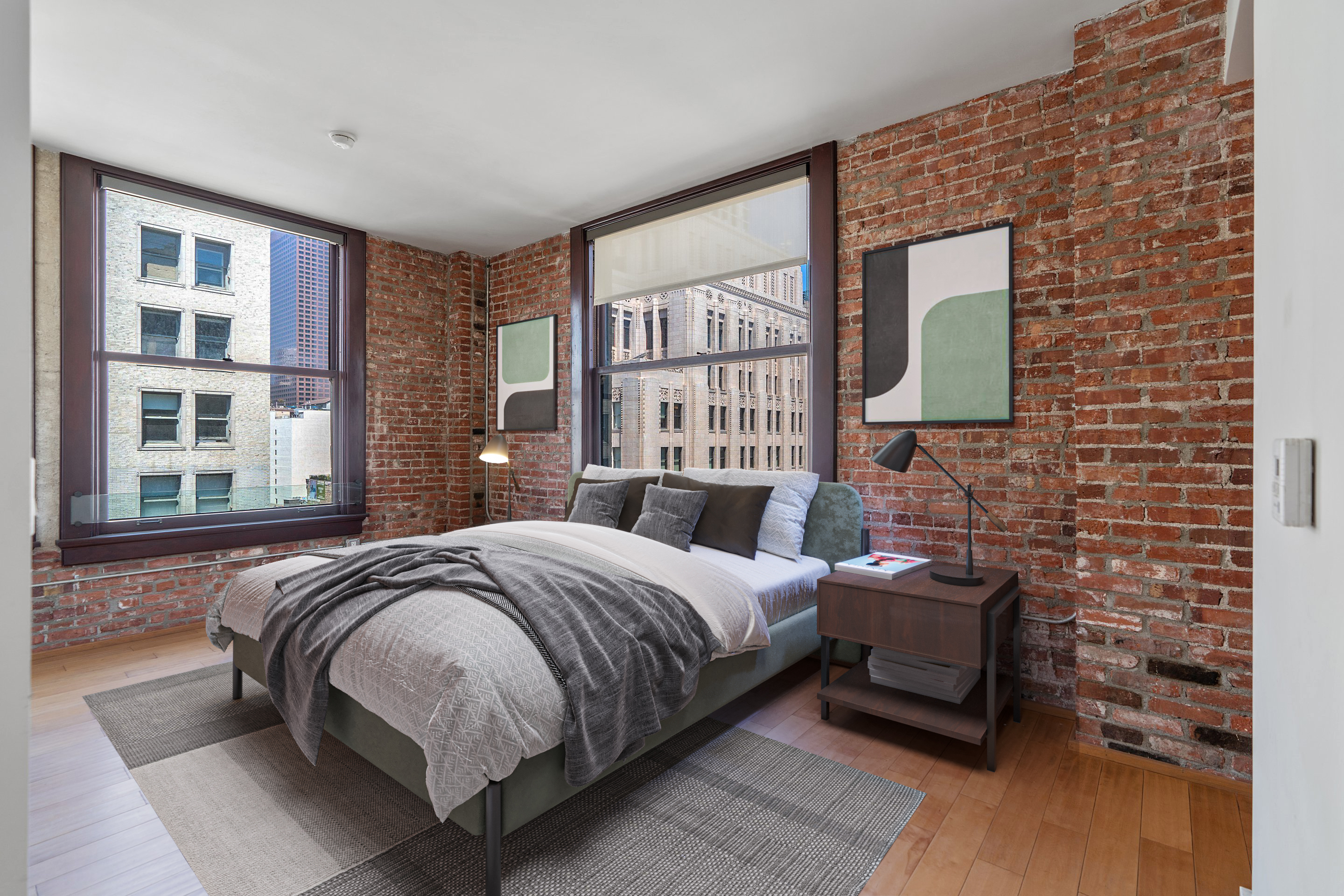
Brick walls have transcended their utilitarian origins to become a cornerstone of interior design trends. These sturdy structures, once hidden behind layers of plaster, are now celebrated for their rustic charm and industrial character. Whether you have authentic exposed brick or are considering faux alternatives, here's a guide to incorporating brick wall decor trends that effortlessly infuse warmth, texture, and timelessness into your space.
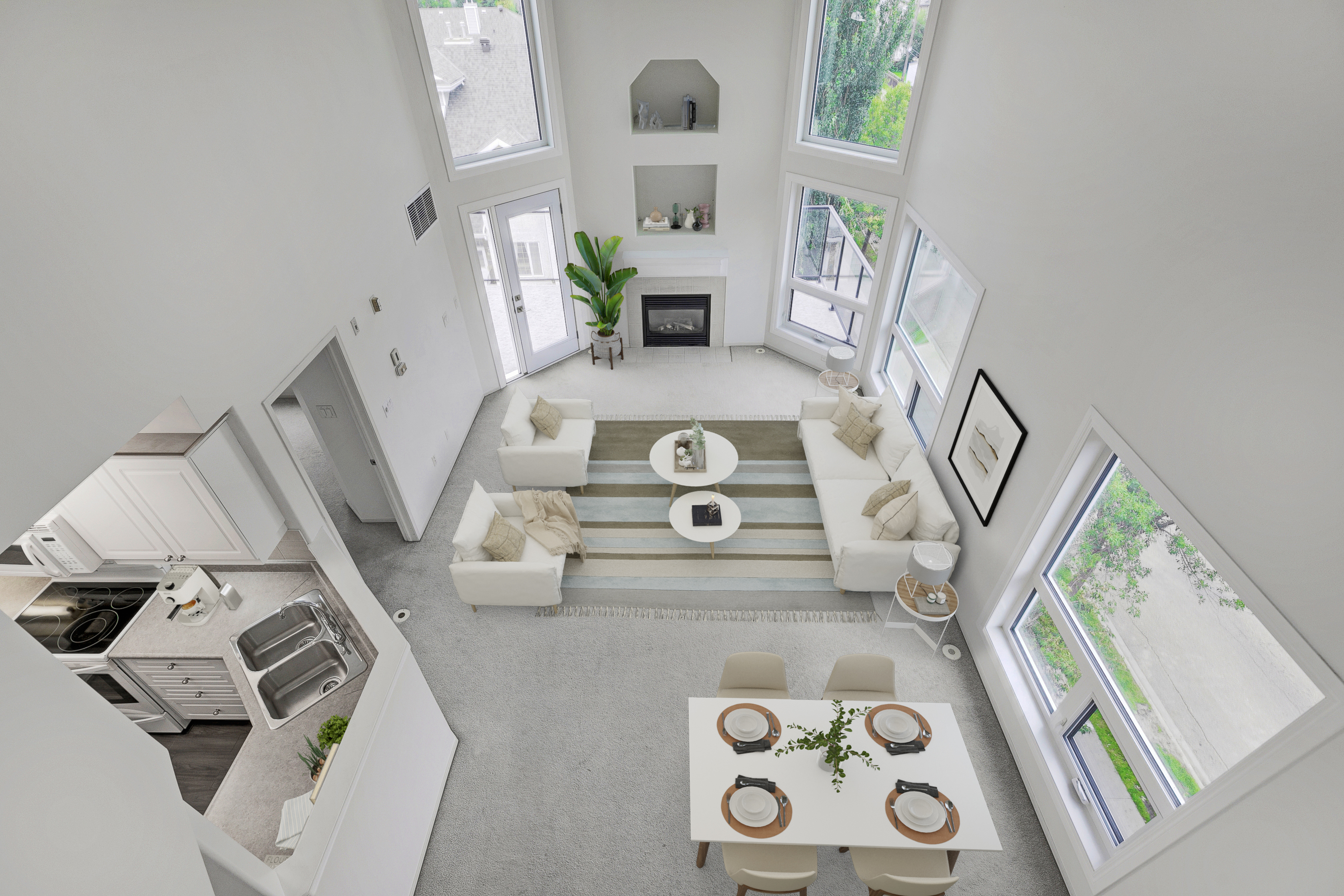
In the dynamic world of real estate, the power of visual storytelling cannot be understated. Among the many tools that have revolutionized the industry, interior aerial images stand out as a game-changer. These captivating photographs captured from above provide a fresh perspective that not only showcases properties in a unique light but also offers a myriad of advantages for both real estate professionals and potential buyers. Let's delve into the benefits of incorporating interior aerial images into real estate marketing strategies.
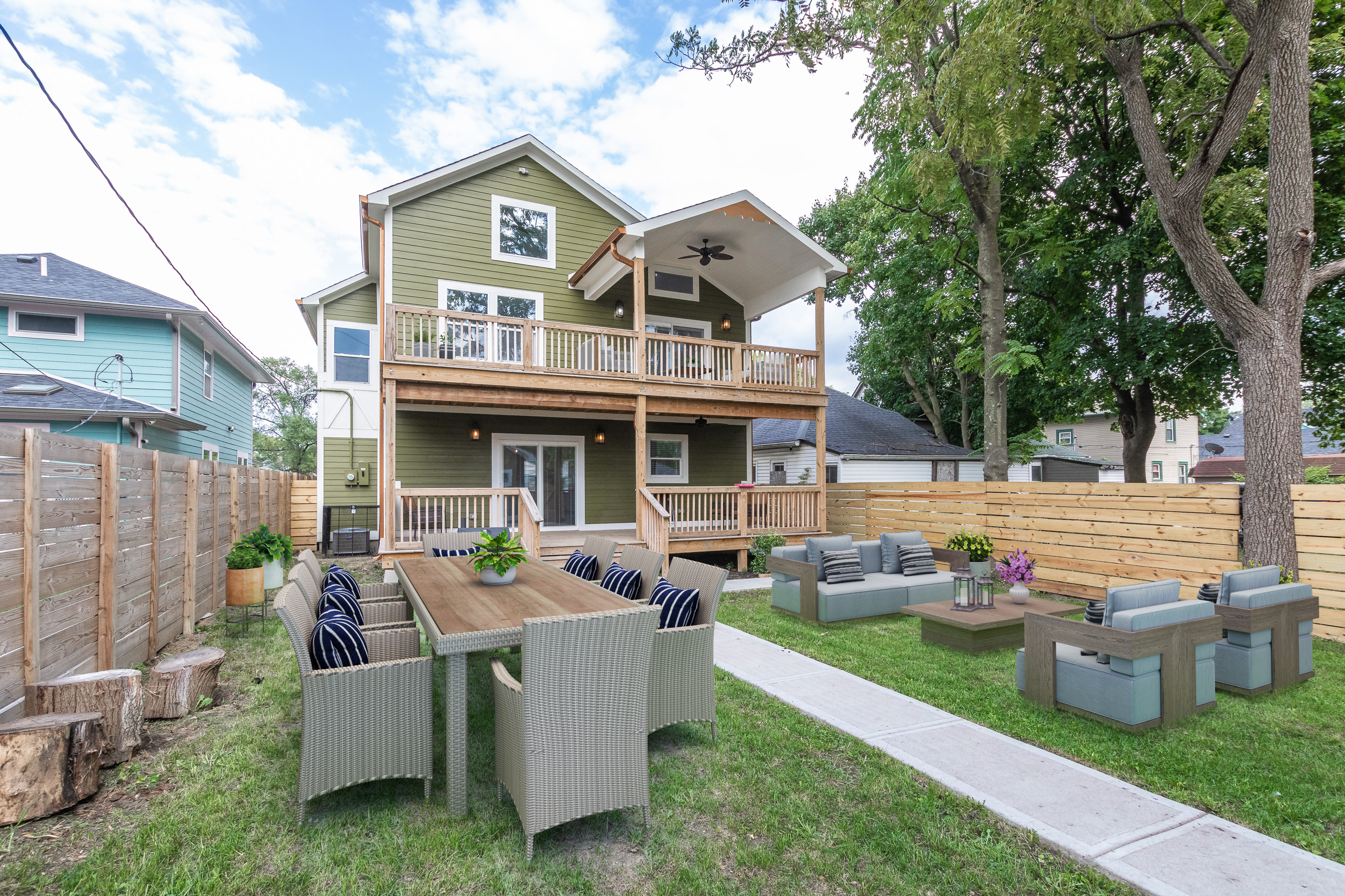
Embarking on the journey to becoming a first-time homeowner is an exciting and transformative experience. It's a step towards financial independence and creating a place to call your own. However, the process can also be overwhelming without proper guidance. To help you navigate this significant milestone, here are essential tips for first-time homebuyers that will empower you to make informed decisions and find the perfect home sweet home.

In the dynamic realm of interior design, the pursuit of crafting visually appealing and functional spaces remains a constant endeavor. With the continuous evolution of technology, the field of interior design has undergone a paradigm shift through the introduction of virtual staging. While staging traditionally involved arranging physical furniture and décor, the rise of virtual staging, especially in the context of closets, has opened up new avenues for designers to showcase their ingenuity and cater to the evolving preferences of clients. This article explores the concept of virtual staging for closets and delves into the diverse benefits it offers.
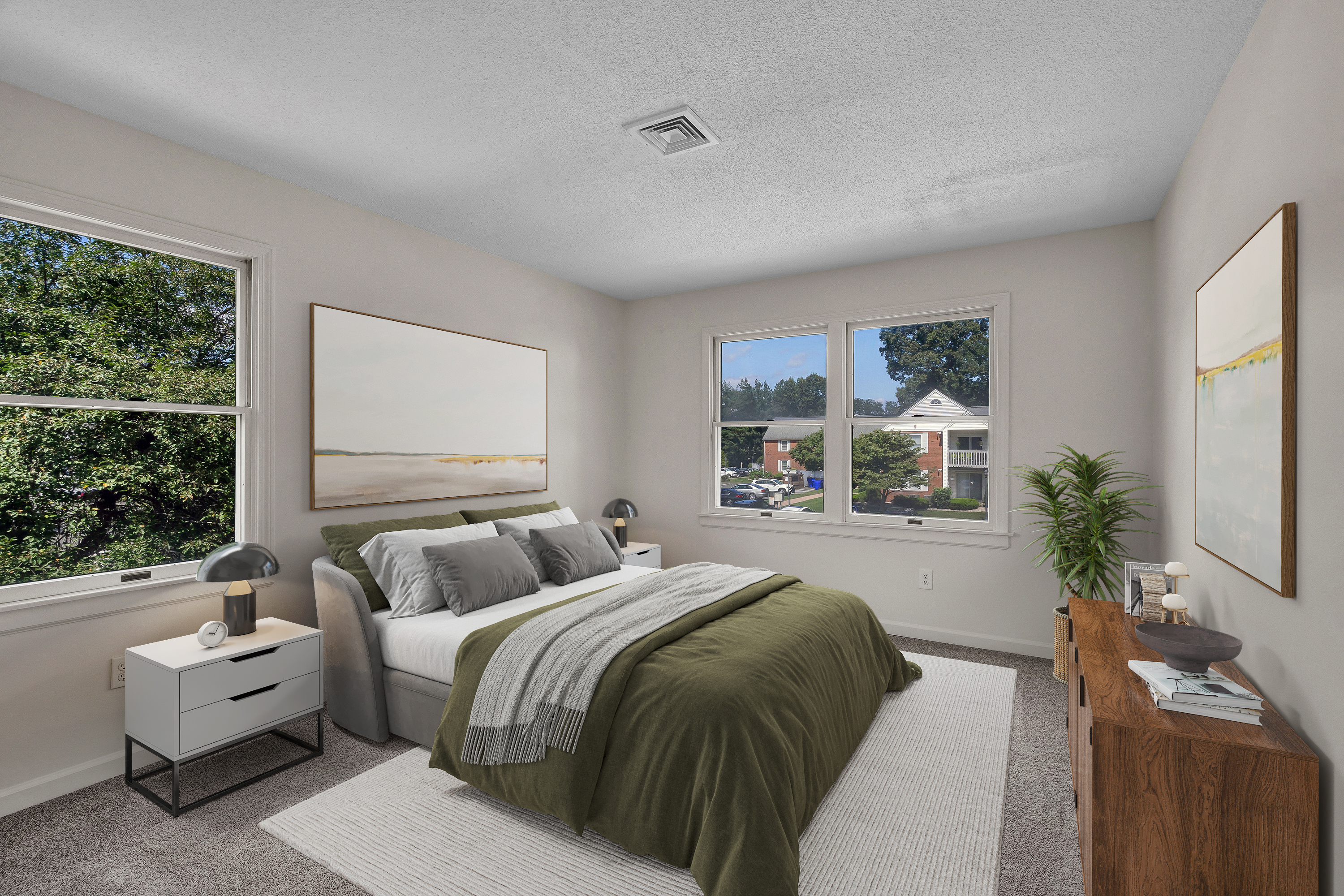
When it comes to interior design, every element plays a pivotal role in crafting a harmonious and inviting ambiance. Among these elements, bedspreads and sheets stand out as essential components that can significantly influence the overall aesthetic of a room. These soft furnishings not only enhance comfort but also serve as a canvas for expressing style and personality. In this article, we'll explore how bedspreads and sheets contribute to room decoration, and how virtual staging is redefining the way we envision these elements within a space.
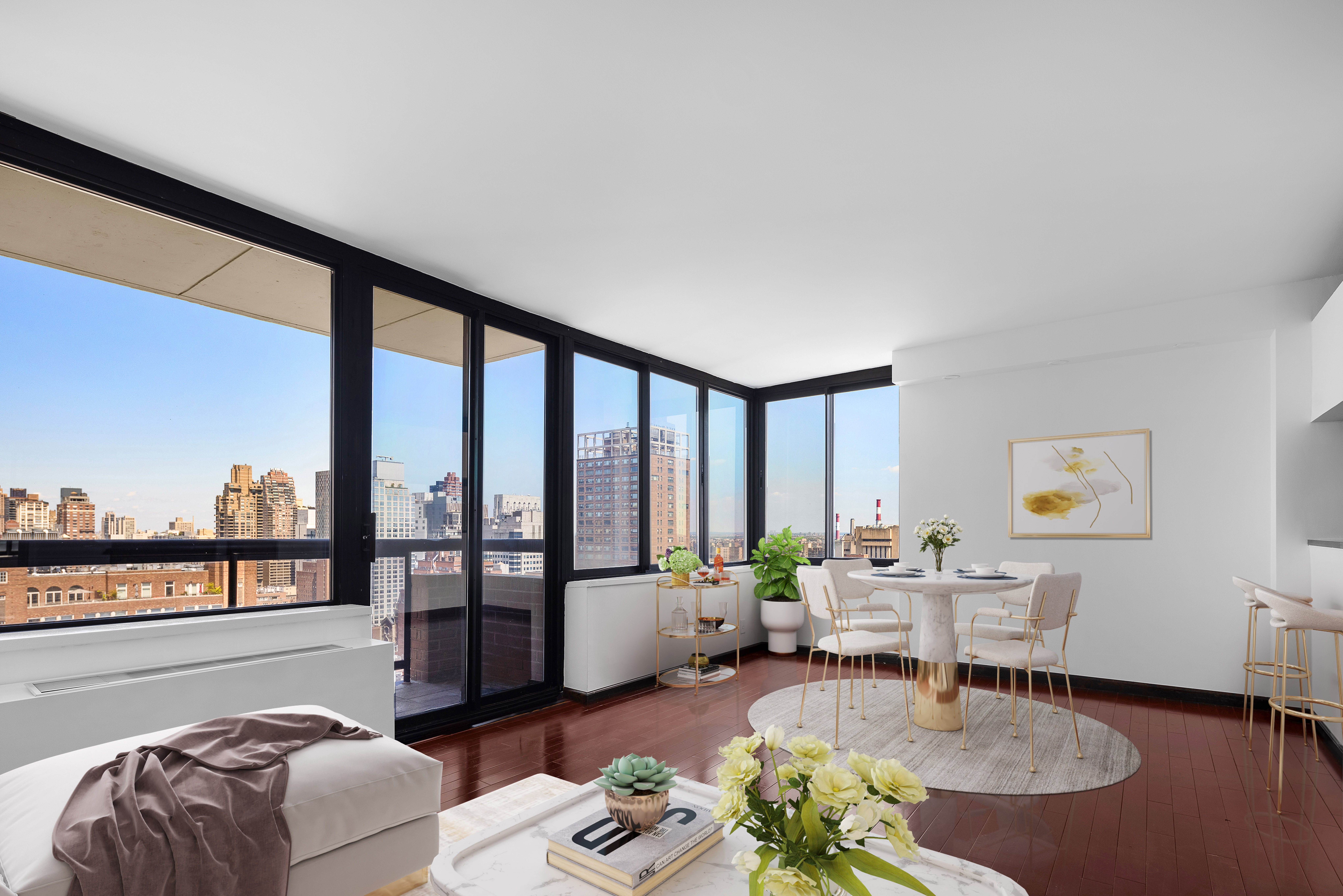
When it comes to selling or renting a property, a picture is indeed worth a thousand words. In the world of real estate, where first impressions are paramount, the art of photography plays a pivotal role in attracting potential buyers or tenants. While professional equipment and techniques are essential, there's one element that can make or break real estate photography: natural light. In this article, we'll delve into how natural light works in photography to enhance a listing's appeal and drive success in the competitive real estate market.
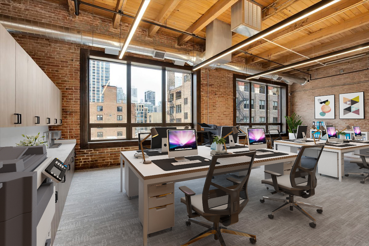
In the ever-evolving world of commercial spaces, the choices in furniture are instrumental in shaping not just the aesthetics but also the functionality and atmosphere. In this article, we'll explore some of the latest trends in commercial furniture design, emphasizing the transformative power of commercial virtual staging in bringing these trends to life.

Gallery walls have emerged as a captivating and versatile trend in interior design, transforming ordinary spaces into dynamic, visually engaging showcases of personal style and creativity. In this article, we'll explore the concept of gallery walls in properties, from their ability to infuse personality into any room to the strategies for creating the perfect display.
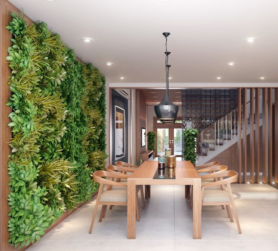
In the world of interior design, the concept of artificial interiors is gaining prominence and transforming the way we perceive and experience our living spaces. Artificial interiors are defined by their creative blend of natural elements and human-made, futuristic, or otherworldly components, resulting in visually stunning and immersive environments. This article explores the artistry behind artificial interiors, the creative potential they offer, and the impact they have on our modern world.
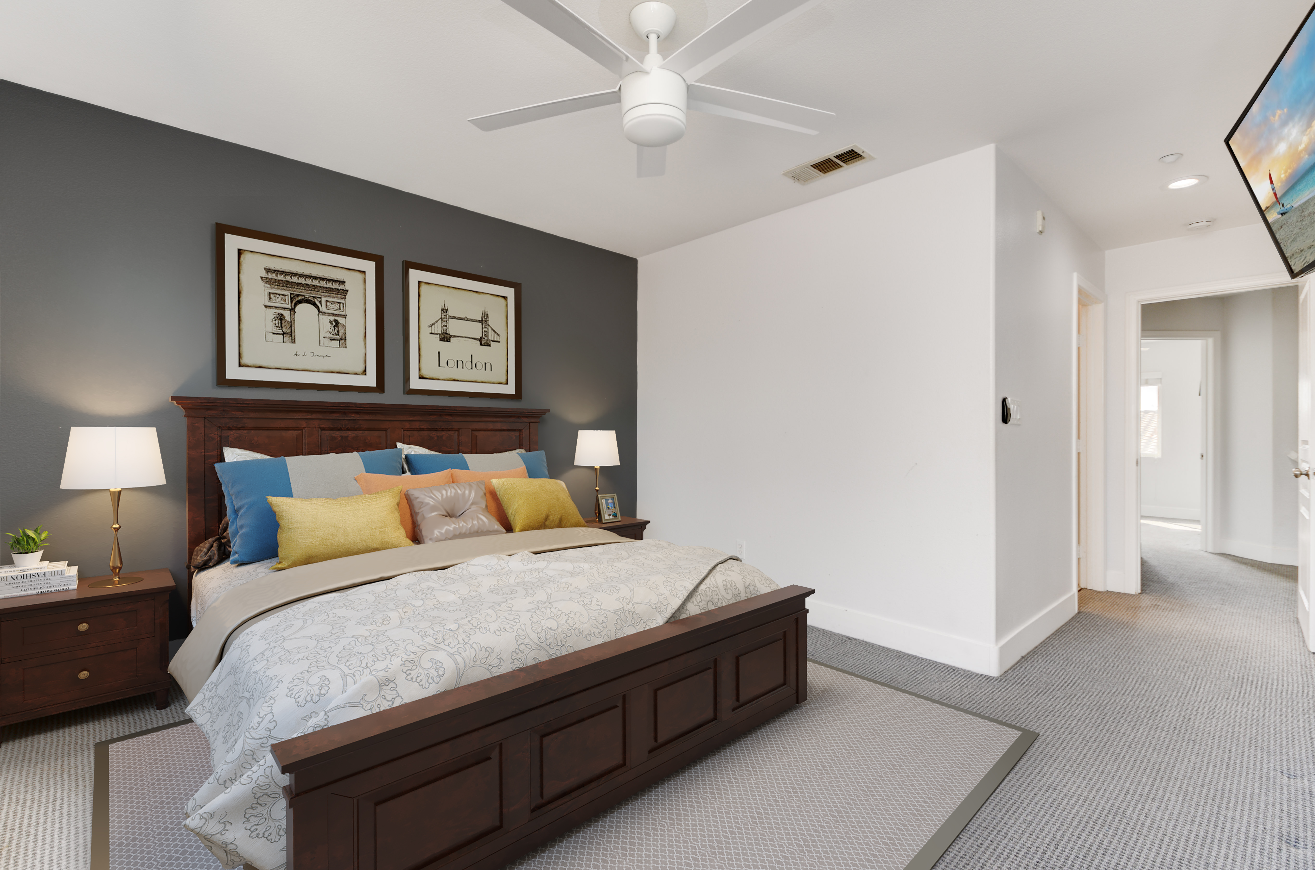
As the leaves change and the air turns crisp, it's time to usher in the cozy and inviting ambiance of fall into your home. Fall decoration trends are all about embracing the season's rich colors, textures, and natural elements to create warm and stylish living spaces. In this article, we'll explore some of the top trends that will help you infuse the spirit of autumn into your home decor.

When it comes to interior decoration, mirrors are often underestimated gems that can elevate a space in countless ways. Beyond serving as functional items, mirrors are essential tools in the decorator's arsenal, offering an array of benefits that contribute to the aesthetics and functionality of a room. In this article, we'll explore the importance of mirrors in decoration and how they can be used to enhance any space.
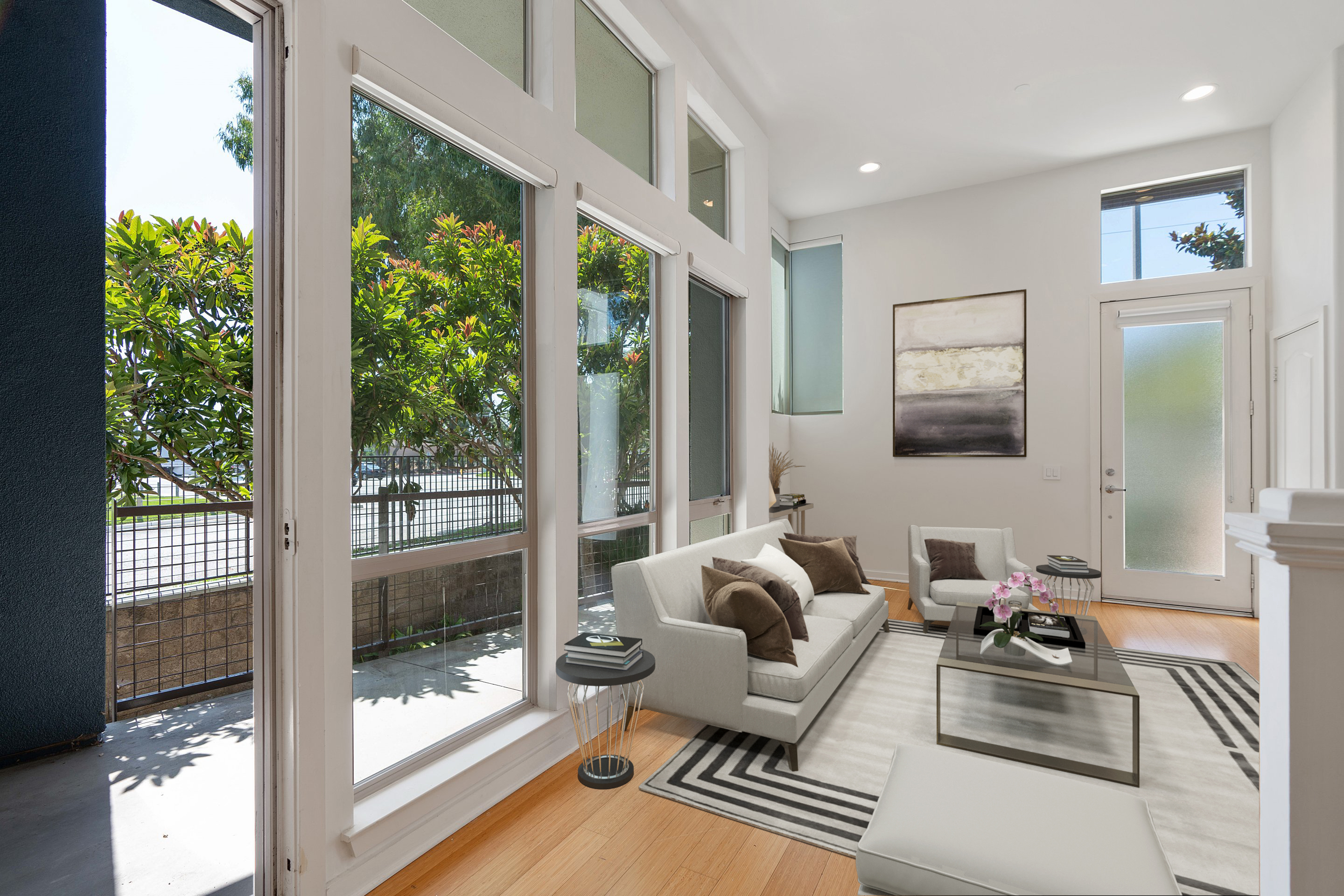
When it comes to listing a property, it's easy to focus on the obvious selling points like square footage, location, and amenities. However, there's one often-overlooked feature that can truly make a difference in a listing's appeal: the windows. In this article, we'll explore the art of showcasing windows on your property listing and why it's a game-changer in attracting potential buyers.
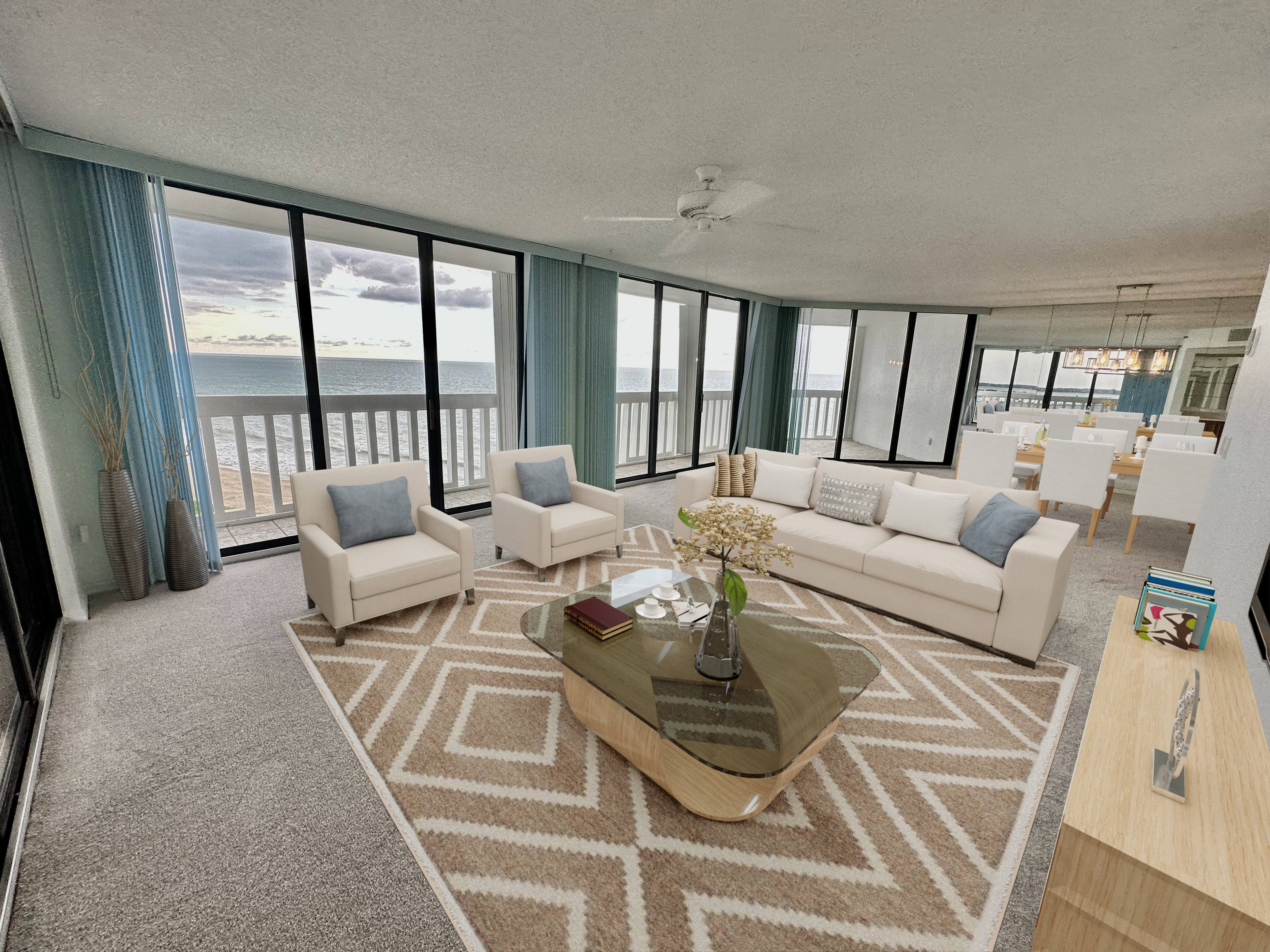
Summer is upon us, and it's time to refresh your living spaces with vibrant and inviting decor that mirrors the season's energy and warmth. Whether you're planning a complete home makeover or just looking to add some seasonal flair, we've got you covered with the top summer decoration trends that will transform your home into a sunny paradise.
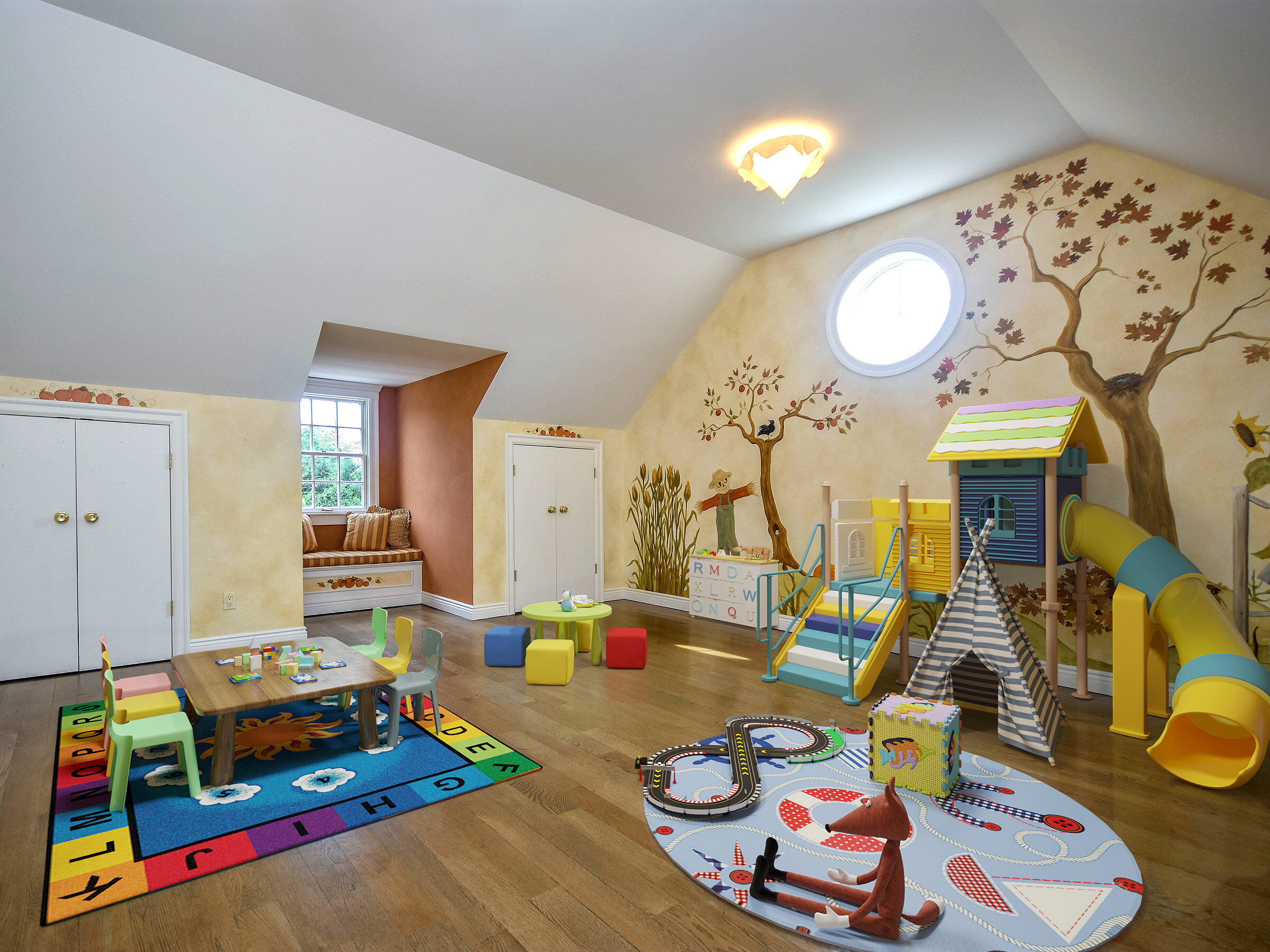
Playrooms are more than just spaces for children to explore their imagination; they are sanctuaries of creativity, learning, and fun. When it comes to designing these special spaces, there's a world of possibilities, and virtual staging adds a touch of enchantment to the process.
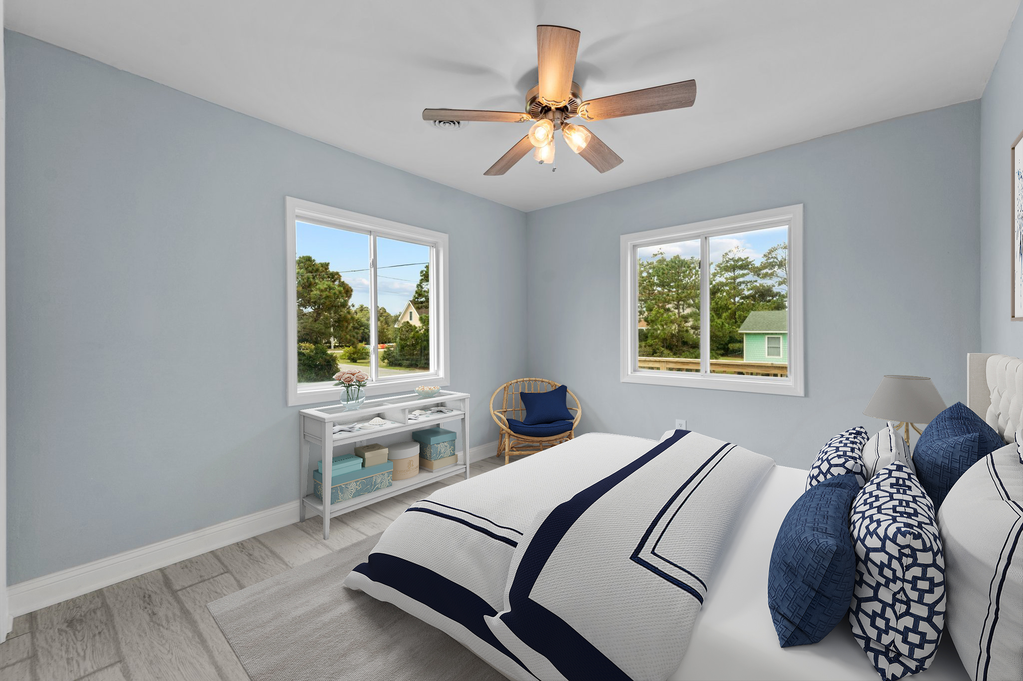
The Hamptons style is a timeless and elegant interior design trend that evokes the breezy, coastal charm of Long Island's Hamptons region. Characterized by its sophisticated yet relaxed aesthetic, achieving this look has become more accessible than ever thanks to virtual staging. In this article, we'll explore the Hamptons style and how virtual staging can help you bring this coastal beauty into your home.
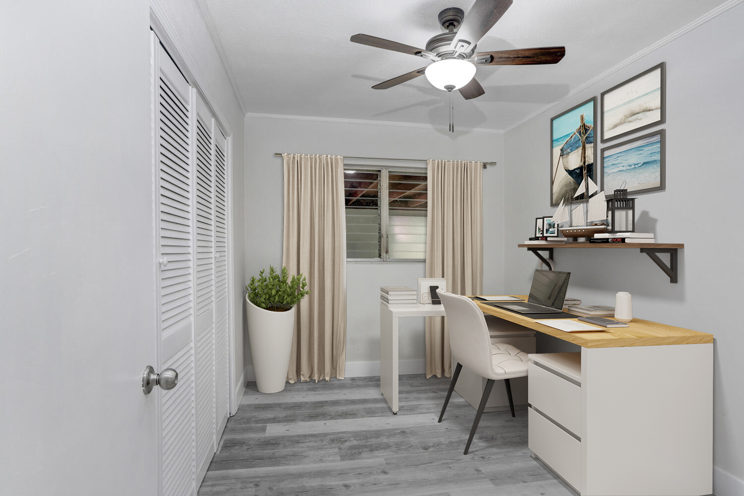
In recent years, the home office has evolved from a convenience to a necessity. As remote work continues to gain popularity, the importance of a well-designed and functional home office space cannot be overstated. In this article, we explore the latest trends and tips for creating a stylish and productive home office.

As outdoor living spaces continue to gain prominence in our lifestyles, the trends in exterior furniture and decoration are evolving to meet the demand for style, comfort, and functionality. In this article, we'll explore the latest tendencies that are transforming our gardens, patios, and balconies into enchanting extensions of our homes.
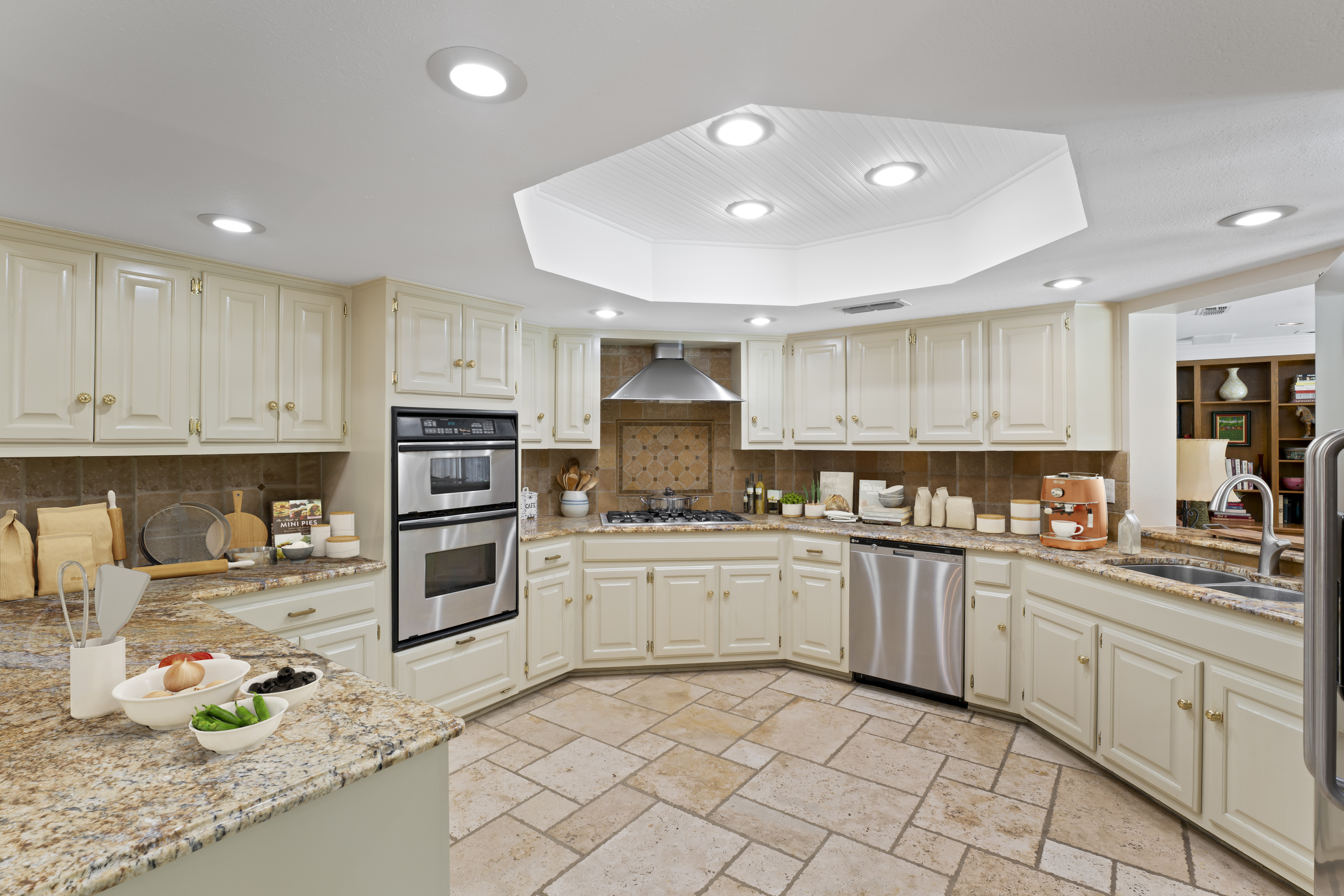
The kitchen is the heart of the home, where culinary creativity meets everyday life. In 2023, kitchen decoration trends are evolving to reflect not just functionality, but also style, sustainability, and a dash of innovation. Join us as we explore the latest trends that are transforming kitchens into the ultimate hubs of inspiration and functionality.
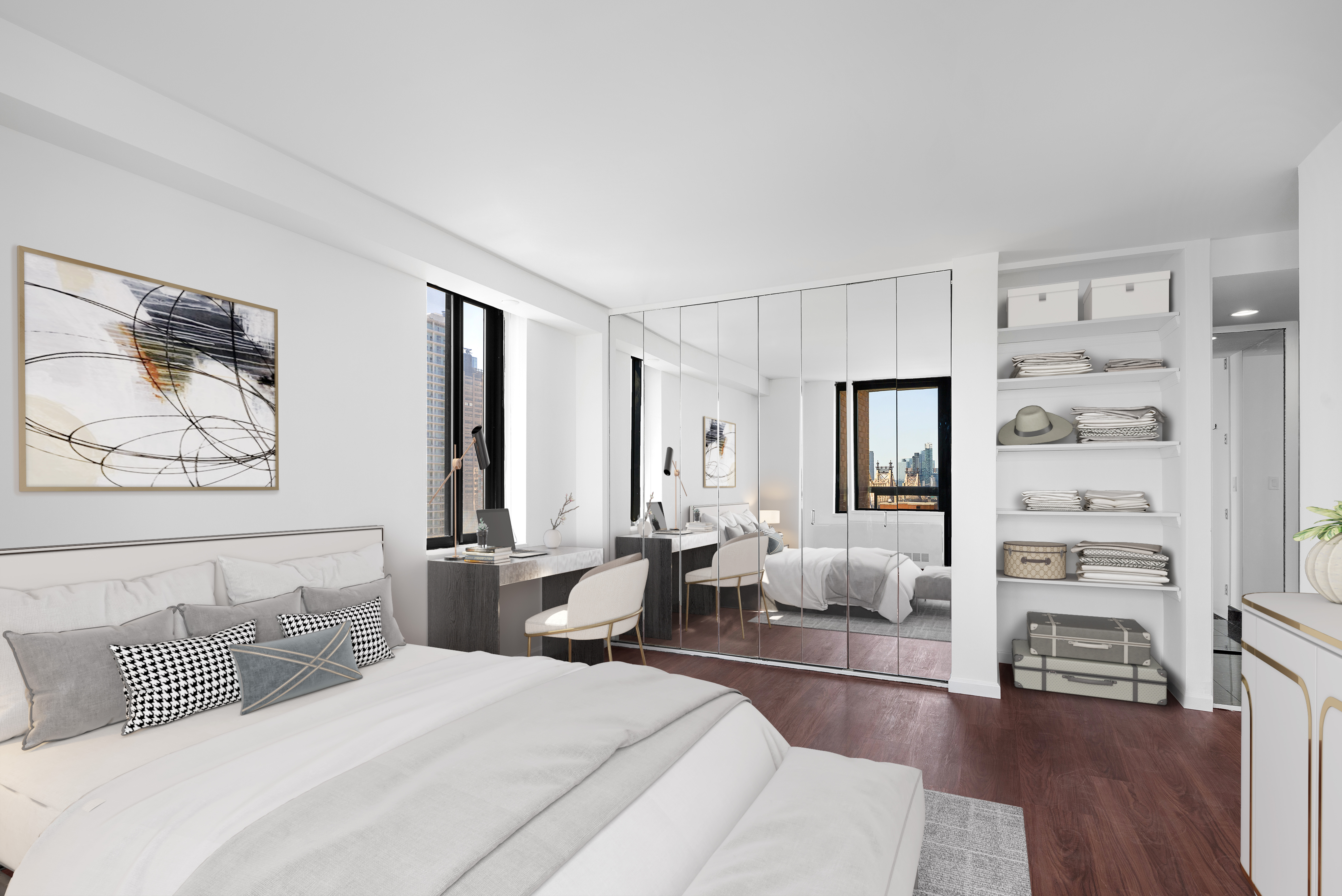
The bedroom is more than just a place to rest your head; it's your personal haven, a sanctuary of serenity where you can unwind, relax, and rejuvenate. If you're looking to transform your bedroom into a peaceful sleep sanctuary, here are some tips to help you create the perfect ambiance.
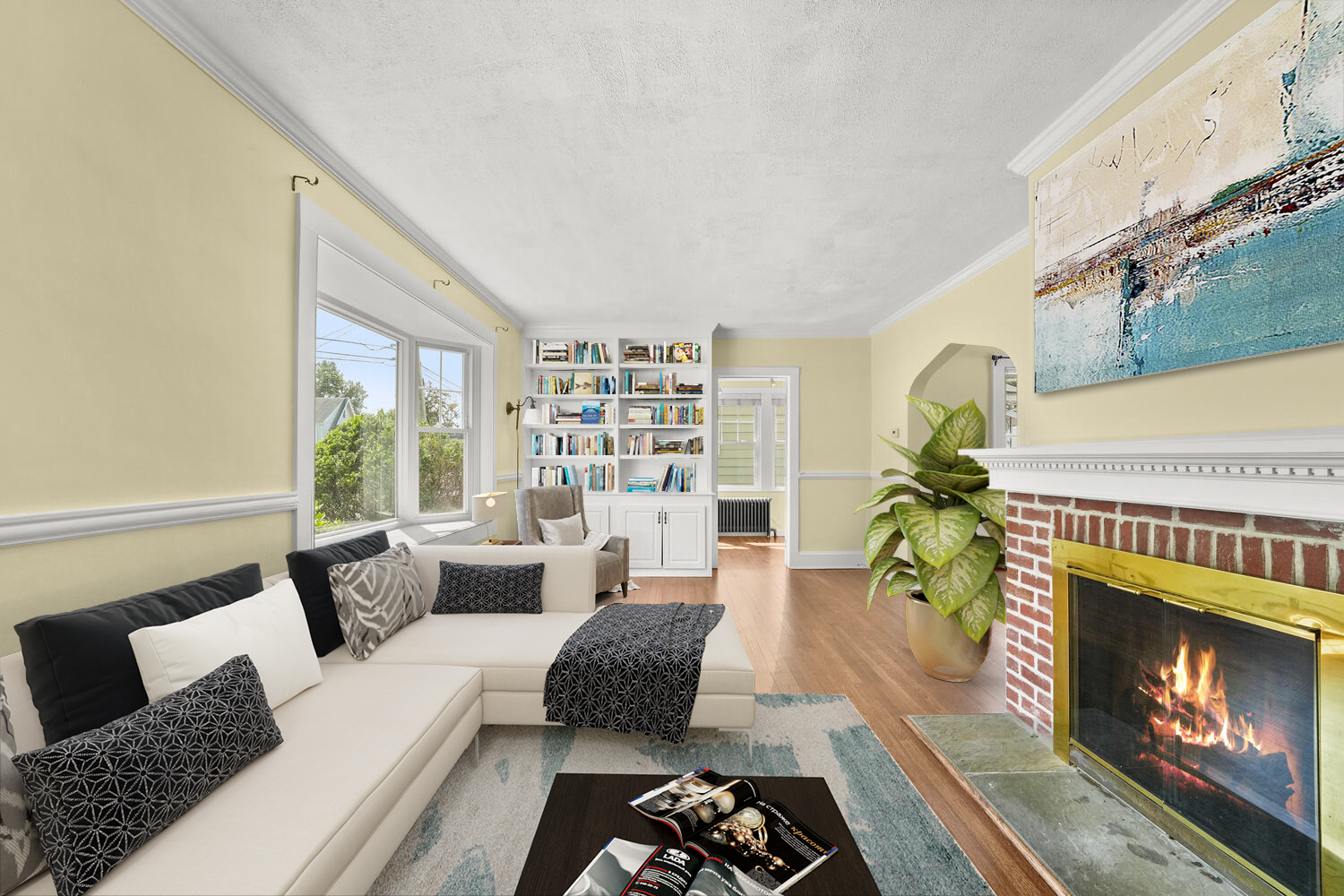
Your living room is the heart of your home—a space where comfort and style converge. As we venture into 2023, living room decoration trends are evolving to create cozy, chic, and inviting atmospheres that reflect the changing needs of homeowners. Here's a glimpse into the living room trends that are shaping the year ahead.

In an age where environmental consciousness is more critical than ever, sustainable interior design has taken center stage. Homeowners are increasingly seeking ways to reduce their carbon footprint and create greener, more eco-friendly living spaces. Here, we explore the principles of sustainable interior design and how you can infuse your home with eco-friendly decor for a greener and more sustainable future
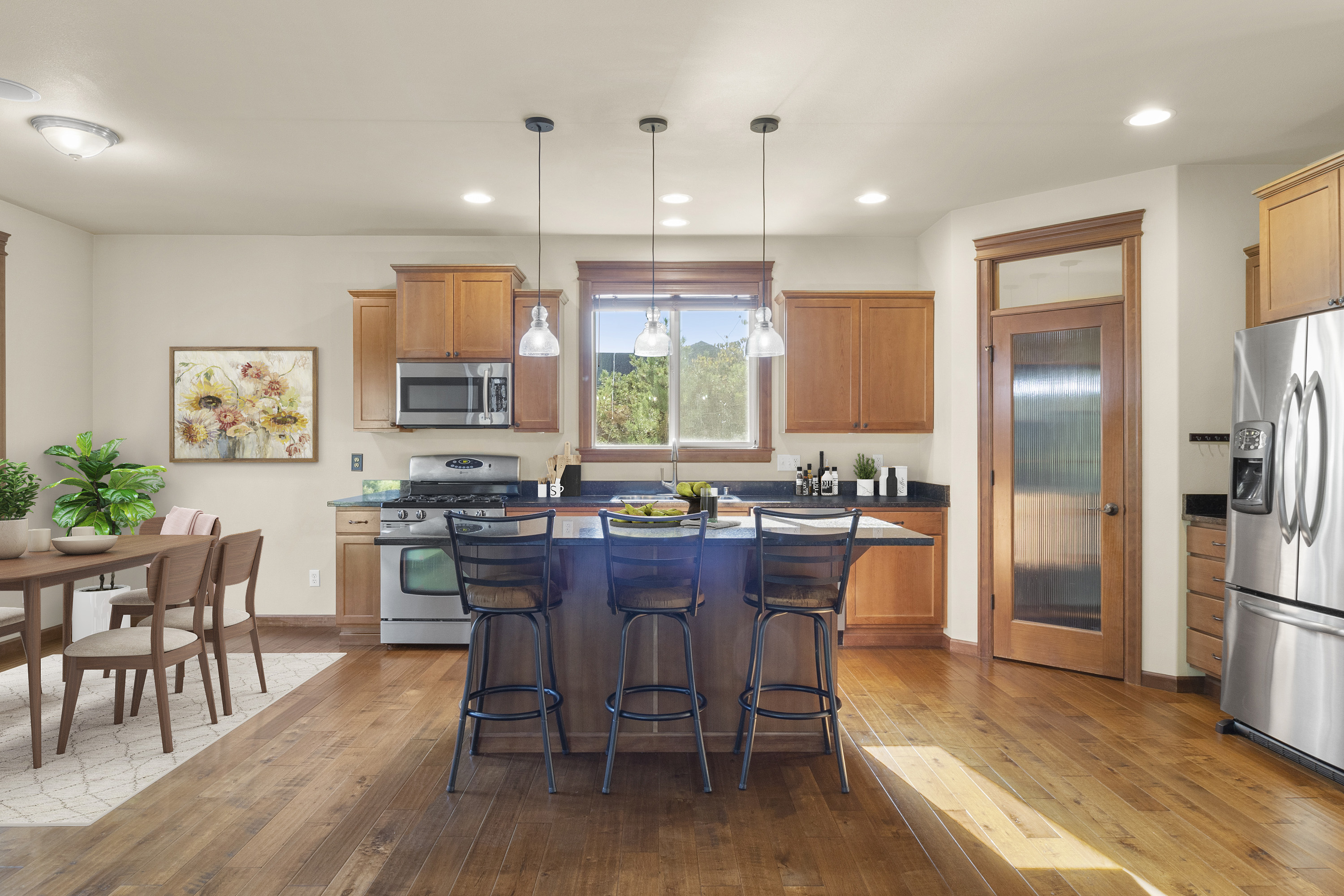
The kitchen is often referred to as the heart of the home, and for good reason. It's where meals are prepared, conversations flow, and memories are made. If your culinary space is in need of a refresh, a kitchen makeover can work wonders. Let's explore how you can transform your kitchen into a functional and stylish hub of creativity.

As the boundaries between indoor and outdoor living continue to blur, creating an outdoor oasis has become a sought-after project for homeowners. Whether you have a sprawling backyard or a cozy balcony, designing your dream patio or garden is a delightful endeavor that transforms your outdoor space into a haven of relaxation, entertainment, and natural beauty.
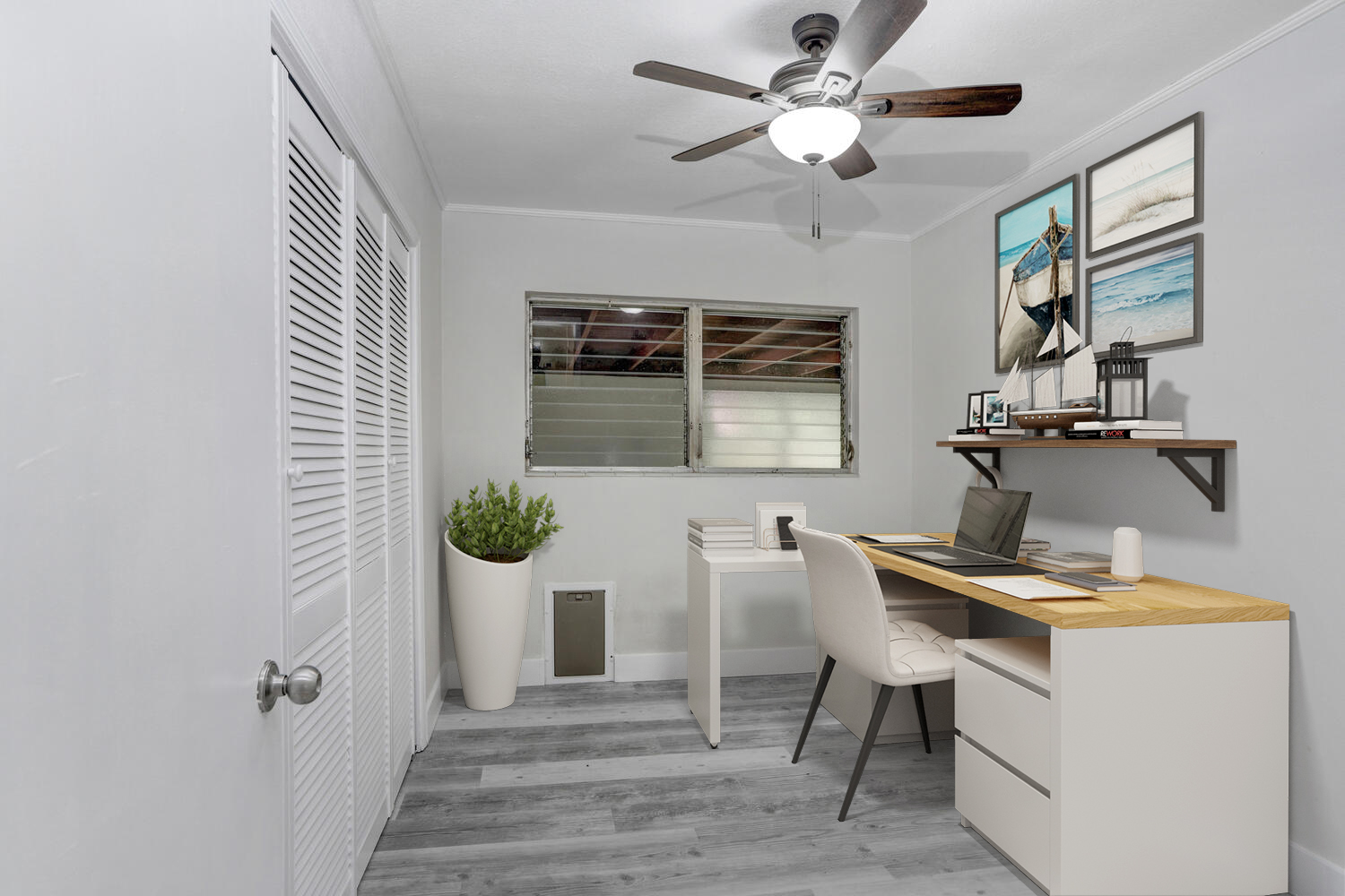
As remote work continues to be a prominent aspect of our lives, designing a productive home office space is more important than ever. A well-designed home office not only boosts productivity but also enhances your overall work experience. Whether you're revamping an existing space or creating a new one, here are some tips to help you design a workspace that inspires creativity and efficiency.
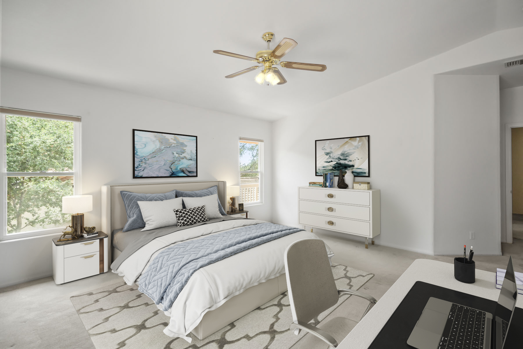
As winter sets in and the temperatures drop, it's the perfect time to infuse your home with colors that exude warmth, comfort, and elegance. Embracing the right color palette can transform your interior spaces, making them feel inviting and cozy during the colder months. Here are the top color trends for interior design this winter that will help you create a stylish and comforting atmosphere.
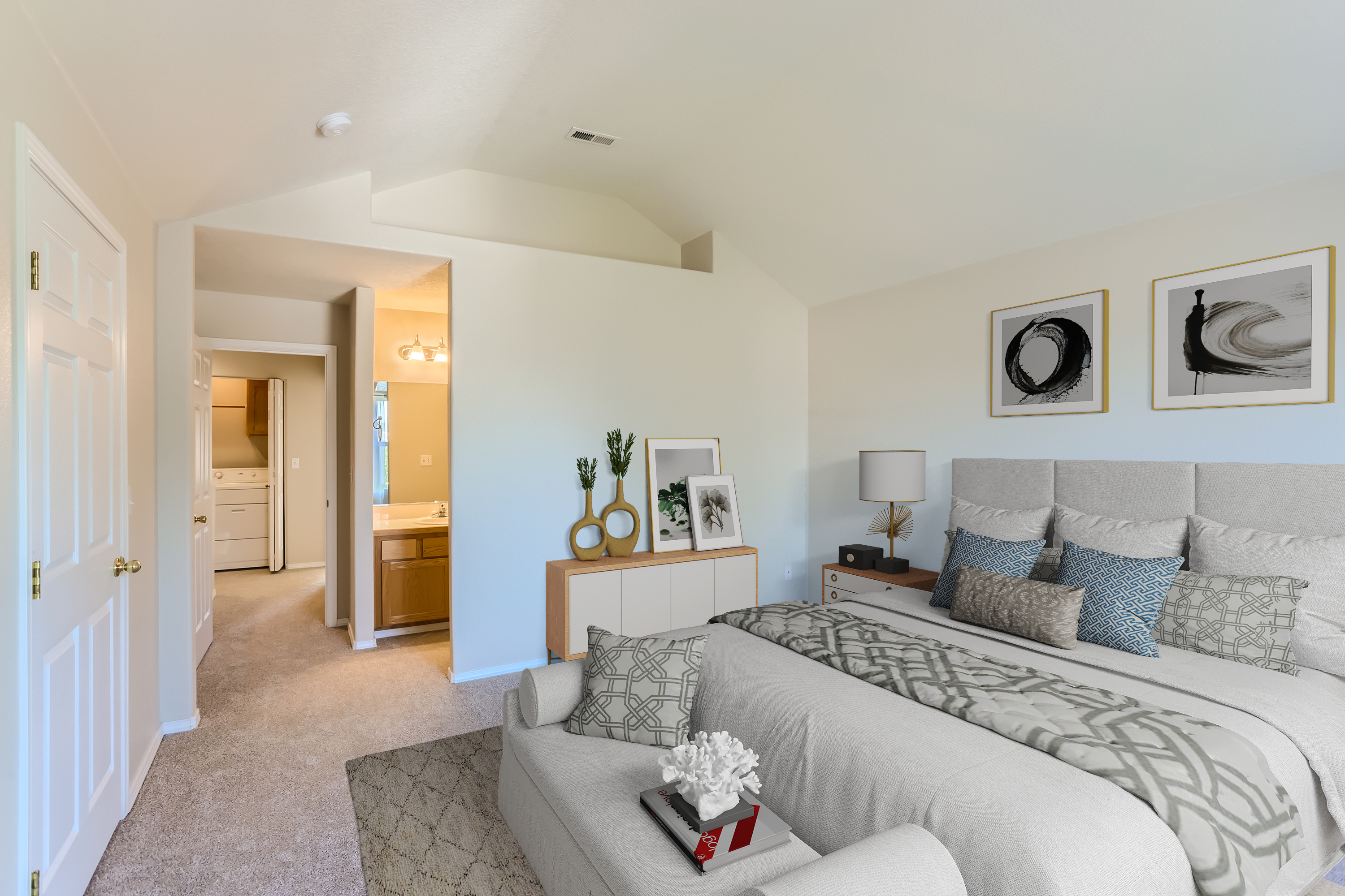
In the fast-paced world of real estate, first impressions are everything. Potential buyers or renters often make snap judgments about a property based on its online listing. This makes the role of professional listing writing in the real estate industry more crucial than ever. Here, we explore the numerous benefits of enlisting the services of a skilled writer to craft your property listings.
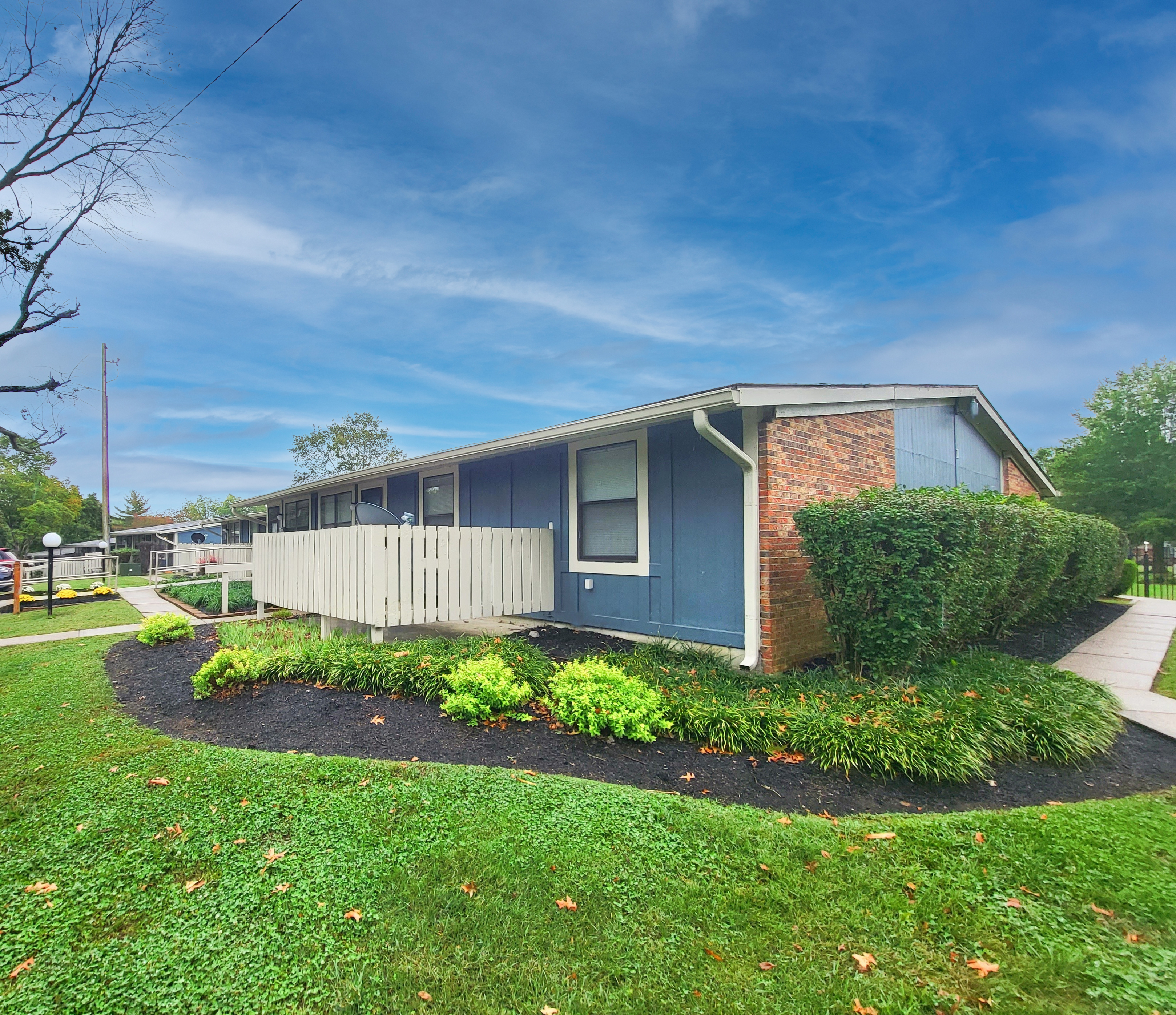
First impressions matter, especially in the world of real estate. When it comes to selling or renting a property, the exterior is your property's first opportunity to captivate potential buyers or renters. Enhancing the outside of a property can significantly impact its curb appeal and overall perceived value. In today's digital age, virtual services like true blue sky, virtual twilight, and virtual landscape services play a pivotal role in transforming the way properties are presented to the market.
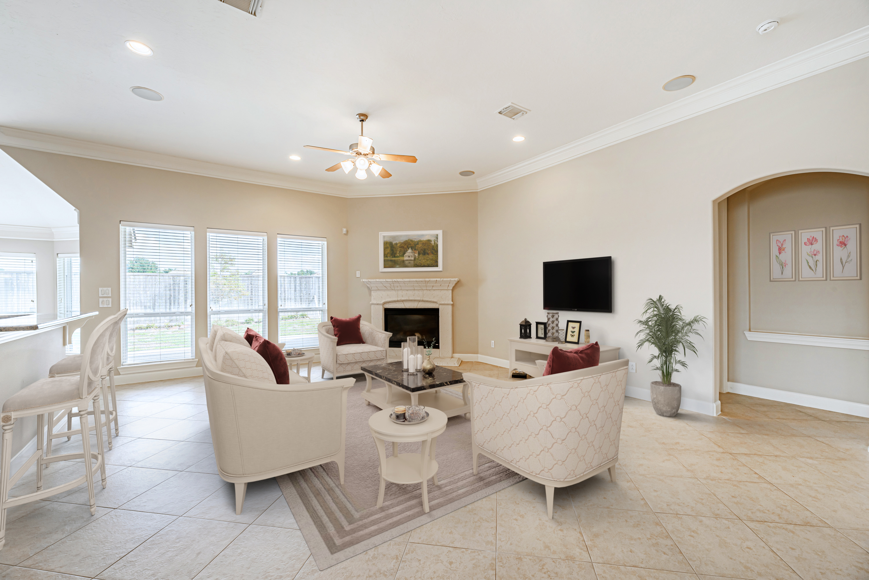
In the ever-evolving world of interior design and home decor, traditional furniture styles stand as timeless icons of elegance and charm. These classic design aesthetics have endured the test of time, bringing a sense of history, sophistication, and comfort to homes. In this article, we'll delve into various traditional furniture styles and also explore how virtual staging can breathe new life into these beloved designs.
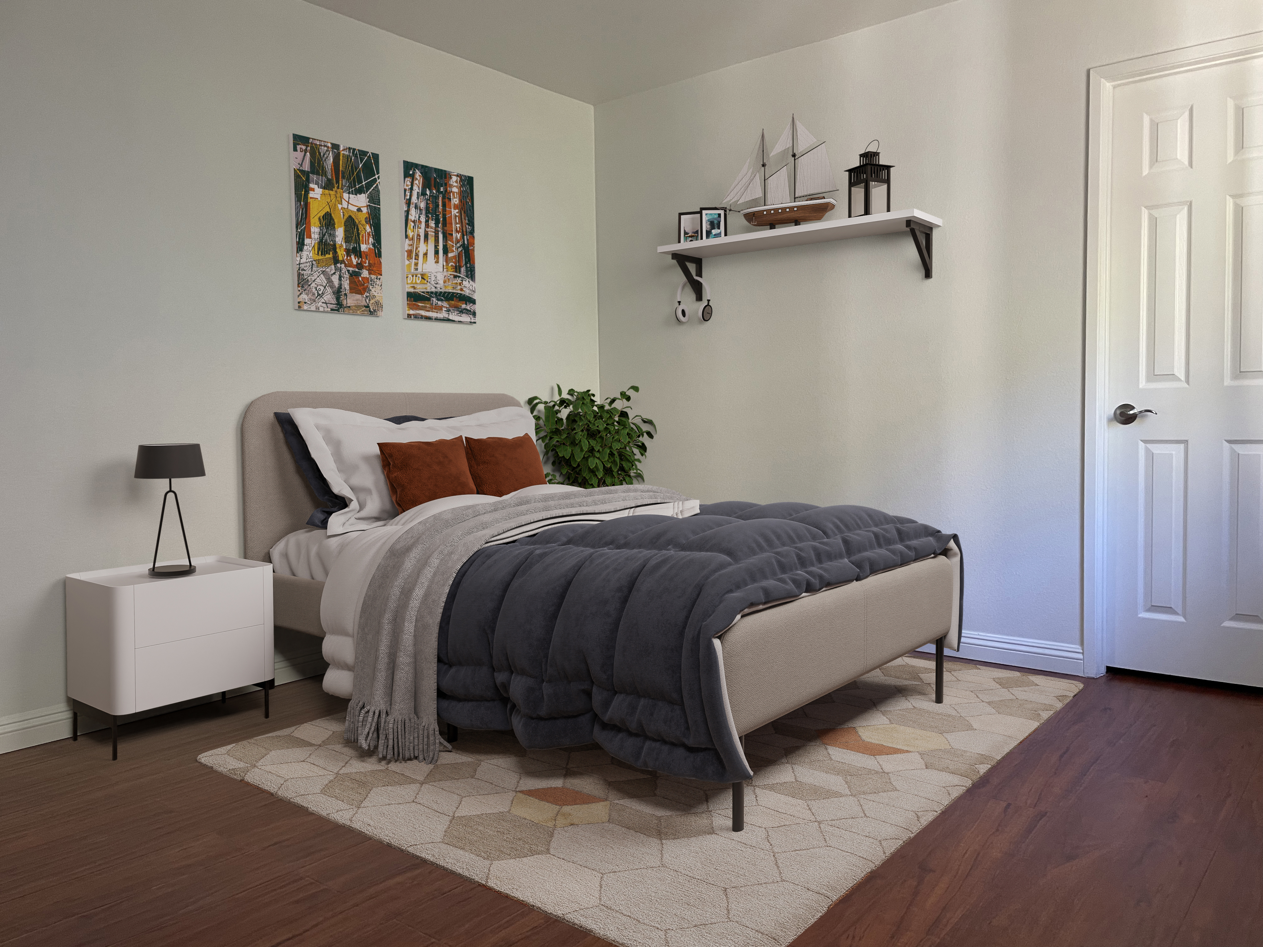
Small bedrooms may lack square footage, but they certainly don't lack potential. With the right design and decor choices, you can transform a compact sleeping space into a cozy, stylish, and functional retreat. In this article, we'll explore some expert tips for decorating small bedrooms, making the most of every inch.
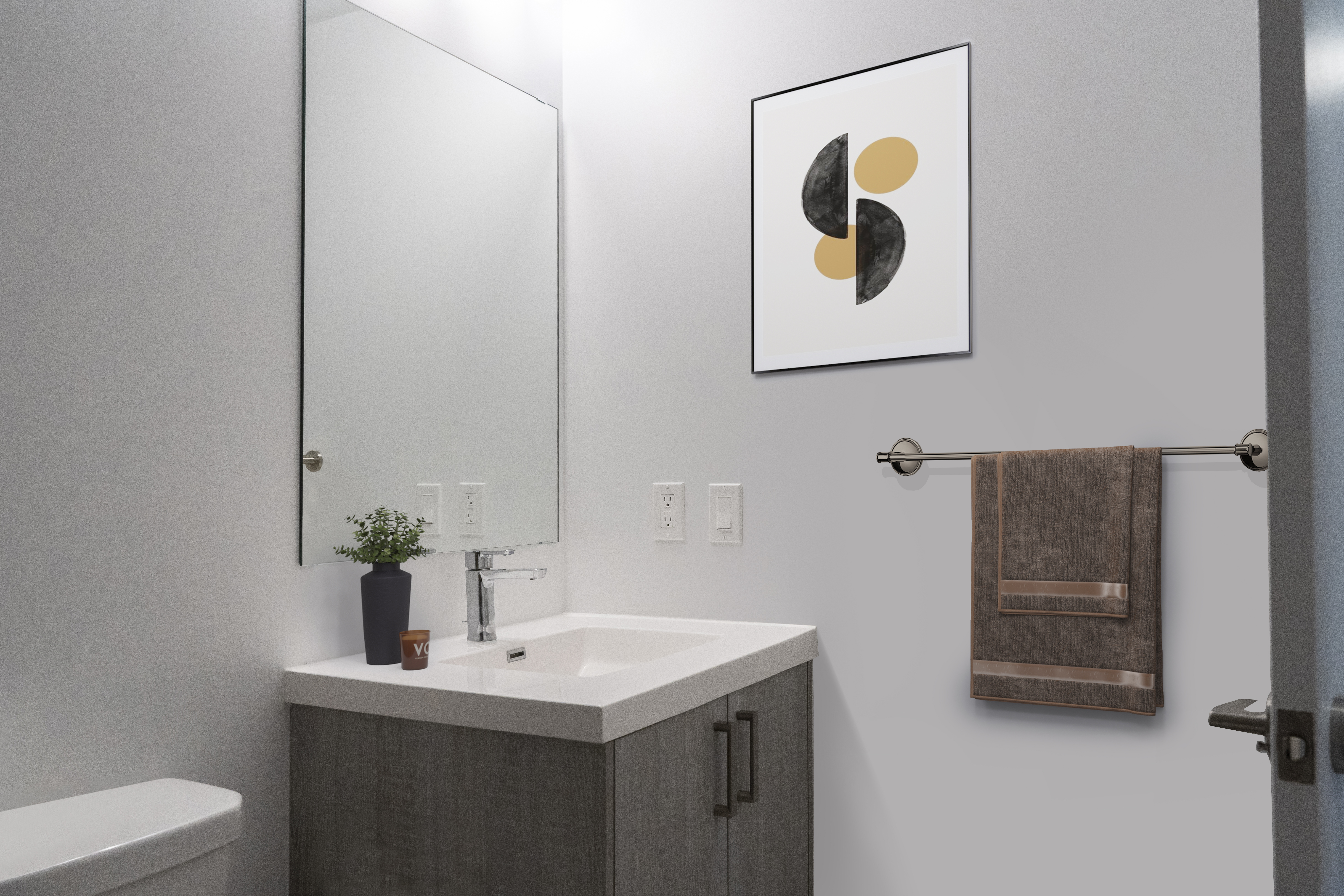
The bathroom is more than just a functional space; it's a sanctuary where you begin and end your day. Decorating your bathroom can transform it into a place of relaxation, rejuvenation, and style. Whether you're planning a complete bathroom overhaul or just a refresh, here are some decoration ideas to help you create a beautiful and functional bathroom.
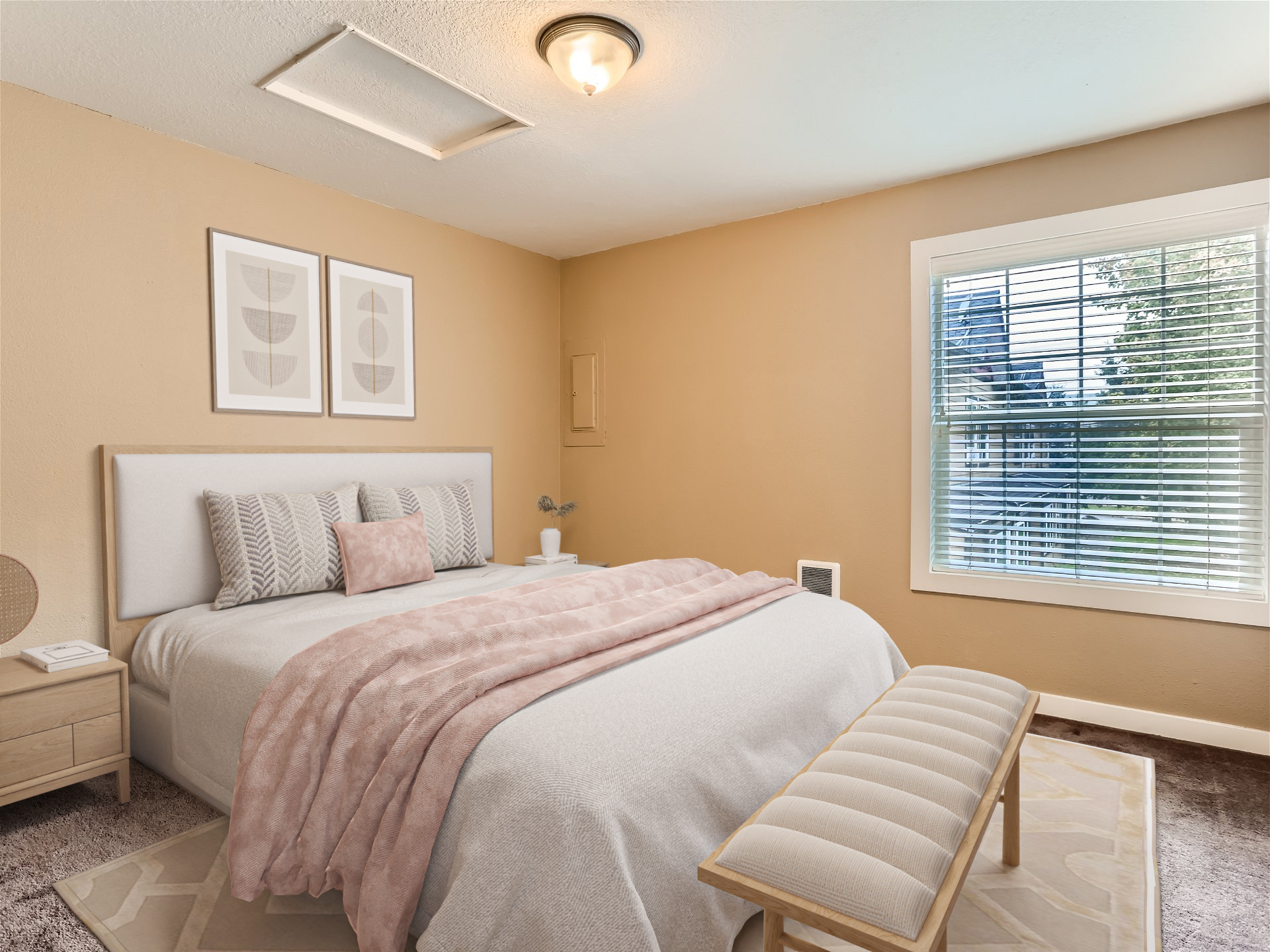
In the dynamic world of digital marketing, where attention spans are shorter than ever, the ability to capture your audience's attention and hold it is a precious commodity. One of the most effective ways to achieve this is through the art of visual storytelling. By weaving compelling narratives with visually appealing content, you can boost engagement and leave a lasting impression on your target audience. In this guide, we will explore the immense power of visual storytelling and provide you with practical strategies to harness it for your brand's success.
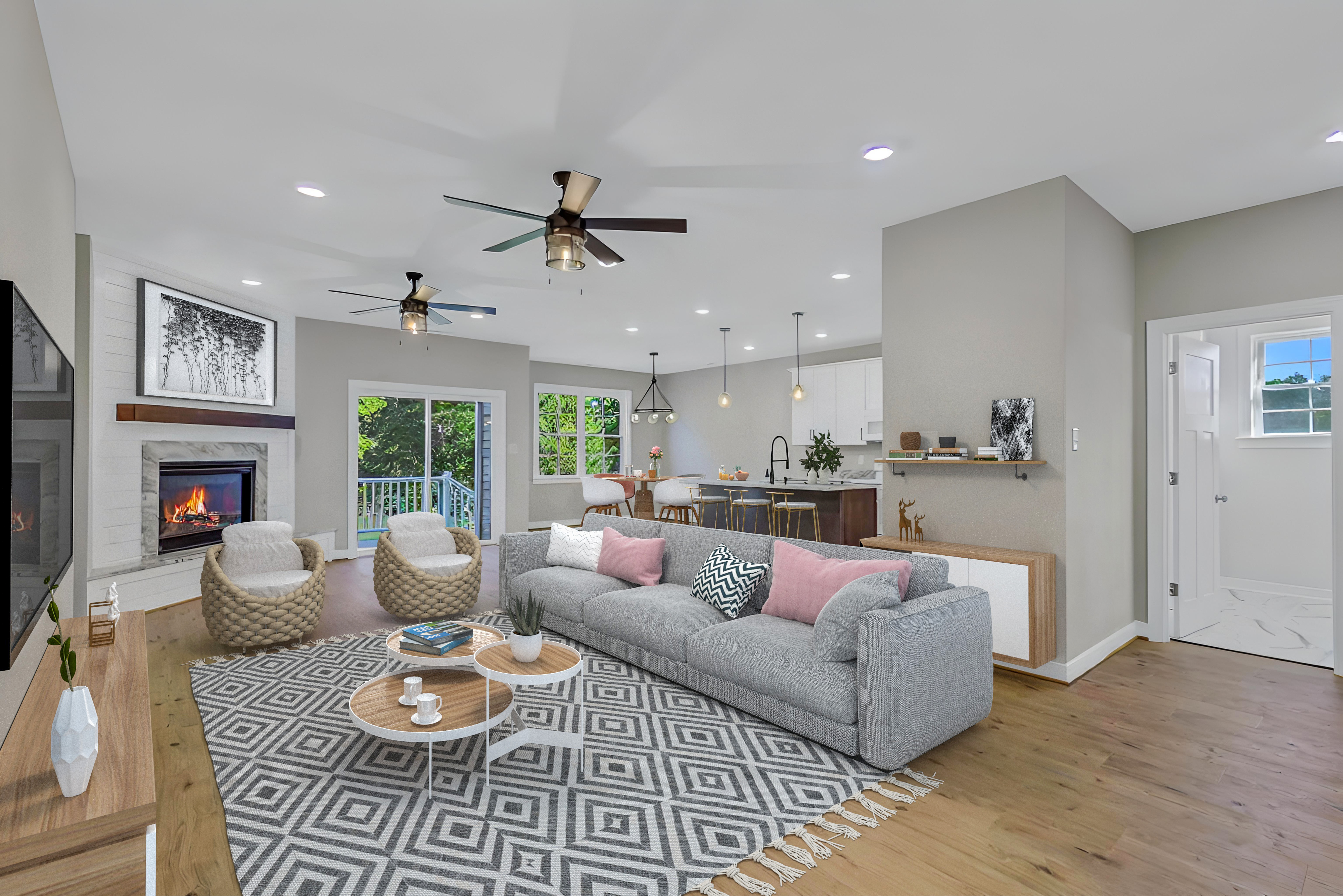
As the calendar turns, our homes often undergo magical transformations to embrace the spirit of various festivities. Whether it's the spooky charm of Halloween, the cozy warmth of Christmas, or the glitz and glamour of New Year's Eve, our living spaces can be the canvas for creating unforgettable memories. In this article, we'll explore how to elevate your home decoration for these special occasions, blending creativity and seasonal charm. Get ready to deck the halls, light up the jack-o'-lanterns, and ring in the New Year in style!
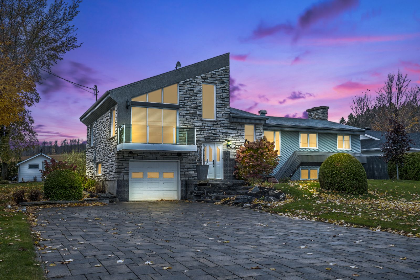
Selling a property can be a bewitching experience, especially when you tap into the spirit of the season. Halloween provides a unique opportunity to infuse your home with charm, creativity, and a touch of spookiness to captivate potential buyers. In this article, we'll explore how to use Halloween-inspired decoration to create an enchanting atmosphere and entice prospective homeowners into falling under your property's spell.
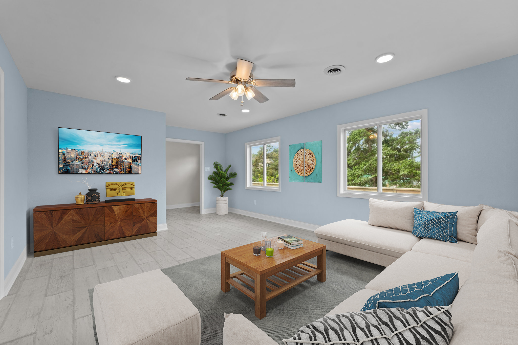
Are you dreaming of transforming your home into a serene and elegant sanctuary that exudes coastal charm and timeless beauty? Look no further than the Hamptons furniture style, a design trend that has been captivating homeowners and interior enthusiasts for decades. In this blog post, we will dive deep into the world of Hamptons furniture style decoration, exploring its origins, key elements, and how to incorporate this classic, yet contemporary style into your living space.
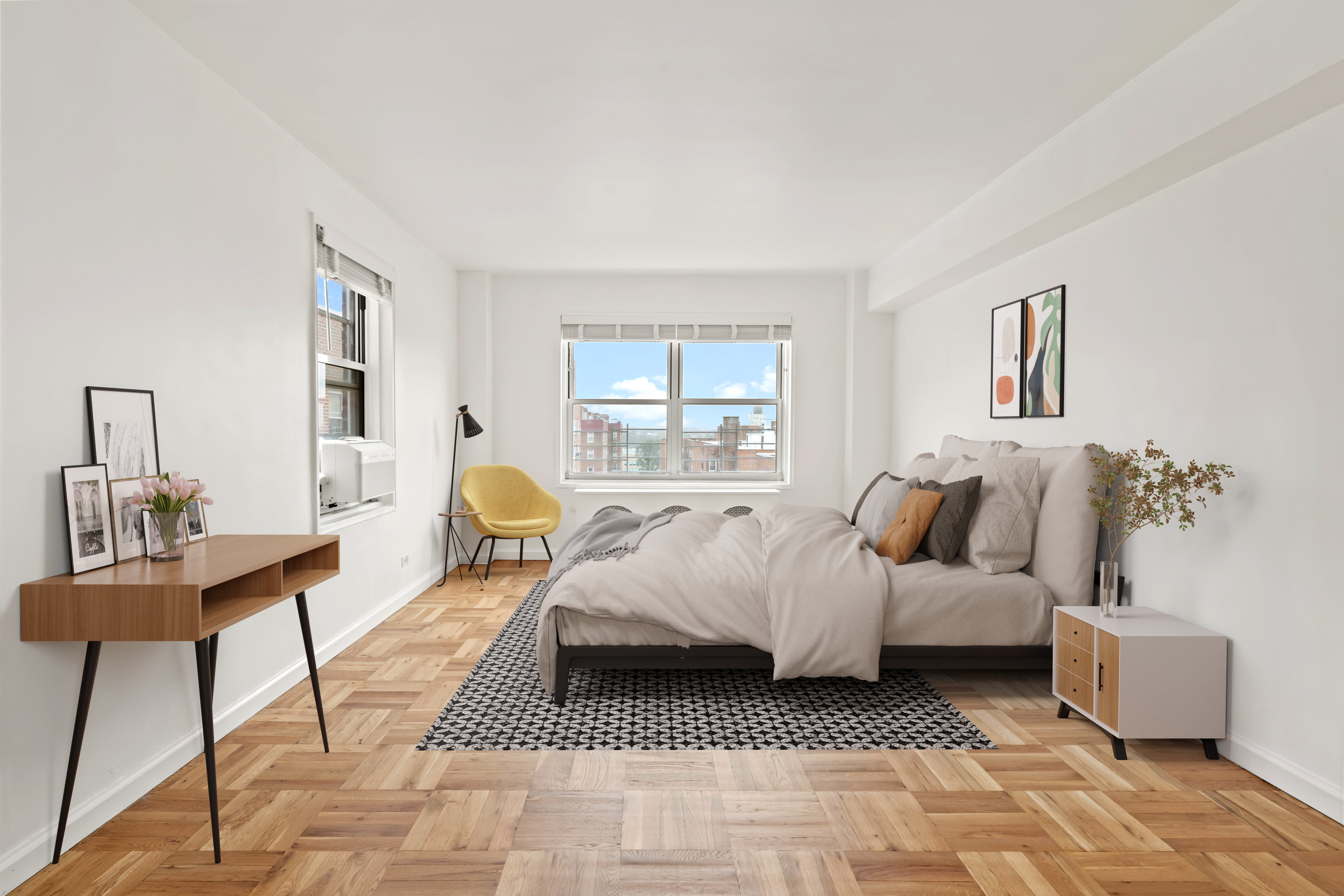
Staging a bedroom for a property listing is an art form that can make or break a sale. A beautifully staged bedroom can stir emotions and create a lasting impression on potential buyers. A crucial element of this process is selecting the right bedspread. In this article, we'll delve into the importance of bedspread selection when staging a bedroom for a listing and how it can elevate your property's appeal in the eyes of prospective buyers.
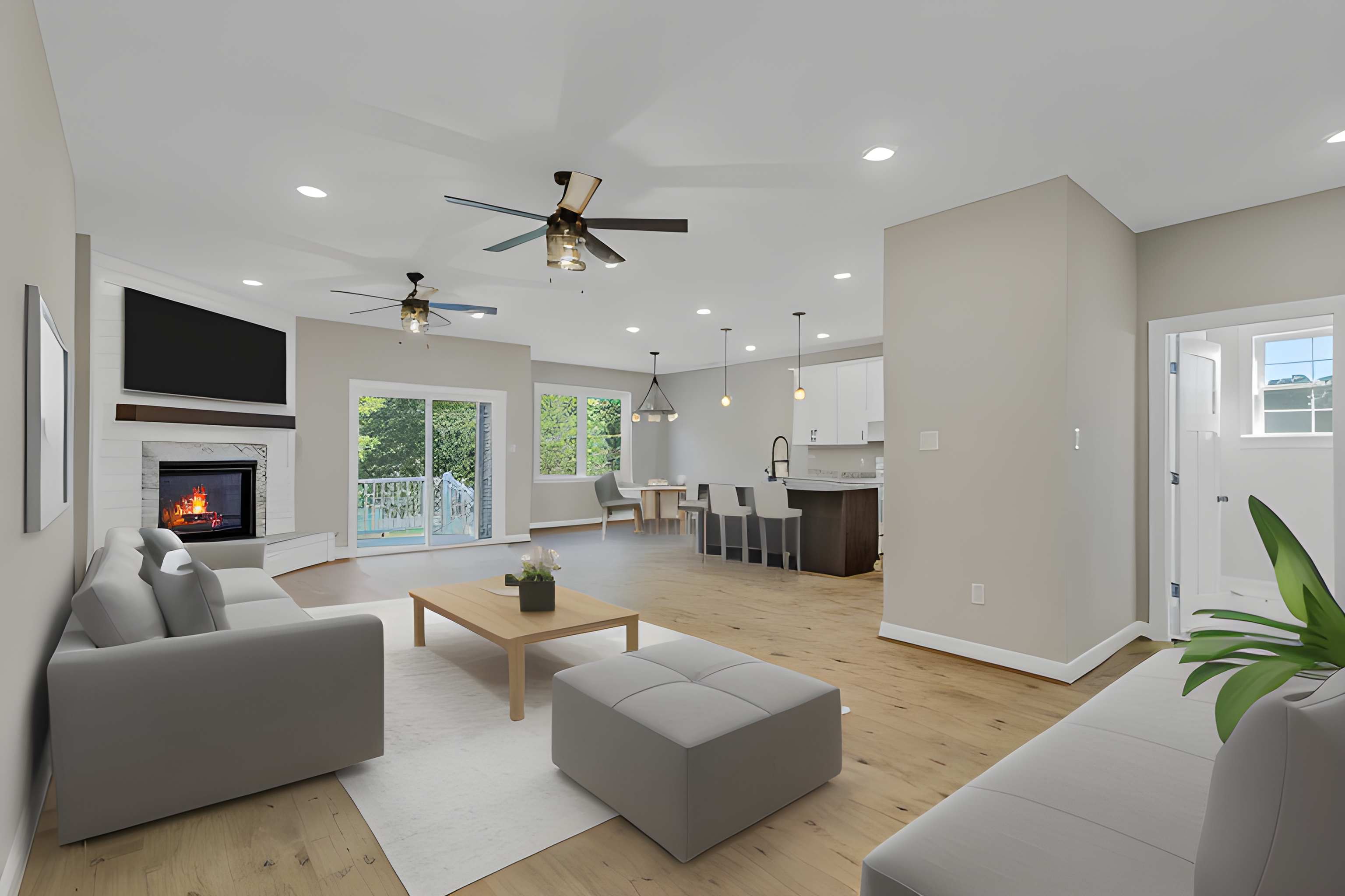
Creating a sense of cohesion and flow in your home's interior design is a key element in achieving a harmonious and inviting living space. One way to achieve this is by integrating different rooms with matching decoration. When done thoughtfully, this approach can make your home feel more interconnected and visually pleasing. In this article, we'll explore the strategies and tips for seamlessly harmonizing your home's various rooms through cohesive decor.
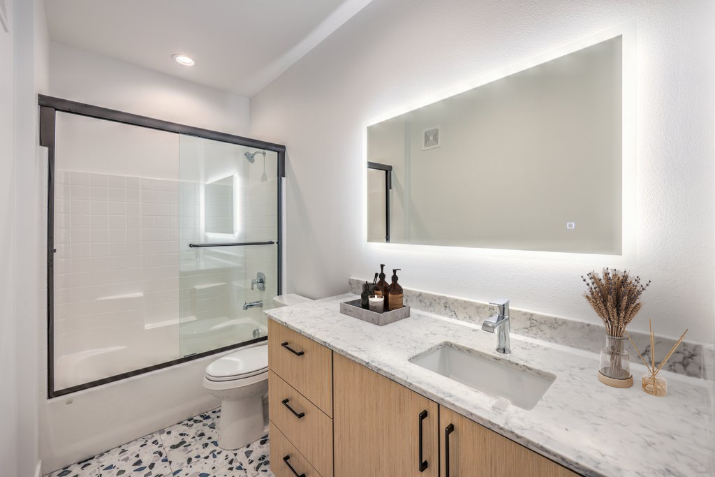
The bathroom is more than just a functional space; it's a sanctuary where you begin and end your day. Decorating your bathroom can transform it into a place of relaxation, rejuvenation, and style. Whether you're planning a complete bathroom overhaul or just a refresh, here are some decoration ideas to help you create a beautiful and functional bathroom.
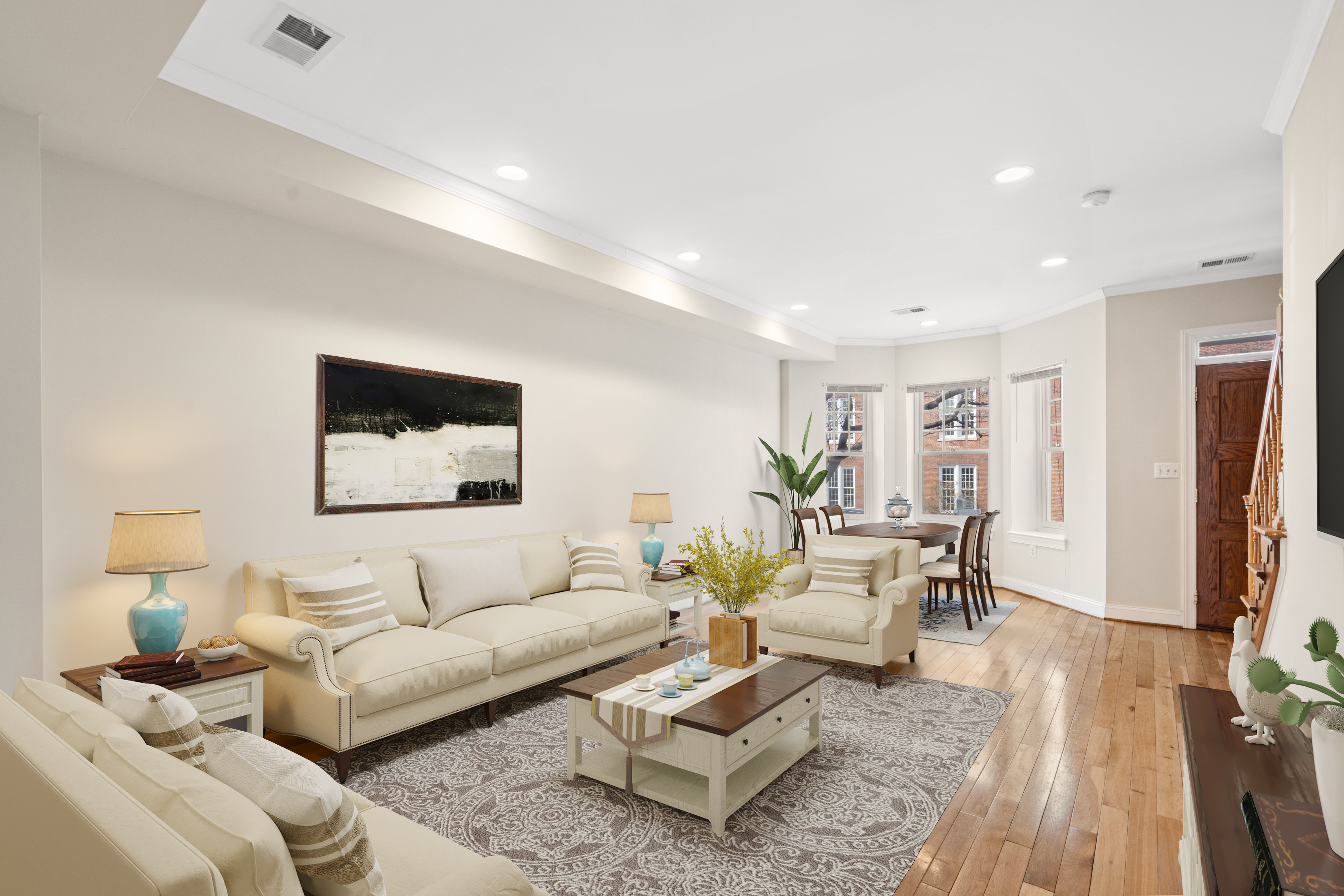
In the world of interior design, embracing a mix of different furniture styles can result in a captivating and distinctive aesthetic. When it comes to staging a property for listing, the art of combining diverse furniture styles adds personality, charm, and a sense of curated eclecticism. Here's a guide on how to expertly mix and match furniture to create a one-of-a-kind decor style that resonates with potential buyers.
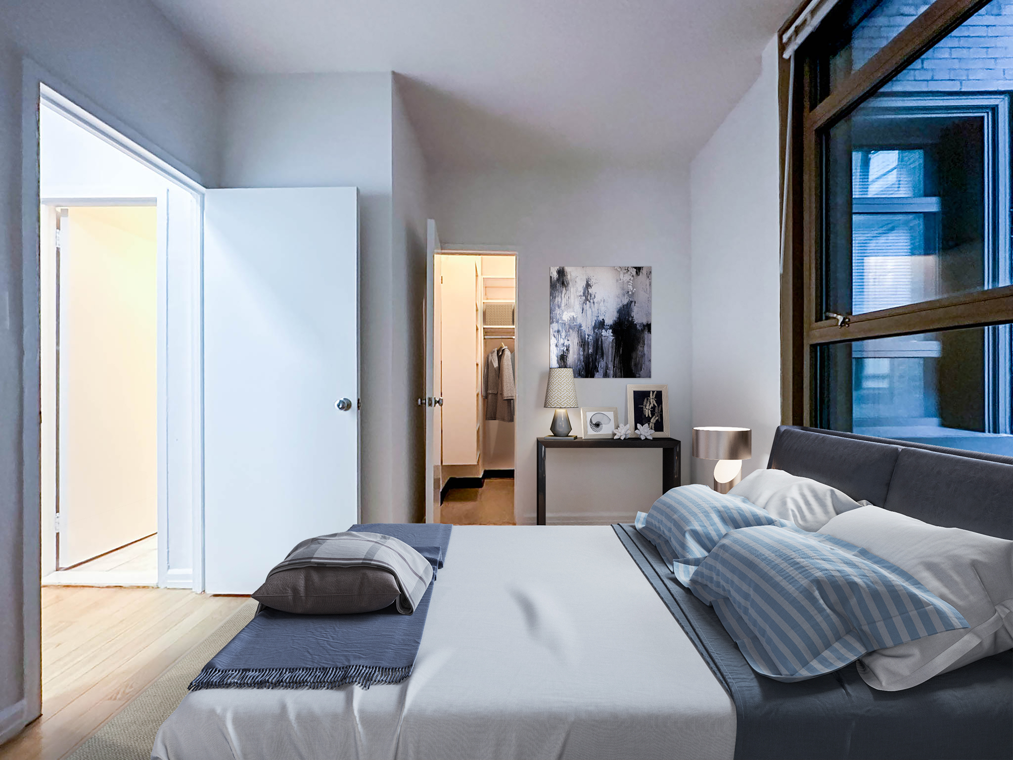
In the world of interior design, color plays a pivotal role in shaping the mood and atmosphere of a space. While warm colors bring energy and vibrancy, cold colors, such as blues, greens, and purples, offer a unique set of benefits, particularly when applied to bedrooms. Let's explore the advantages of incorporating cold colors into your home decor.
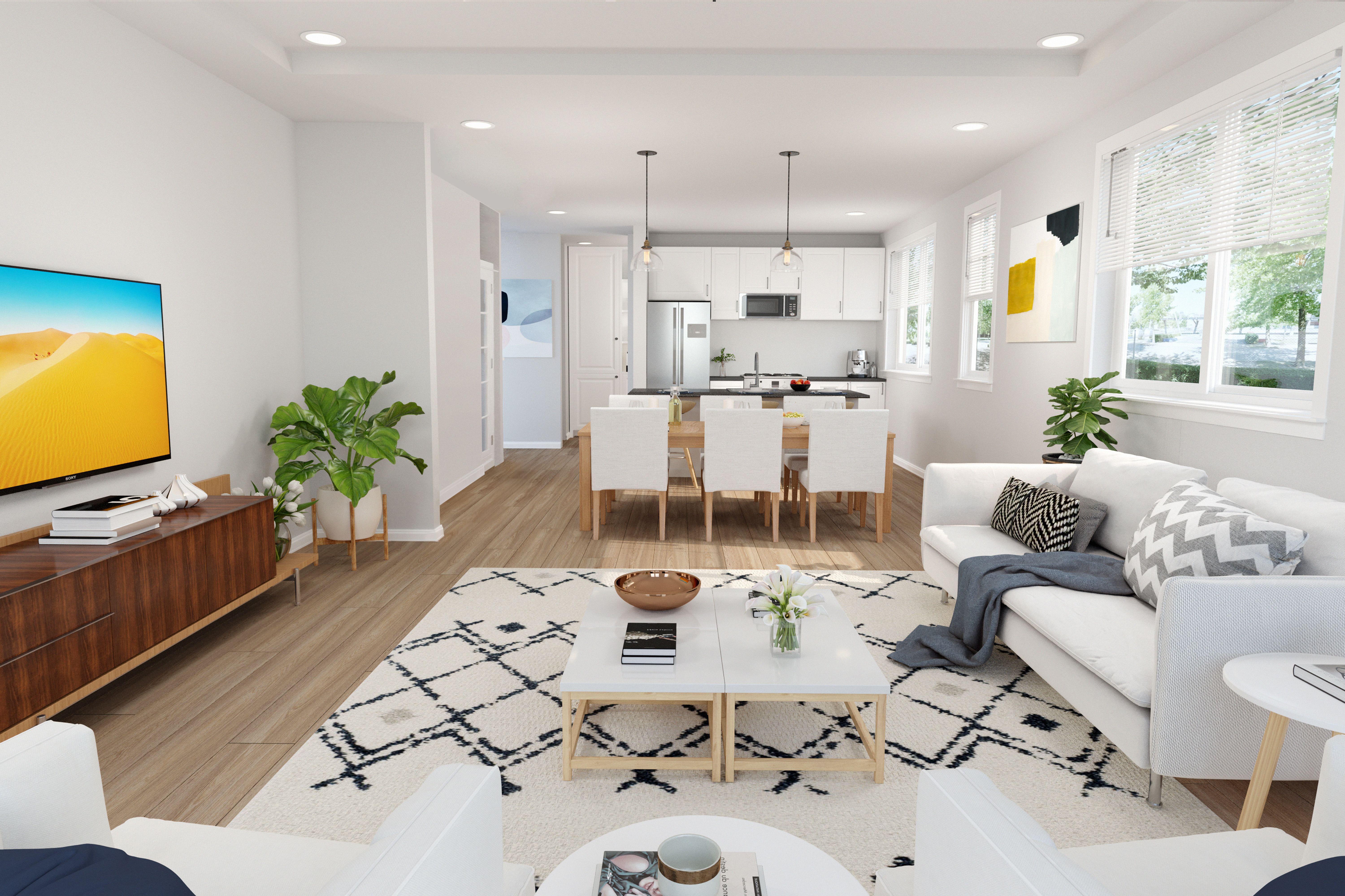
In the dynamic realm of real estate, the magic of virtual rendering has become a game-changer, offering a transformative experience for both buyers and sellers. As we celebrate the one-year milestone of virtual rendering's prominence in the real estate business, let's delve into the enchanting world of property visualization and explore the tangible benefits it brings to this ever-evolving industry.
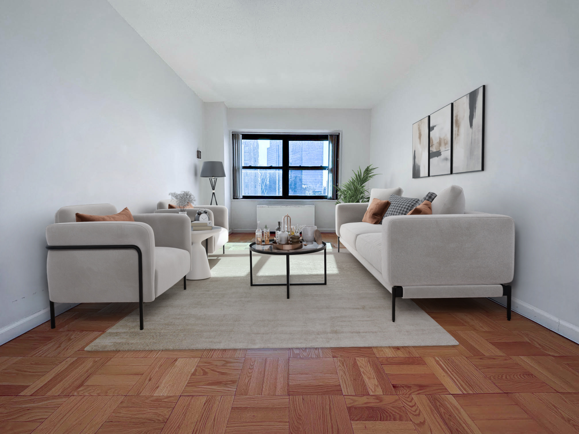
As December unfolds its festive charm, the real estate industry gears up for a unique window of opportunity. Contrary to common belief, listing homes during this holiday season can be a strategic move, offering a range of advantages for both sellers and real estate professionals. In this article, we explore the reasons why December is an opportune time to showcase homes on the market, with a special focus on the magic of virtual staging.
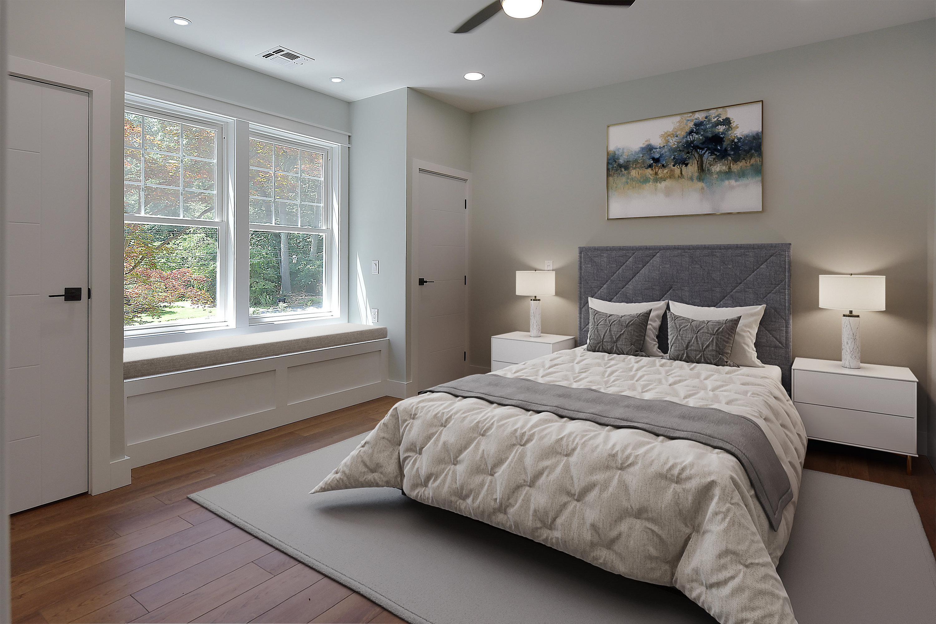
In the dynamic world of real estate, trends come and go, but some endure the test of time. One such enduring trend that has been making waves in the realm of interior design and property listings is the use of gray scales. Beyond being a mere color choice, the incorporation of varying shades of gray brings a timeless and sophisticated elegance to spaces, offering a host of benefits for both property sellers and real estate professionals.
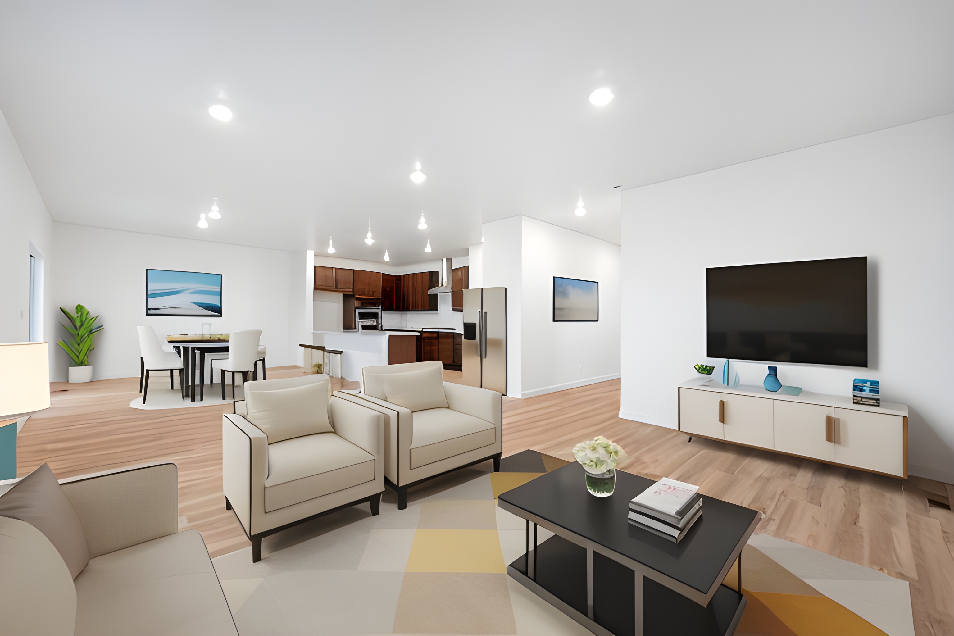
As we step into the future, the world of interior design and furniture evolves, bringing forth new styles and trends that capture the essence of contemporary living. 2024 promises to be a year of creativity and innovation, with furniture trends reflecting a harmonious blend of modern aesthetics, sustainability, and a nod to timeless design principles. In this article, we explore the key furniture style trends set to dominate homes and spaces in the coming year.

As the year comes to a close, there's no better way to welcome the possibilities of the upcoming year than by transforming your home into a festive haven. New Year's Eve is a time for celebration, and the latest decoration trends for 2024 promise to infuse your space with style, flair, and a touch of glamour. In this article, we'll explore the trends that will elevate your New Year's Eve house decor and create an unforgettable atmosphere for welcoming the new year.

In the competitive landscape of real estate, making a strong first impression is crucial, and it often begins with the exterior of a property. Virtual staging has become a powerful tool for transforming a house's visual appeal, but its significance extends beyond just the interior. Regardless of the season, exterior virtual staging plays a pivotal role in enhancing a listing and attracting potential buyers. In this article, we'll delve into the year-round importance of virtual staging for the exterior of your property.

In the bustling real estate market of Chicago, where architectural marvels meet the city's rich history, a new wave of innovation is reshaping the way homes are presented to potential buyers. Enter the world of virtual staging, a transformative tool that adds a touch of magic to Chicago's real estate scene. In this blog post, we'll explore the significance of virtual staging in the Windy City and how VSH Media is leading the way in creating captivating visual narratives for homes, houses, and properties.

In the heartbeat of urban luxury and iconic skylines, New York City's real estate market stands as a testament to sophistication and diversity. As the city that never sleeps evolves, so do the innovative tools that shape the presentation of its homes and properties. Enter virtual staging, a transformative technique that adds a layer of elegance to the New York real estate scene. In this article, we'll delve into the importance of virtual staging in the Big Apple and explore how VSH Media is leading the charge in creating compelling visual narratives for New York homes, houses, and properties.The NYC Allure:

In the enchanting hills and iconic vistas of San Francisco, real estate takes on a unique rhythm, blending historic charm with modern innovation. As the City by the Bay continues to evolve, so does the art of presenting its homes and properties to potential buyers. Virtual staging, a transformative approach, becomes the conductor orchestrating a symphony of elegance in San Francisco's real estate scene. In this article, we explore the significance of virtual staging in the Golden City and the role VSH Media plays in crafting captivating visual stories for San Francisco homes, houses, and properties.

In the vibrant sun-soaked landscape of Miami, where the art deco charm meets contemporary luxury, the real estate market dances to the beat of its own rhythm. As the Magic City continues to redefine itself, a transformative tool takes center stage in presenting its homes and properties. Virtual staging becomes the radiant brush, painting a picture of elegance in Miami's real estate canvas. In this article, we delve into the significance of virtual staging in the Magic City and how VSH Media is casting a luminous spotlight on Miami's homes, houses, and properties.

In the dazzling desert oasis of Las Vegas, where the skyline shimmers with neon lights and entertainment reigns supreme, the real estate market has found a way to capture the city's flair for the dramatic. Amid the vibrant energy of the Strip and the sophisticated luxury of residential neighborhoods, a revolutionary tool takes center stage in presenting homes and properties. Virtual staging becomes the secret behind the curtain, creating a spectacle of elegance in Las Vegas' real estate arena. In this article, we'll explore the significance of virtual staging in the Entertainment Capital of the World and how VSH Media is setting the stage for captivating visual narratives for Las Vegas homes, houses, and properties.

In the heart of political power and historic grandeur, Washington DC's real estate market is a testament to timeless elegance and architectural significance. As the capital city continues to blend tradition with modernity, a transformative tool takes center stage in presenting its homes and properties. Virtual staging becomes the curator of sophistication, adding a touch of grace to Washington DC's real estate landscape. In this article, we delve into the significance of virtual staging in the Capital of the United States and how VSH Media is contributing to the creation of captivating visual narratives for Washington DC homes, houses, and properties.

In the cradle of American history, where cobblestone streets meet modern cityscapes, Philadelphia's real estate market weaves a narrative that seamlessly blends historic charm with contemporary allure. As the City of Brotherly Love continues to evolve, a groundbreaking tool takes center stage in presenting its homes and properties. Virtual staging emerges as the maestro, harmonizing the past and present to elevate Philadelphia's real estate landscape. In this article, we'll explore the significance of virtual staging in the Birthplace of America and how VSH Media is instrumental in crafting captivating visual narratives for Philadelphia homes, houses, and properties.

In the heart of the Lone Star State, where southern charm meets modern sophistication, Dallas' real estate market radiates a distinct blend of elegance and contemporary flair. As the city continues to embrace its unique cultural tapestry, a revolutionary tool takes center stage in presenting its homes and properties. Virtual staging becomes the artisan, sculpting a narrative that elevates Dallas' real estate landscape. In this article, we'll explore the significance of virtual staging in the Big D and how VSH Media is shaping captivating visual narratives for Dallas homes, houses, and properties.

Nestled in the Pacific Northwest, where the Puget Sound meets the towering evergreens, Seattle's real estate market boasts a distinctive blend of natural beauty and urban sophistication. As the Emerald City continues to set the stage for innovation and growth, a groundbreaking tool takes center stage in presenting its homes and properties. Virtual staging becomes the artisan, shaping narratives that elevate Seattle's real estate landscape. In this article, we'll explore the significance of virtual staging in the Emerald City and how VSH Media is contributing to the creation of captivating visual narratives for Seattle homes, houses, and properties.

Nestled along the Chesapeake Bay, Baltimore, often referred to as Charm City, exudes a unique blend of historical charm and contemporary vibrancy. As the city embraces its rich heritage and burgeoning modernity, a transformative tool takes center stage in presenting its homes and properties. Virtual staging becomes the artistic architect, sculpting narratives that elevate Baltimore's real estate landscape. In this article, we delve into the significance of virtual staging in Charm City and how VSH Media is shaping captivating visual narratives for Baltimore homes, houses, and properties.

Bathed in perpetual sunshine and caressed by the Pacific Ocean breezes, San Diego's real estate market offers a picturesque blend of coastal charm and laid-back sophistication. As the city embraces its coastal beauty and diverse communities, a groundbreaking tool takes center stage in presenting its homes and properties. Virtual staging becomes the artistic curator, crafting narratives that elevate San Diego's real estate landscape. In this article, we explore the significance of virtual staging in America's Finest City and how VSH Media is pioneering captivating visual narratives for San Diego homes, houses, and properties.

In the heart of the Mississippi Delta, where the sounds of jazz echo through the historic streets, New Orleans' real estate market carries a distinct flavor of architectural charm and cultural richness. As the Crescent City embraces its unique blend of French, African, and Spanish influences, a transformative tool takes center stage in presenting its homes and properties. Virtual staging becomes the artistic conductor, orchestrating narratives that elevate New Orleans' real estate landscape. In this article, we explore the significance of virtual staging in the Big Easy and how VSH Media is pioneering captivating visual narratives for New Orleans homes, houses, and properties.

In the heart of country music's capital, where the twang of guitars and the resonance of honky-tonks fill the air, Nashville's real estate market boasts a unique blend of Southern charm and musical heritage. As the Music City embraces its rich cultural roots and burgeoning modernity, a transformative tool takes center stage in presenting its homes and properties. Virtual staging becomes the maestro, orchestrating narratives that elevate Nashville's real estate landscape. In this article, we explore the significance of virtual staging in the Music City and how VSH Media is pioneering captivating visual narratives for Nashville homes, houses, and properties.

In the heart of the Rockies, where the majestic peaks meet urban sophistication, Denver's real estate market unfolds as a tapestry of mountainous landscapes and metropolitan allure. As the Mile-High City embraces its outdoor culture and modern lifestyle, a groundbreaking tool takes center stage in presenting its homes and properties. Virtual staging becomes the artisan, crafting narratives that elevate Denver's real estate landscape. In this article, we explore the significance of virtual staging in the Mile-High City and how VSH Media is pioneering captivating visual narratives for Denver homes, houses, and properties.

In the heart of the Sonoran Desert, where the sun paints the landscape with hues of red and gold, Phoenix's real estate market unfolds as a tapestry of desert living and urban sophistication. As the Valley of the Sun embraces its arid beauty and modern lifestyle, a transformative tool takes center stage in presenting its homes and properties. Virtual staging becomes the architect, crafting narratives that elevate Phoenix's real estate landscape. In this article, we delve into the significance of virtual staging in the Valley of the Sun and how VSH Media is pioneering captivating visual narratives for Phoenix homes, houses, and properties.

In the heart of the Lone Star State, where urban energy converges with Southern charm, Houston's real estate market unfolds as a blend of cultural diversity and modern living. As Space City embraces its cosmopolitan allure and rich heritage, a revolutionary tool takes center stage in presenting its homes and properties. Virtual staging becomes the curator, weaving narratives that elevate Houston's real estate landscape. In this article, we delve into the significance of virtual staging in Space City and how VSH Media is pioneering captivating visual narratives for Houston homes, houses, and properties.

In the heart of Texas, where history blends seamlessly with modern charm, San Antonio's real estate market unfolds as a tapestry of cultural richness and Southern hospitality. As the Alamo City embraces its unique heritage and vibrant atmosphere, a transformative tool takes center stage in presenting its homes and properties. Virtual staging becomes the artisan, crafting narratives that elevate San Antonio's real estate landscape. In this article, we explore the significance of virtual staging in the Alamo City and how VSH Media is pioneering captivating visual narratives for San Antonio homes, houses, and properties.

In the heart of the Pacific Ocean, where lush landscapes meet crystal-clear waters, Maui's real estate market unfolds as a canvas of tropical paradise and island sophistication. As the Valley Isle embraces its unique beauty and laid-back lifestyle, a transformative tool takes center stage in presenting its homes and properties. Virtual staging becomes the artist, crafting narratives that elevate Maui's real estate landscape. In this article, we explore the significance of virtual staging in the Valley Isle and how VSH Media is pioneering captivating visual narratives for Maui homes, houses, and properties.

In the heart of the Texas Hill Country, where live music echoes through the vibrant streets, Austin's real estate market unfolds as a dynamic tapestry of cultural richness and modern living. As the Live Music Capital embraces its eclectic atmosphere and tech-savvy community, a revolutionary tool takes center stage in presenting its homes and properties. Virtual staging becomes the curator, weaving narratives that elevate Austin's real estate landscape. In this article, we delve into the significance of virtual staging in the Capital City and how VSH Media is pioneering captivating visual narratives for Austin homes, houses, and properties.

In the heart of the entertainment capital, where palm-lined streets meet iconic landmarks, Los Angeles's real estate market unfolds as a glamorous tapestry of luxury living and cultural diversity. As the City of Angels embraces its cinematic allure and sprawling neighborhoods, a transformative tool takes center stage in presenting its homes and properties. Virtual staging becomes the maestro, orchestrating narratives that elevate Los Angeles's real estate landscape. In this article, we explore the significance of virtual staging in the City of Stars and how VSH Media is pioneering captivating visual narratives for Los Angeles homes, houses, and properties.

In the heart of the historic East Coast, where cobblestone streets wind through centuries-old neighborhoods, Boston's real estate market unfolds as a tapestry of colonial charm and modern sophistication. As the Cradle of Liberty embraces its rich history and diverse communities, a transformative tool takes center stage in presenting its homes and properties. Virtual staging becomes the curator, weaving narratives that elevate Boston's real estate landscape. In this article, we delve into the significance of virtual staging in the Hub of the Universe and how VSH Media is pioneering captivating visual narratives for Boston homes, houses, and properties.

In the heart of the Midwest, where the Mississippi River flows through a city of lakes and parks, Minneapolis's real estate market unfolds as a harmonious blend of natural beauty and urban vibrancy. As the Mill City embraces its Nordic heritage and modern flair, a transformative tool takes center stage in presenting its homes and properties. Virtual staging becomes the artist, crafting narratives that elevate Minneapolis's real estate landscape. In this article, we explore the significance of virtual staging in the City of Lakes and how VSH Media is pioneering captivating visual narratives for Minneapolis homes, houses, and properties.

In the heart of the Peach State, where Southern charm meets urban sophistication, Atlanta's real estate market unfolds as a vibrant tapestry of cultural diversity and dynamic living. As the A-Town embraces its rich history and blossoming skyline, a transformative tool takes center stage in presenting its homes and properties. Virtual staging becomes the conductor, orchestrating narratives that elevate Atlanta's real estate landscape. In this article, we delve into the significance of virtual staging in the Capital of the South and how VSH Media is pioneering captivating visual narratives for Atlanta homes, houses, and properties.

In the heart of the Sunshine State, where the Gulf breeze meets vibrant urban living, Tampa's real estate market unfolds as a canvas of tropical elegance and coastal allure. As the Cigar City embraces its waterfront charm and multicultural energy, a transformative tool takes center stage in presenting its homes and properties. Virtual staging becomes the designer, sculpting narratives that elevate Tampa's real estate landscape. In this article, we delve into the significance of virtual staging in the Cigar City and how VSH Media is pioneering captivating visual narratives for Tampa homes, houses, and properties.

In the heart of the Pacific Northwest, where the Willamette River meanders through a city adorned with bridges and lush greenery, Portland's real estate market unfurls as a canvas of eclectic neighborhoods and sustainable living. As the City of Roses embraces its unique blend of nature and urban flair, a transformative tool takes center stage in presenting its homes and properties. Virtual staging becomes the curator, shaping narratives that elevate Portland's real estate landscape. In this article, we explore the significance of virtual staging in the City of Roses and how VSH Media is pioneering captivating visual narratives for Portland homes, houses, and properties.

Nestled in the confluence of three rivers, where steel history meets modern innovation, Pittsburgh's real estate market unfolds as a tapestry of industrial charm and revitalized neighborhoods. As the Steel City embraces its cultural resurgence and panoramic skyline, a transformative tool takes center stage in presenting its homes and properties. Virtual staging becomes the conductor, orchestrating narratives that elevate Pittsburgh's real estate landscape. In this article, we delve into the significance of virtual staging in the Steel City and how VSH Media is pioneering captivating visual narratives for Pittsburgh homes, houses, and properties.

In the heart of the Sonoran Desert, where saguaros stand tall against the setting sun and mountain vistas paint the horizon, Tucson's real estate market unfolds as a canvas of Southwestern allure and natural beauty. As the Old Pueblo embraces its rich cultural heritage and outdoor lifestyle, a transformative tool takes center stage in presenting its homes and properties. Virtual staging becomes the artist, painting narratives that elevate Tucson's real estate landscape. In this article, we explore the significance of virtual staging in the Old Pueblo and how VSH Media is pioneering captivating visual narratives for Tucson homes, houses, and properties.

Situated at the geographical crossroads of America, where historic neighborhoods blend seamlessly with modern developments, Indianapolis's real estate market unfolds as a canvas of Midwestern charm and cultural richness. As the Circle City embraces its legacy of motorsports and burgeoning arts scene, a transformative tool takes center stage in presenting its homes and properties. Virtual staging becomes the architect, designing narratives that elevate Indianapolis's real estate landscape. In this article, we delve into the significance of virtual staging in the Circle City and how VSH Media is pioneering captivating visual narratives for Indianapolis homes, houses, and properties.

Nestled along the shores of Lake Erie, where industrial heritage meets cultural resurgence, Cleveland's real estate market unfolds as a canvas of Rust Belt charm and urban revitalization. As the Rock and Roll Capital embraces its rich history and emerging neighborhoods, a transformative tool takes center stage in presenting its homes and properties. Virtual staging becomes the curator, shaping narratives that elevate Cleveland's real estate landscape. In this article, we delve into the significance of virtual staging in the Forest City and how VSH Media is pioneering captivating visual narratives for Cleveland homes, houses, and properties.

Nestled along the historic cobblestone streets of the Holy City, where Southern charm meets coastal allure, Charleston's real estate market unfolds as a canvas of antebellum grandeur and Lowcountry sophistication. As the Palmetto City embraces its rich history and architectural treasures, a transformative tool takes center stage in presenting its homes and properties. Virtual staging becomes the artisan, painting narratives that elevate Charleston's real estate landscape. In this article, we explore the significance of virtual staging in the Holy City and how VSH Media is pioneering captivating visual narratives for Charleston homes, houses, and properties.

Nestled along the Detroit River, where industrial heritage converges with a resurgence of urban vibrancy, Detroit's real estate market unfurls as a canvas of Motor City resilience and architectural innovation. As the Motor City embraces its rich automotive history and a wave of cultural rejuvenation, a transformative tool takes center stage in presenting its homes and properties. Virtual staging becomes the maestro, orchestrating narratives that elevate Detroit's real estate landscape. In this article, we delve into the significance of virtual staging in the Motor City and how VSH Media is pioneering captivating visual narratives for Detroit homes, houses, and properties.

Nestled along the shores of the Chesapeake Bay, where colonial history intertwines with vibrant city life, Baltimore's real estate market unveils as a canvas of Chesapeake elegance and architectural diversity. As Charm City embraces its maritime heritage and a thriving arts scene, a transformative tool takes center stage in presenting its homes and properties. Virtual staging becomes the designer, weaving narratives that elevate Baltimore's real estate landscape. In this article, we explore the significance of virtual staging in Charm City and how VSH Media is pioneering captivating visual narratives for Baltimore homes, houses, and properties.

Sacramento, the capital of California, stands as a beacon of history and innovation, where the past intertwines with a dynamic present. In the heart of this River City, a captivating real estate renaissance is unfolding, shaping a landscape that mirrors the city's rich tapestry of diversity and culture. As we embark on this journey through Sacramento's neighborhoods and architectural wonders, we'll unveil the secrets of its real estate market, exploring the transformative influence of virtual staging with a particular focus on the unparalleled expertise of VSH Media.

Nestled along the banks of the mighty Ohio River, Cincinnati emerges as a city where the past gracefully waltzes with the present, composing a real estate symphony that echoes the unique character of the Queen City. This metropolis, with its diverse neighborhoods and architectural wonders, is experiencing a renaissance—a harmonious blend of history and modernity. As we embark on a journey through the dynamic streets and scenic landscapes of Cincinnati, we'll unravel the intricacies of its real estate market, delving into the transformative influence of virtual staging, with a special focus on the creative mastery of VSH Media.

Nestled in the heart of Silicon Valley, San Jose conducts a unique symphony where innovation harmonizes with the serene beauty of California living. As the capital of Silicon Valley, this city pulsates with technological vibrancy amidst towering tech campuses, verdant parks, and diverse cultural influences. San Jose's real estate market stands as a testament to the city's distinctive blend of innovation and the laid-back Californian lifestyle.

Nestled in the heart of Texas, Fort Worth emerges as a city where the echoes of cowboy boots on historic streets harmonize with the modern cadence of urban living. This article embarks on a captivating journey through Fort Worth's diverse neighborhoods and real estate offerings, unveiling the transformative influence of virtual staging, with a special focus on the creative mastery of VSH Media.

Nestled in the heart of Ohio, Columbus stands as a city where the echoes of history harmonize with the rhythms of progress. This article embarks on a journey through the diverse neighborhoods and real estate offerings of Columbus, unveiling the transformative influence of virtual staging, with a spotlight on the creative mastery of VSH Media.

Nestled along the banks of the mighty Ohio River, Cincinnati emerges as a city where the past gracefully waltzes with the present, composing a real estate symphony that echoes the unique character of the Queen City. This metropolis, with its diverse neighborhoods and architectural wonders, is experiencing a renaissance—a harmonious blend of history and modernity. As we embark on a journey through the dynamic streets and scenic landscapes of Cincinnati, we'll unravel the intricacies of its real estate market, delving into the transformative influence of virtual staging, with a special focus on the creative mastery of VSH Media.

Welcome to the mesmerizing world of Orlando's real estate, where every property is a canvas waiting to be transformed into a masterpiece. Join us on a magical journey through the City Beautiful, where architectural wonders and modern living converge in harmony. At the heart of this enchanting experience is the artistry of virtual staging, led by our expert touch at VSH Media.

Newark, a city steeped in history and pulsating with modern energy, unveils its architectural tapestry as a testament to its diverse character. As we step into this urban canvas, Newark's real estate market emerges as a dynamic landscape, offering a rich array of neighborhoods that each tell a unique story. From the cultural blend of Ironbound to the academic ambiance of University Heights, Newark's neighborhoods create a living narrative that awaits exploration.

Welcome to Lincoln, Nebraska, a city that seamlessly blends history, modernity, and Midwestern charm. In this exploration, we embark on a journey through Lincoln's diverse neighborhoods, each with its unique story waiting to be told. Virtual staging, the transformative force in real estate marketing, takes center stage as we unveil the architectural tapestry of Lincoln. From historic districts to contemporary developments, virtual staging breathes life into vacant spaces, inviting potential buyers to envision themselves as part of Lincoln's dynamic community.

Nestled against the stunning backdrop of the Sierra Nevada mountains, Reno, Nevada, invites you into a world where cityscapes and natural beauty coalesce seamlessly. Known as "The Biggest Little City in the World," Reno exudes a unique charm, blending outdoor adventure with a vibrant cultural scene. As we embark on this journey, we'll delve into the heart of Reno's neighborhoods, exploring the transformative influence of virtual staging on its diverse real estate landscape.

Buffalo, New York, stands as a city steeped in history, boasting a rich architectural heritage and a dynamic real estate scene. As we embark on this journey, we delve into the heart of Buffalo's neighborhoods, discovering the transformative power of virtual staging on the city's diverse real estate landscape.

Madison, Wisconsin, nestled between two picturesque lakes, unfolds as a city with a blend of historic charm and modern vibrancy. In this exploration, we delve into Madison's diverse neighborhoods, discovering the transformative power of virtual staging on the city's unique real estate landscape.

Nestled across the Hudson River from Manhattan, Jersey City stands as a vibrant canvas of architectural diversity and urban energy. In this exploration, we venture into the heart of Jersey City's real estate landscape, uncovering the unique interplay of historical charm and contemporary allure. Virtual staging, as an artful tool, takes center stage in revealing the potential of Jersey City's diverse properties.

Welcome to the vibrant city of Laredo, where rich cultural heritage meets modern living. In this blog, we embark on a journey through Laredo's real estate landscape, exploring how virtual staging, technology, and the expertise of VSH Media play pivotal roles in shaping the city's property market.

St. Petersburg, Florida, emerges as a gem along the Gulf Coast, offering a unique blend of cultural vibrancy and coastal beauty. In this section, we introduce you to the enchanting world of St. Petersburg's real estate scene, where virtual staging, in collaboration with VSH Media, unveils the distinctive charm of coastal living.

Nestled along the banks of the Chesapeake Bay, the city of Chesapeake, Virginia, boasts a unique blend of urban conveniences and natural beauty. In this introductory section, we unravel the real estate charms that define Chesapeake, offering a glimpse into the diverse offerings that make this city a sought-after destination for homebuyers. Virtual staging, in partnership with VSH Media, plays a pivotal role in bringing these real estate treasures to life.

Welcome to Port St. Lucie, a city nestled along Florida's picturesque Treasure Coast. In this immersive exploration of Port St. Lucie's real estate wonders, we'll unravel the city's unique charm and lifestyle offerings. Through the transformative lens of virtual staging by VSH Media, each property becomes a canvas, inviting potential buyers to envision a life filled with sunshine, coastal breezes, and the vibrant spirit that defines Port St. Lucie.

Welcome to Norfolk, Virginia, a city where history whispers through cobblestone streets and modernity thrives along the shimmering waterfront. Norfolk's real estate canvas is a masterpiece, painted with the hues of architectural diversity, cultural richness, and a vibrant community spirit. In this section, we embark on a journey to unravel the distinct threads that weave together the captivating tapestry of real estate in Norfolk.

Nestled along the banks of the James River, Richmond, Virginia, stands as a city with a rich tapestry of history, culture, and diverse real estate offerings. In this vibrant cityscape, the fusion of traditional and modern homes creates a unique market. Explore how VSH Media's virtual staging redefines the presentation of Richmond's real estate, bringing forth its inherent charm.

Nestled amidst the picturesque landscapes of California, San Bernardino boasts a real estate scene as diverse as its stunning surroundings. From the panoramic views of the San Bernardino Mountains to the vibrant urban neighborhoods, the city offers a rich tapestry of properties that cater to a myriad of tastes and preferences. In this exploration, we'll uncover the distinctive features that make San Bernardino's real estate market a captivating canvas for potential buyers.

Nestled in the heart of Alabama, Huntsville boasts a distinctive charm that is reflected in its real estate offerings. In this section, we embark on a journey to explore the unique features that define Huntsville's real estate landscape, capturing the essence of a city that seamlessly blends Southern hospitality with technological innovation.

McKinney, Texas, stands as a testament to the seamless integration of historical charm and modern progress. As a city that cherishes its rich heritage while embracing growth, McKinney's real estate reflects the dynamic balance between the past and the present. Join us on a journey through McKinney's unique blend of history and modern living.

Welcome to Modesto, where the real estate landscape is a tapestry of diverse homes and promising properties. In this section, we'll explore the unique characteristics that define Modesto's real estate market, from historic gems to modern abodes. Discover the rich canvas waiting for your personal touch.

Moreno Valley, a vibrant city in Southern California, is renowned for its picturesque landscapes, diverse neighborhoods, and a real estate market that reflects the dynamic spirit of the community. Nestled within Riverside County, Moreno Valley boasts a mix of residential, commercial, and natural spaces, making it an attractive destination for homebuyers. In this blog, we'll explore how virtual staging, real estate, and the innovative solutions offered by VSH Media converge to redefine the Moreno Valley housing experience.

Tacoma, nestled along the shores of Puget Sound in Washington, boasts a real estate landscape characterized by a diverse mix of architectural styles. From historic Craftsman homes to contemporary waterfront residences, Tacoma's real estate market is as varied as its scenic beauty. As we embark on this journey, we'll explore how virtual staging, a revolutionary approach to showcasing homes, is leaving an indelible mark on Tacoma's real estate narrative.
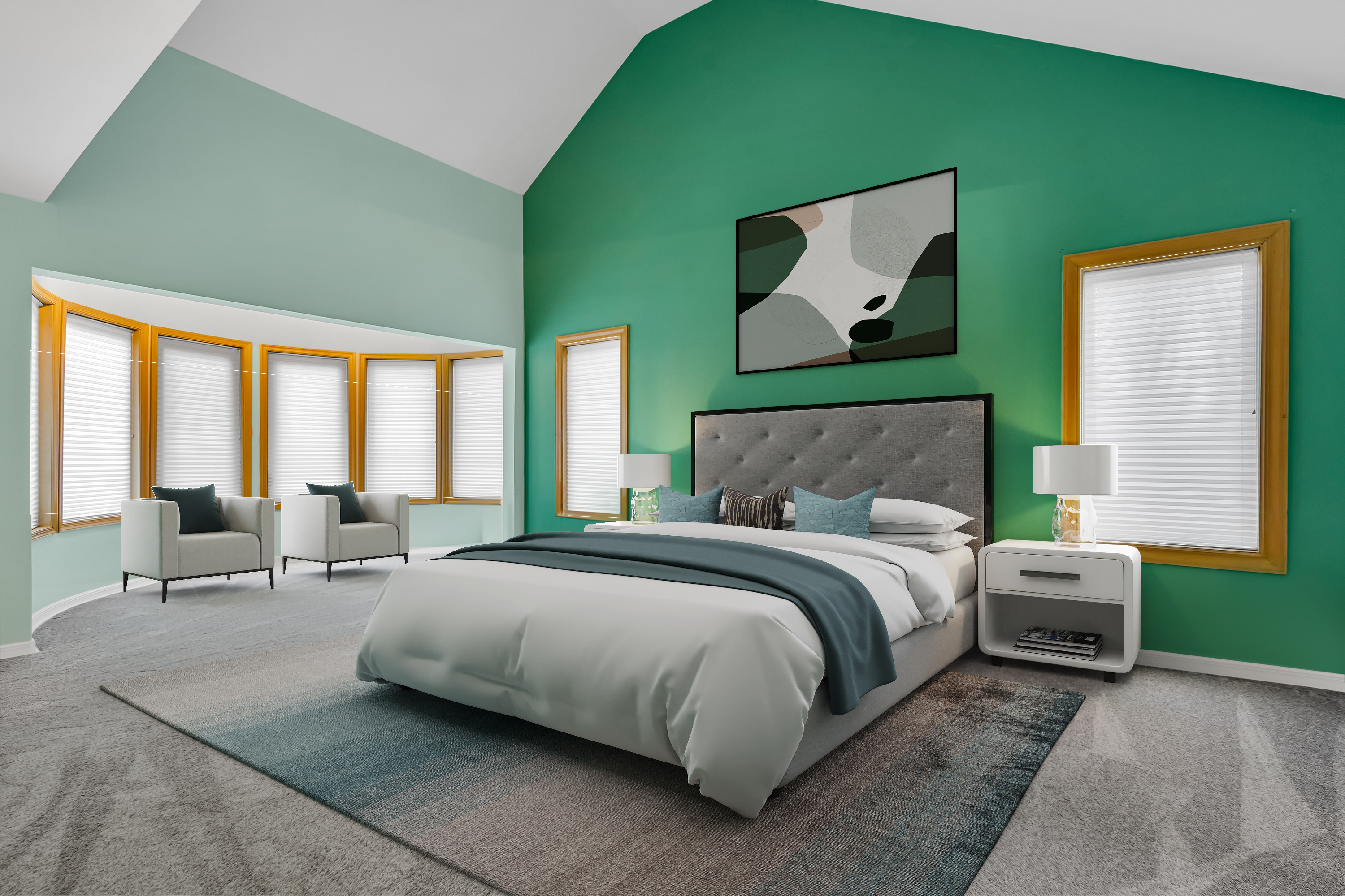
In today's competitive real estate market, sellers and agents are continually seeking innovative ways to capture buyers' attention and drive sales. One such innovation that has gained significant traction is virtual staging. By digitally enhancing property images with furniture, decor, and other elements, virtual staging has transformed the way properties are presented to potential buyers. In this article, we'll delve into real-life success stories that demonstrate how virtual staging has revolutionized real estate sales, showcasing its effectiveness in attracting buyers, increasing property appeal, and driving faster sales.
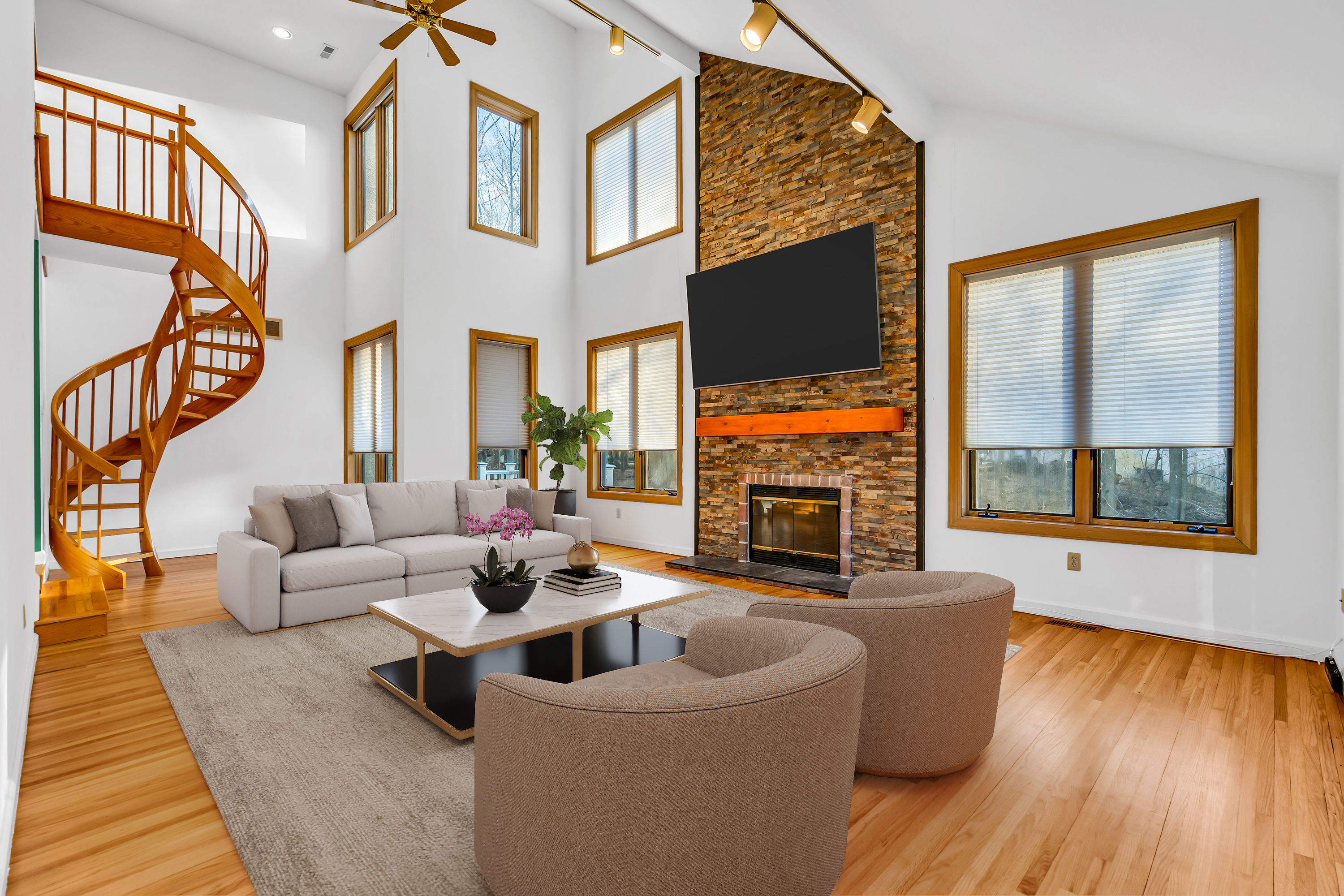
In the ever-evolving landscape of real estate marketing, staying ahead of the curve is essential for success. One increasingly popular tool that has revolutionized the industry is virtual staging. This innovative technology allows real estate professionals to digitally enhance property listings, creating visually appealing spaces that resonate with potential buyers. In this comprehensive guide, we'll explore the importance of virtual staging in increasing sales in the real estate market, diving into its benefits, strategies, and real-world success stories.
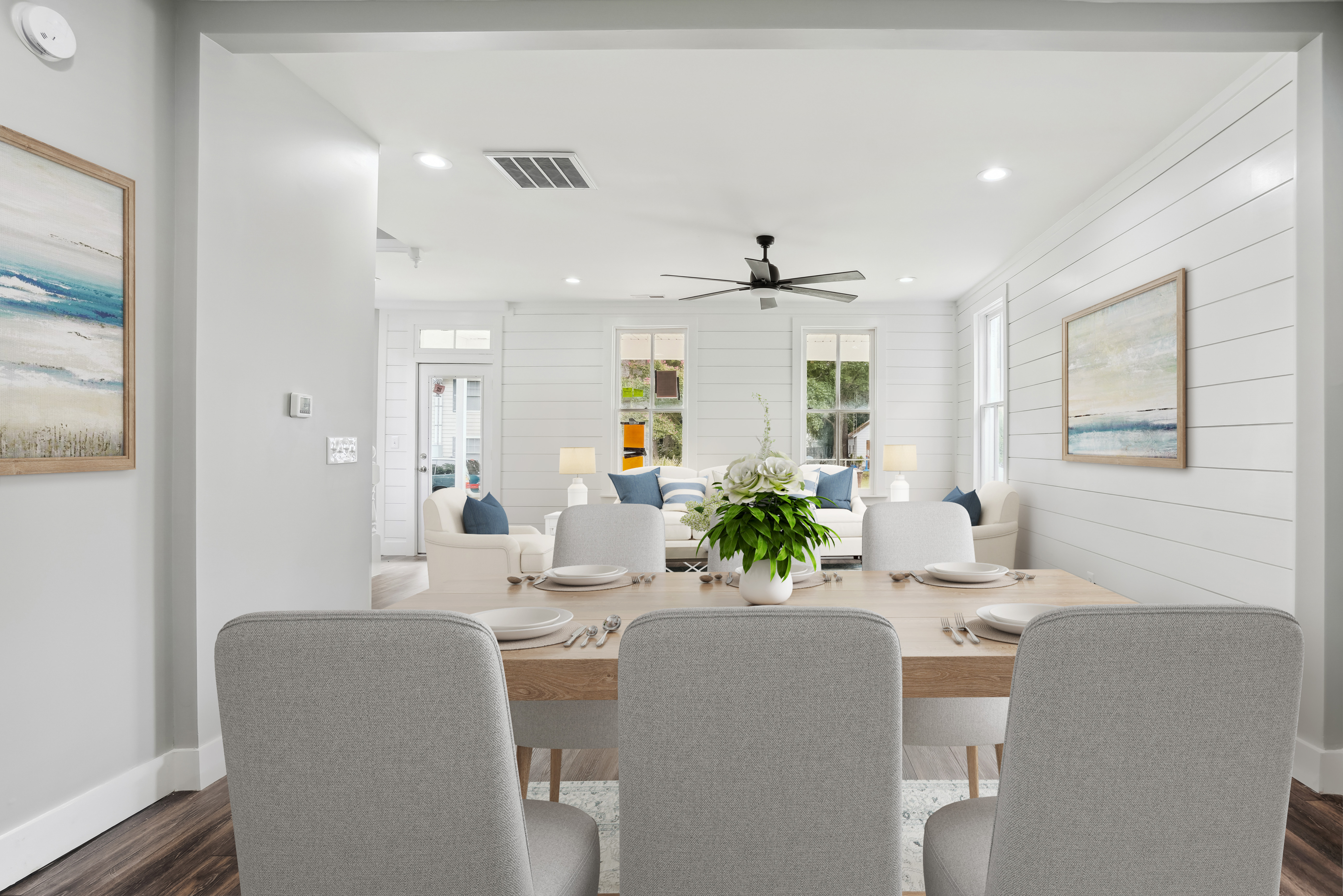
In the dynamic world of real estate marketing, staying ahead of trends and adopting innovative strategies is key to success. Over the past decade, virtual staging has emerged as a transformative tool, revolutionizing the way properties are presented to potential buyers. In this comprehensive guide, we'll delve into the evolution of virtual staging, exploring its origins, growth, and impact on the real estate industry.
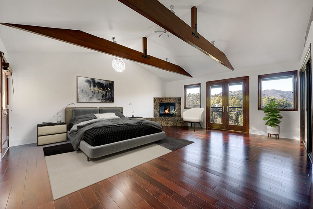
In the competitive world of real estate marketing, staging plays a crucial role in presenting properties in their best light to potential buyers. Traditionally, this involved physically furnishing and decorating a property to enhance its appeal. However, advancements in technology have introduced virtual staging as a viable alternative. In this article, we'll compare virtual staging with traditional staging methods, exploring their respective pros, cons, and best practices to help real estate professionals make informed decisions.

In the competitive world of real estate marketing, capturing the attention of potential buyers is paramount. While traditional methods like physical staging and landscaping have long been staples in property promotion, advancements in technology have introduced virtual exterior services as powerful tools for enhancing curb appeal and showcasing a property's full potential. In this comprehensive guide, we'll delve into the world of virtual exterior services, including virtual staging, virtual pools, and virtual landscaping, and explore how they can revolutionize the way properties are marketed and sold.
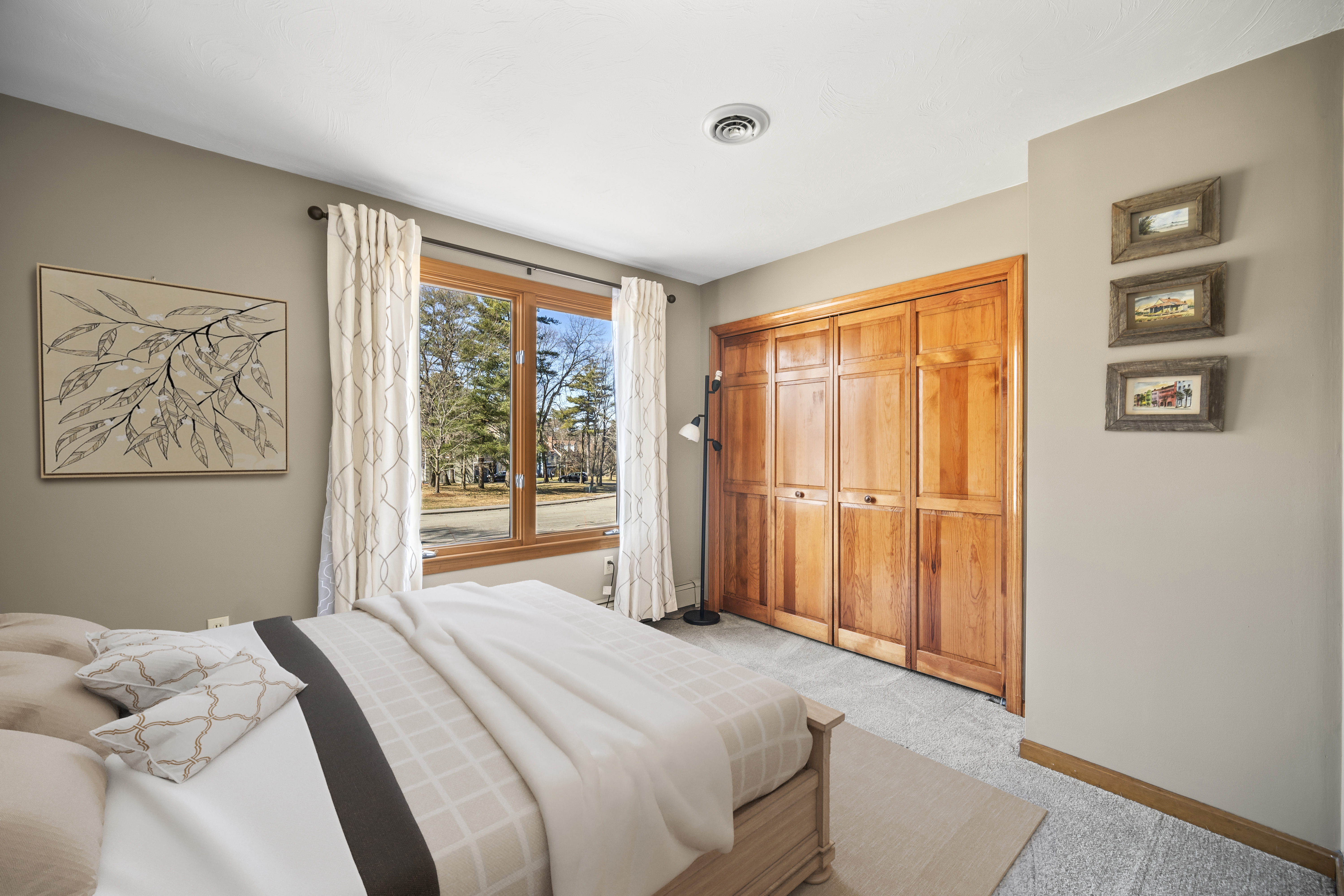
Virtual staging is not only transforming the real estate industry but also revolutionizing home design trends. With its ability to digitally furnish and decorate empty spaces, virtual staging has become a powerful tool for homeowners looking to reimagine their living spaces and stay ahead of the latest decor trends.
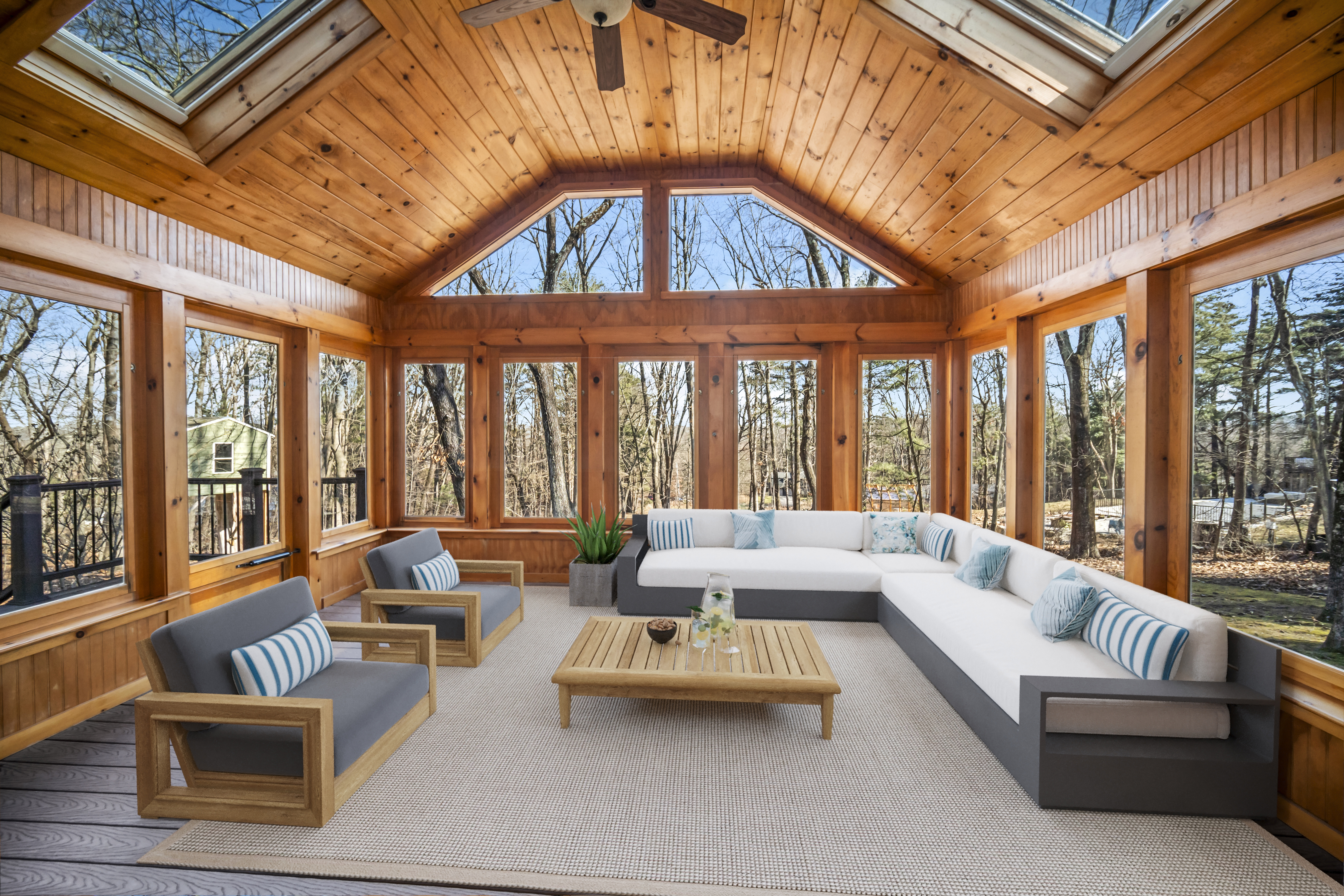
In today's competitive real estate market, virtual staging has emerged as a powerful tool for maximizing property sales and attracting more buyers. By digitally furnishing and decorating empty or under-furnished properties, virtual staging helps real estate agents showcase homes in their best possible light, driving greater interest and engagement among potential buyers.
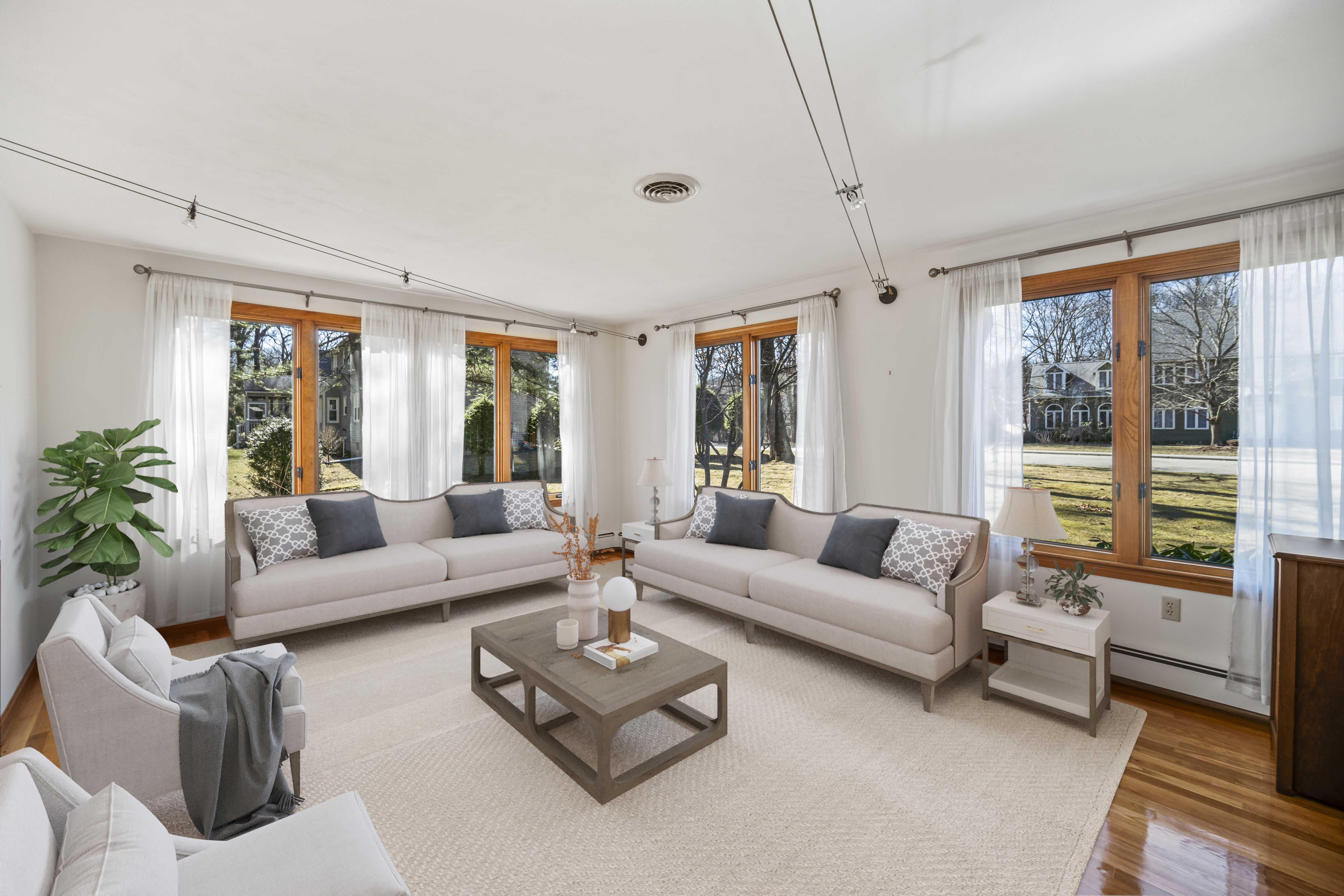
The real estate industry is undergoing a significant transformation, thanks to the rise of virtual staging technology. As more homebuyers turn to online platforms to search for properties, virtual staging is becoming an essential tool for helping them visualize their dream homes and make informed purchasing decisions.
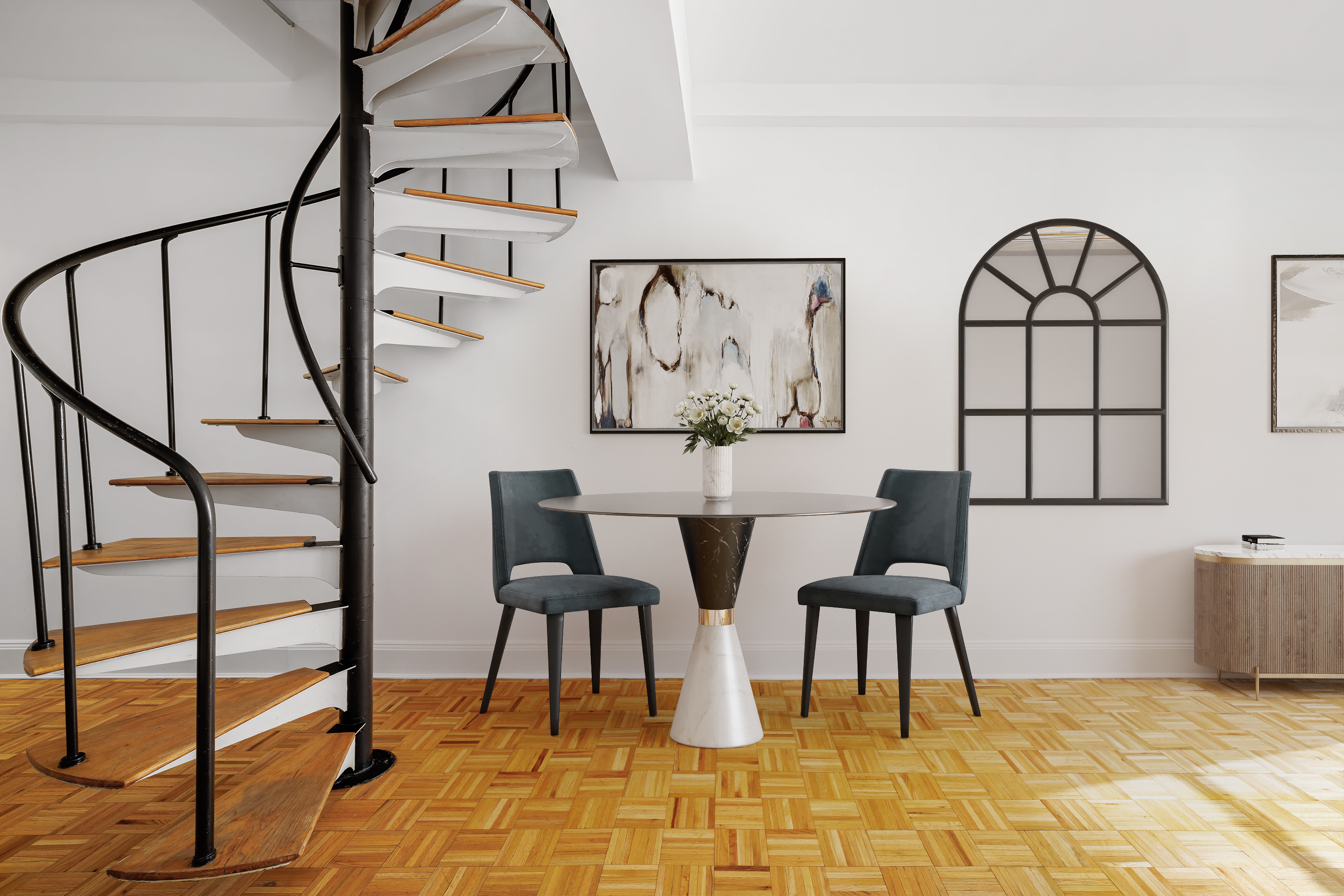
Visual content has become increasingly important in the world of real estate, and VSH Media is taking property listings to new heights. By combining high-quality visuals with interactive features, VSH Media offers a dynamic and engaging way to showcase properties online, capturing the attention of potential buyers and driving greater interest and engagement.
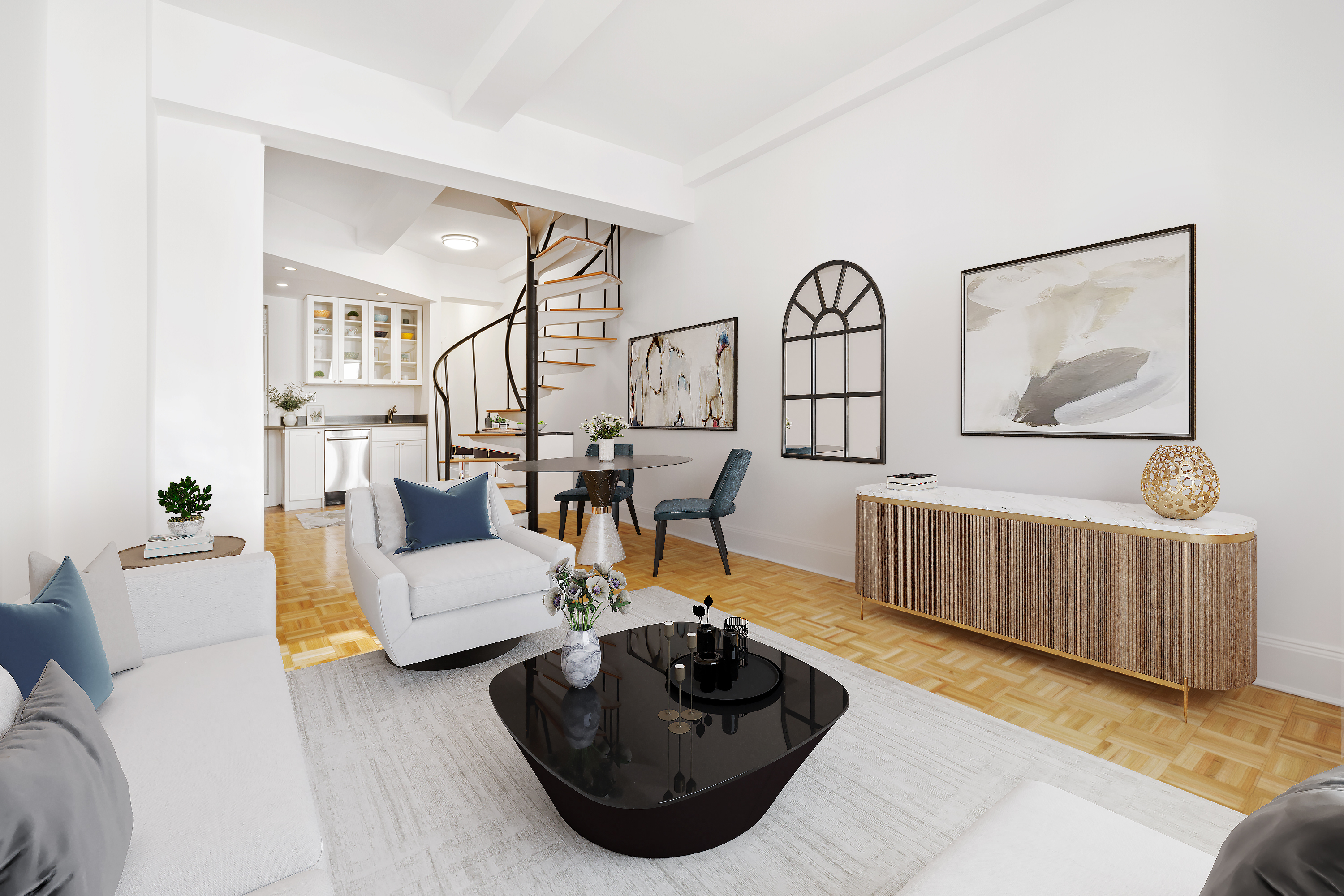
Empty spaces can present a significant challenge when it comes to selling a property. Without furnishings or decor to provide context, buyers may struggle to envision the full potential of a space, leading to decreased interest and lower offers. However, virtual staging offers a solution to this problem by digitally furnishing and decorating properties, helping buyers see past the empty rooms and visualize their future homes.
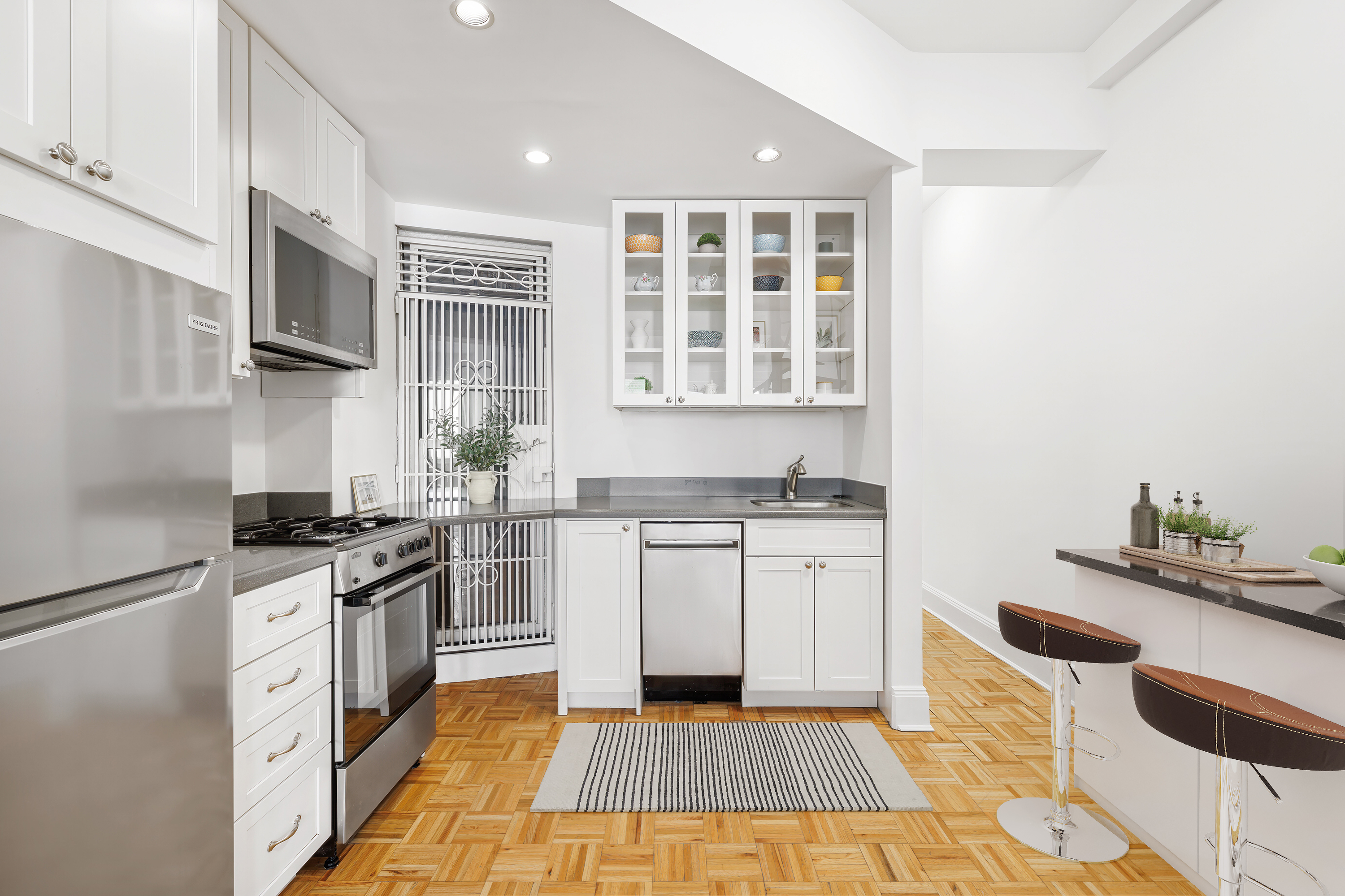
In the competitive world of real estate, capturing buyers' attention is key to driving interest and generating offers. Virtual staging has emerged as a powerful tool for captivating buyers by creating visually stunning representations of properties that resonate with their desires and aspirations.
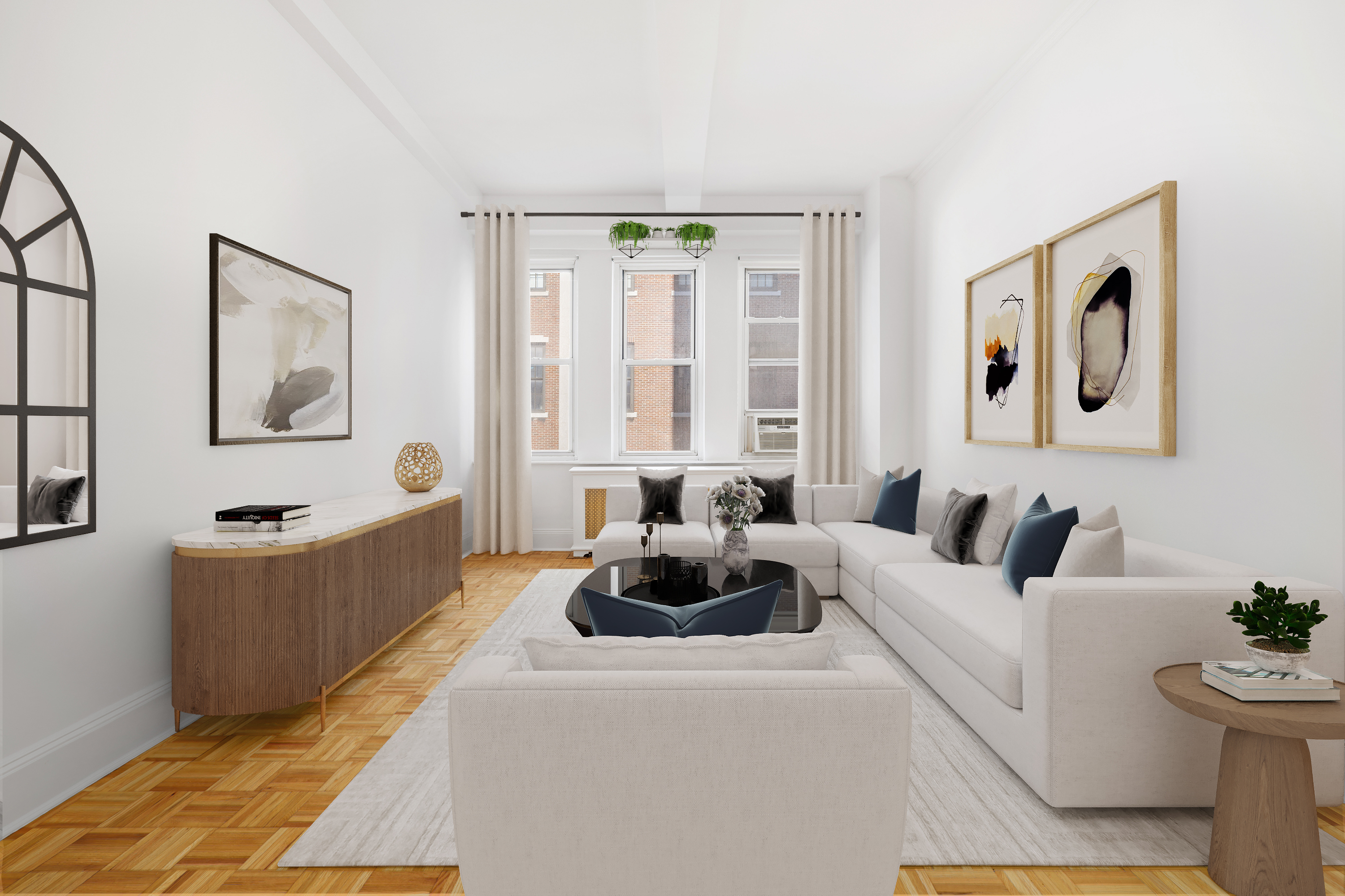
Fixer-upper properties present a unique opportunity for buyers to purchase homes at a lower price point and customize them to suit their needs and preferences. However, many buyers struggle to see past the cosmetic flaws and envision the full potential of these properties. Virtual staging offers a solution to this problem by digitally transforming fixer-uppers into desirable homes that capture buyers' imaginations and inspire them to take action.
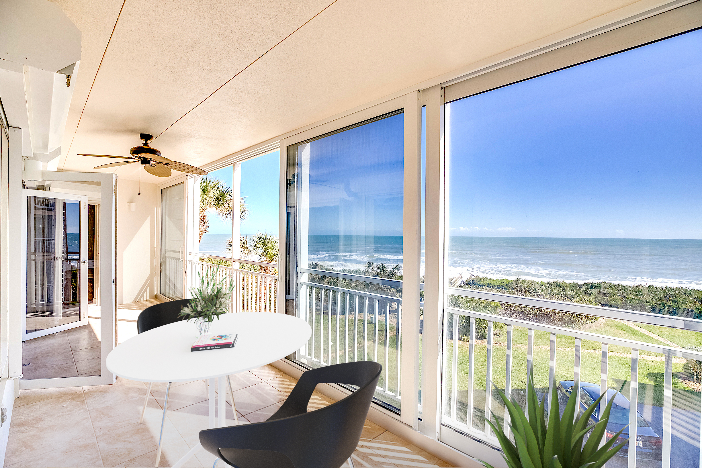
In the competitive world of real estate, storytelling is key to capturing buyers' attention and driving interest in properties. Virtual staging plays a crucial role in visual storytelling by creating compelling narratives that resonate with buyers and inspire them to take action.
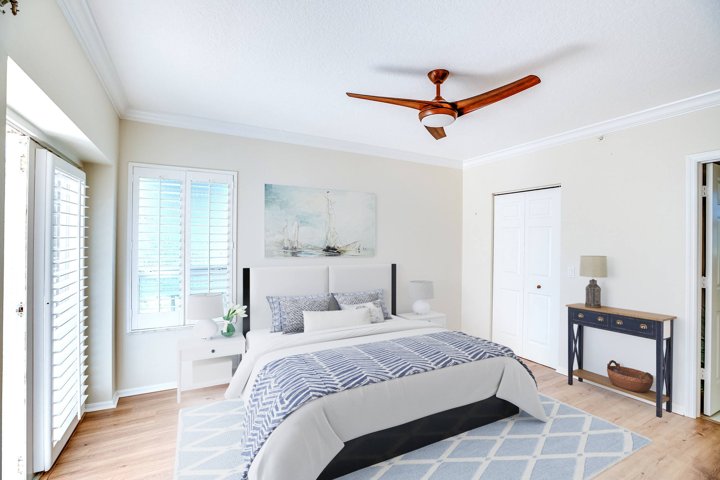
The real estate industry is constantly evolving, and virtual staging and VSH Media are at the forefront of this transformation. By harnessing the power of technology and multimedia content, real estate professionals are breaking boundaries and setting new standards for marketing properties online.
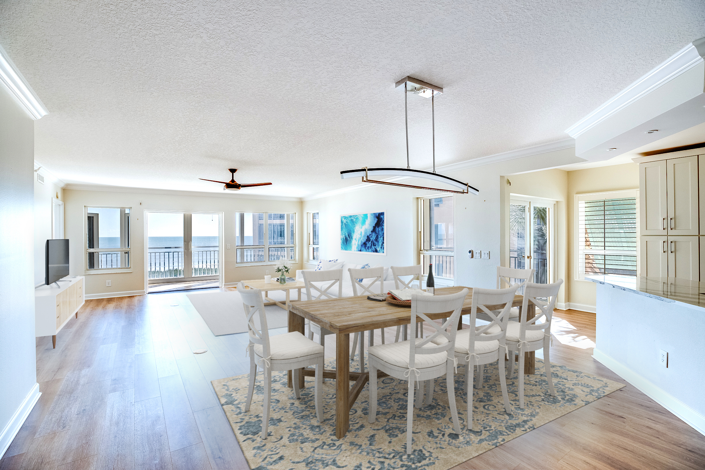
As sustainability becomes increasingly important to homeowners, virtual staging and VSH Media are playing a crucial role in promoting eco-friendly home trends. By showcasing environmentally conscious features and promoting sustainable living practices, virtual staging and VSH Media are helping to shape the future of home design and construction.

In today's fast-paced real estate market, staying ahead of the competition requires innovative strategies that capture buyers' attention and drive engagement. Two technologies leading this charge are virtual landscaping and VSH Media. Let's explore how these cutting-edge tools can transform your real estate marketing efforts and help you stand out in a crowded market.

In the fast-paced world of real estate, standing out from the competition is crucial. With advancements in technology, virtual landscaping and VSH Media are reshaping how properties are marketed and perceived by potential buyers. In this blog post, we'll explore how these innovative tools can transform your real estate listings and drive greater engagement and conversions.

In today's fast-paced real estate market, staying ahead of the competition requires innovative strategies that captivate buyers' attention and drive engagement. Virtual landscaping and VSH Media are two such strategies that have been reshaping the industry, offering immersive experiences that enhance property listings and attract more potential buyers.

In the ever-evolving landscape of real estate marketing, staying ahead of the curve is paramount. With technology advancing at a rapid pace, virtual pool services have emerged as a game-changer, offering a multitude of benefits for both real estate agents and prospective buyers. At the forefront of this revolution is VSH Media, providing cutting-edge virtual pool services that redefine the way properties are showcased. Let's delve into the advantages of leveraging VSH Media's virtual pool services for your real estate listings.

In the competitive world of real estate, the key to success lies in captivating potential buyers and setting your listings apart. Enter VSH Media's virtual pool tours, a cutting-edge solution that transforms the way properties with pools are showcased. Let's explore the unique advantages of incorporating VSH Media's virtual pool tours into your real estate listings.

In the realm of real estate, first impressions matter. When it comes to showcasing a property's exterior, lighting plays a crucial role in creating a captivating visual experience. Enter virtual twilight services by VSH Media – a cutting-edge solution that illuminates listings in a whole new light. In this blog post, we'll explore the benefits of leveraging VSH Media's virtual twilight services to enhance the exterior presentation of your real estate listings.

In the world of real estate, it's all about creating an irresistible allure that draws buyers in from the moment they lay eyes on a listing. With VSH Media's virtual twilight services, agents can do just that – illuminate their properties in a whole new light. Here, we explore the myriad benefits of incorporating virtual twilight into your real estate marketing strategy.

When it comes to showcasing properties, the right lighting can make all the difference. With VSH Media's virtual twilight services, agents can elevate their listings to new heights, capturing the attention of potential buyers and creating an atmosphere of warmth and elegance. Here, we delve into the benefits of incorporating virtual twilight into your real estate marketing strategy.

In the competitive world of real estate, making a lasting impression is key to attracting buyers and closing deals. With VSH Media's virtual twilight services, agents can transform their listings and captivate potential buyers with stunning imagery that showcases the property's exterior in a whole new light. Here, we explore the benefits of incorporating virtual twilight into your real estate marketing strategy.
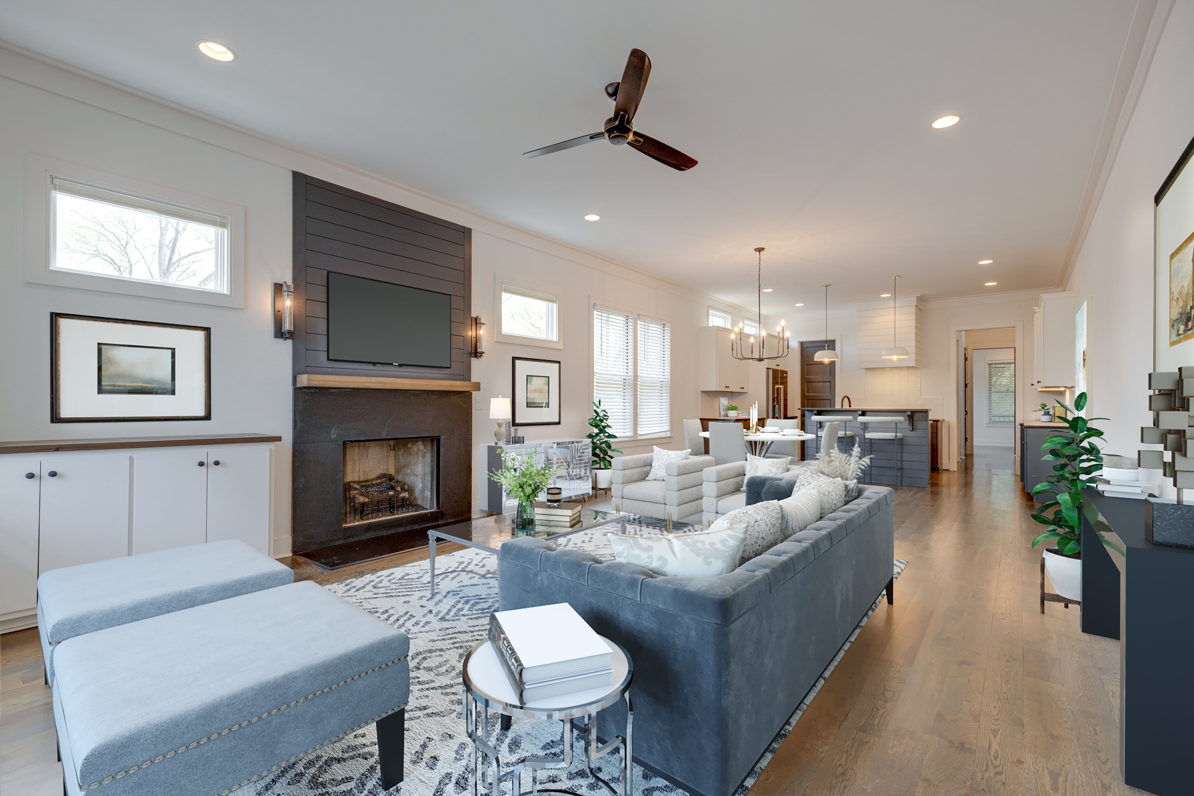
In the realm of real estate, first impressions are paramount. As the market evolves, so do the tools and strategies employed to attract potential buyers. Virtual staging has emerged as a groundbreaking technique, transforming the traditional approach to selling homes.
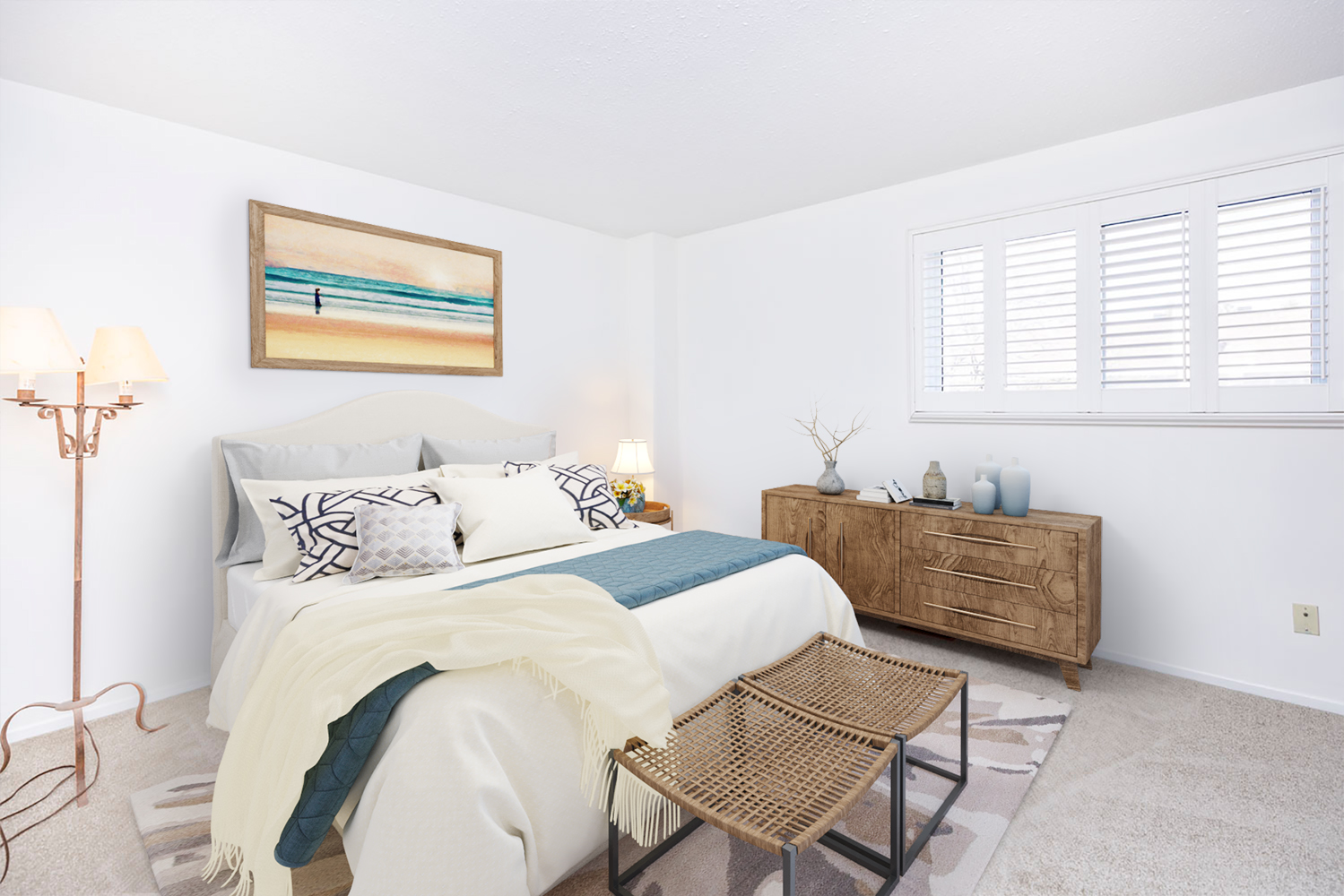
In the dynamic world of real estate, capturing potential buyers' attention and imagination is paramount. With the rise of online listings and virtual tours, the presentation of properties has evolved dramatically. Gone are the days of relying solely on traditional staging methods to showcase homes. Enter virtual staging, a game-changing solution revolutionizing the industry.
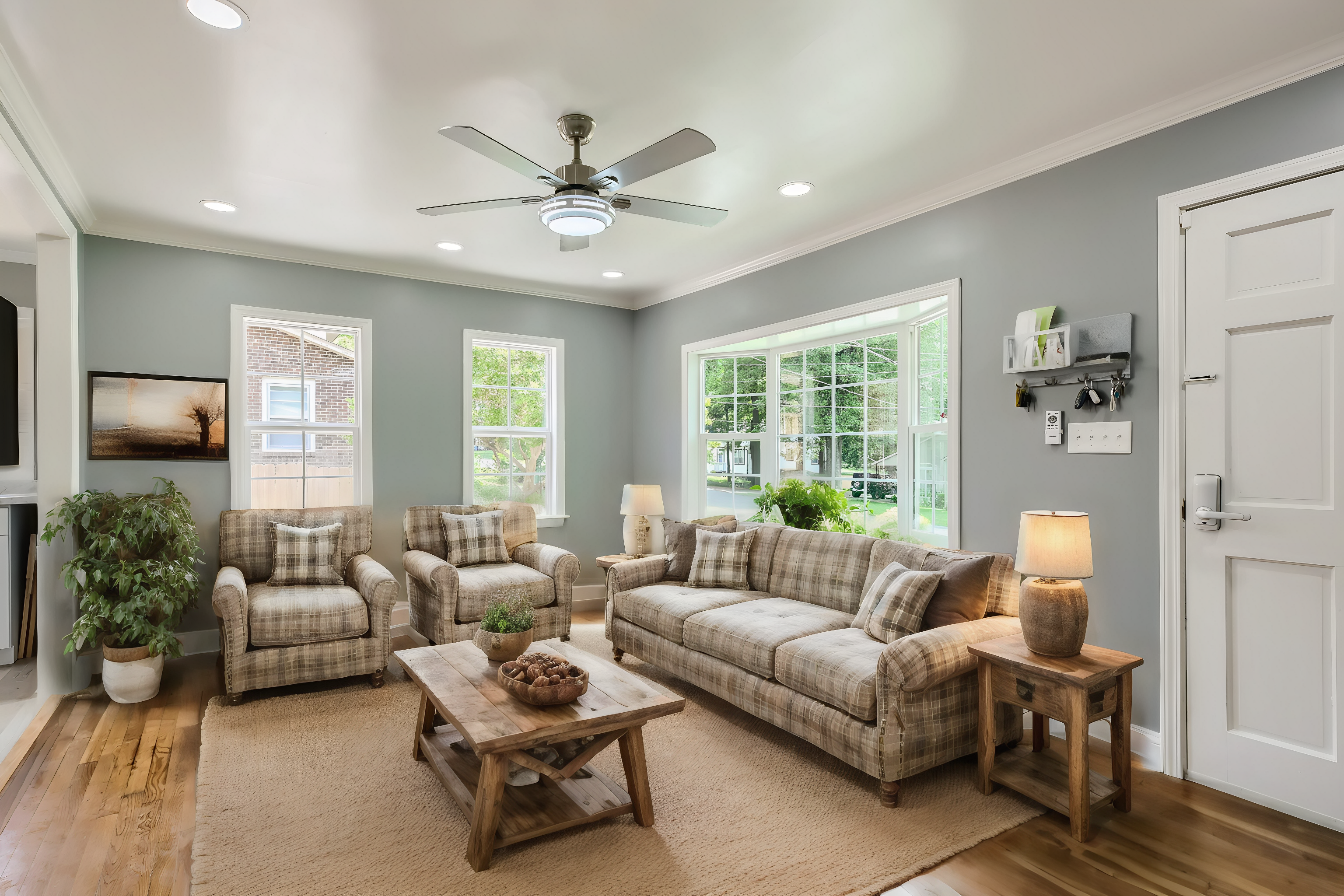
Virtual staging is a technology-driven solution transforming how properties are presented in the real estate market. By digitally furnishing vacant properties, virtual staging creates photorealistic images that captivate potential buyers online.
Copyright © VIRTUAL STAGING HOUSE MEDIA 2026 | All Rights Reserved. Professional staging for real estate agents across the country. Full online staging for realtors from VSH MEDIA.